You are using an out of date browser. It may not display this or other websites correctly.
You should upgrade or use an alternative browser.
You should upgrade or use an alternative browser.
- Thread starter Observer Walt
- Start date
A Torontonian Now
Senior Member
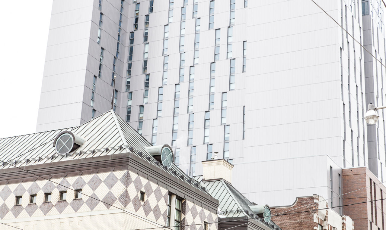
Would the 11.61% of UT readers who voted for this vertical prison as one of the best buildings completed in 2017 please report for a mandatory eye exam.
http://urbantoronto.ca/news/2018/01/urbantoronto-readers-select-best-buildings-2017
http://urbantoronto.ca/news/2018/01/urbantoronto-readers-select-best-buildings-2017
It makes me wonder if the word went out at Knightstone to vote! vote! vote!
42
42
am29
Active Member
Does the property to the East of this have any developmental potential? I suppose if the East and West sides of this get blocked off by better developments this won't looks as bad because the front of this building is alright..
Automation Gallery
Superstar
Does the property to the East of this have any developmental potential? I suppose if the East and West sides of this get blocked off by better developments this won't looks as bad because the front of this building is alright..
Not much to the east with the public library there, but to the west that corner is ripe for development
but then again that west facade is not as ugly as the other side..lol
Attachments
Last edited:
torontologist
Active Member
If only they could get some public art on that east facade...
M.R.Victor
Active Member
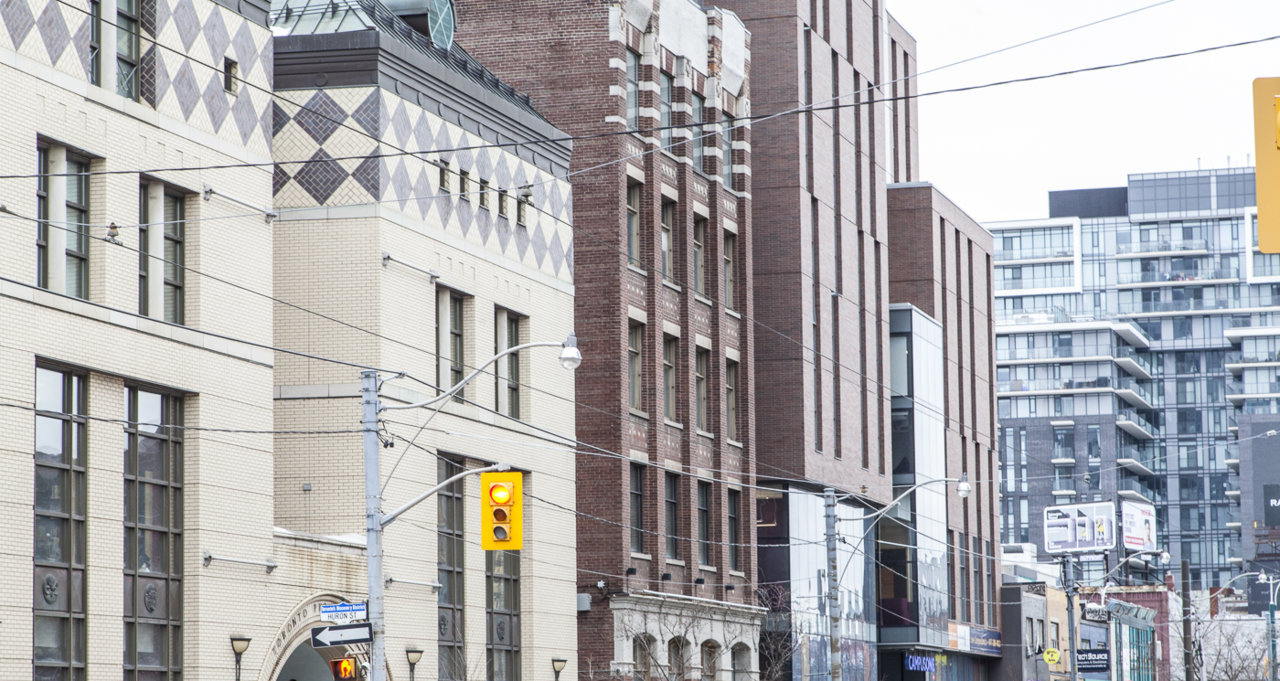
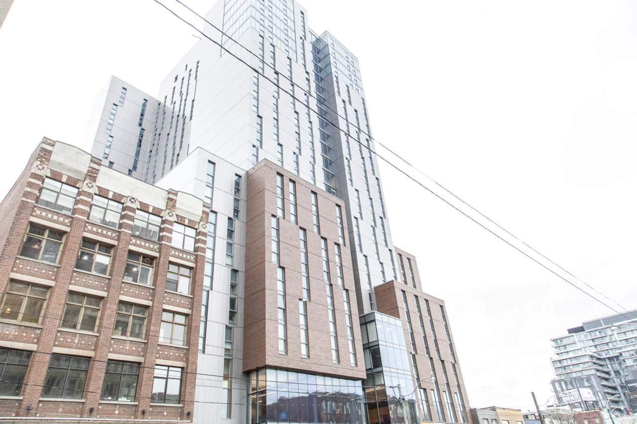
A student residence which could hardly hope to break a Top 10 Most Attractive Urban Prisons list, Campus One is nevertheless a very necessary part of downtown TO's student housing infrastructure. Of note is the interaction between the otherwise clunky mass and it's smaller-scaled surroundings, particularly the nod to the brown brick building directly to the east.
Photo update from earlier today.


Photo update from earlier today.
Attachments
ponyboy
Active Member
Miscreant
Senior Member
junctionist
Senior Member
It's sterile yet imposing like a bad contemporary hospital design.
ponyboy
Active Member
as bad as that west view looks now, it will be completely obscured by another building going up on the corner.
Such is my earnest prayer.as bad as that west view looks now, it will be completely obscured by another building going up on the corner.
42
Automation Gallery
Superstar
Such is my earnest prayer.
42
Hey, they thought this was too big and didn't want @ Bloor and Dundas, bring it here...
Attachments
ADRM
Senior Member
Hey, they thought this was too big and didn't want @ Bloor and Dundas, bring it here...
View attachment 136553
Oy, but that's also too ugly for here (or anywhere).
When you've got a pimple, you're not looking to cover it with another pimple.
Automation Gallery
Superstar
[

Such is my earnest prayer.
42
Oh well look around, ..be careful for what you wishOy, but that's also too ugly for here (or anywhere).
When you've got a pimple, you're not looking to cover it with another pimple.


