You are using an out of date browser. It may not display this or other websites correctly.
You should upgrade or use an alternative browser.
You should upgrade or use an alternative browser.
- Thread starter interchange42
- Start date
Towered
Superstar
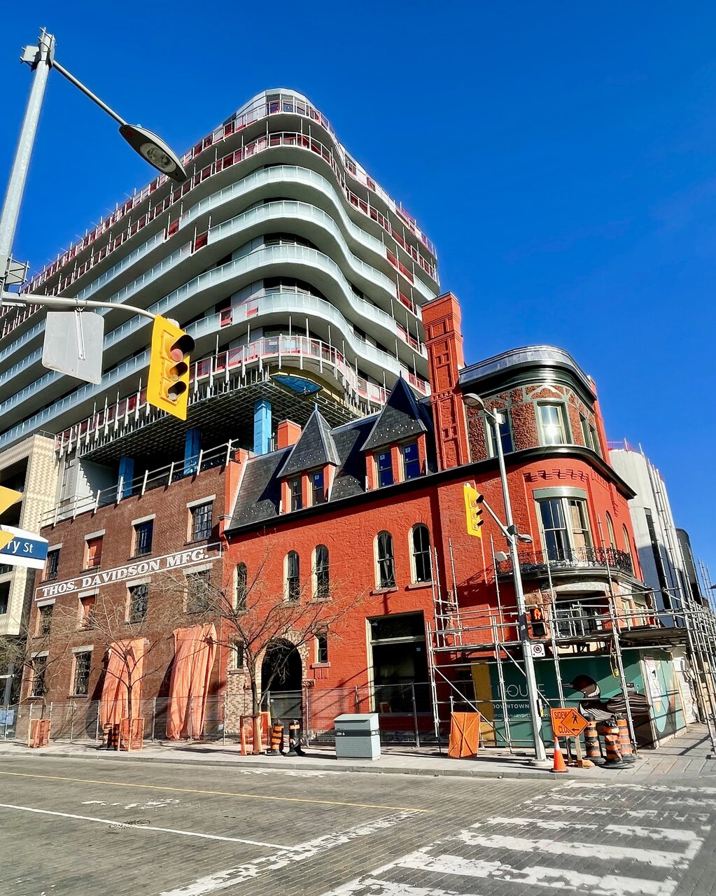
So they were perfectly capable of restoring the original brick on that portion of the building, but not on the flagship heritage house on the corner. What idiot makes such a decision?
Chronamut
Active Member
honestly they shoulda painted this yellow if anything - then it woulda been a "canary" yellow house.
jxmyth_
Active Member
I'm appreciating the mixture of textures and surfaces. This is the kind of thing that would have helped projects like Time & Space and Honest Ed's
Chronamut
Active Member
I really wish we'd repaint our old brick signs in hamilton white like that - looks awesome. Instead we keep them faded and dilapidated looking like our tip-top tailors.. One of these days I'm just gonna go up there and paint it myself lol..
skycandy
Senior Member
DavidCapizzano
Senior Member
Nice street wall forming on the south side of front
amh
Active Member
Chronamut
Active Member
what happened to the giant opening in the wall there ? looks like some of the brick is missing? Was that originally blocked up?
Oh looks like this may have not originally been an entrance at first glance and was instead punched in..
Oh looks like this may have not originally been an entrance at first glance and was instead punched in..
DSC
Superstar
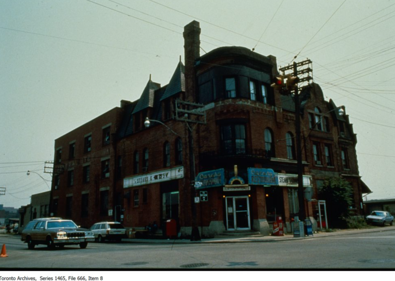
I kinda like the splash of orange. Here is what it used to look like:

Dr. Snoot
Active Member
The sweet full reveal. 
Take it off, baby.

Take it off, baby.
globalexpress
Active Member
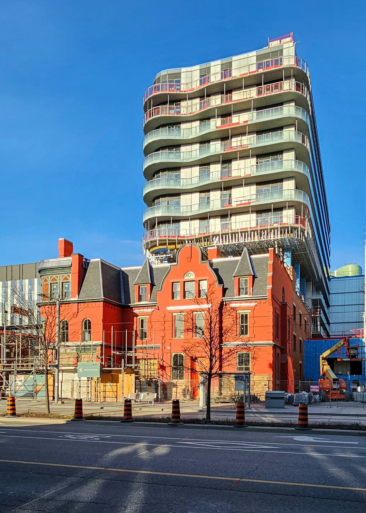
Canary House this evening.

Chronamut
Active Member
hunh so the part with the rubble brick look on the top was a later addition or a covered up old as it just shows black originally.. that just makes it even stranger how it's offset.. almost like they added a smaller window, realized it was now off, and then just covered it over in black so you wouldn't see..
glad they added the wraparound cornice back, even if it isn't of the original style - you can see it was ripped off in the original image..
(I'm big on cornices lol..)
that arched entrance that looks like it's trying to emulate a carriage stable looks new.. hmm.. or is it? It's hard to tell but it looks like the original image might have bricked over this area with new brick.. so maybe it WAS original.. originally.. an old building like that most likely woulda had a place for a horsedrawn carriage to park.. kinda weird how it's a mixture of bricks though..
I will admit the original colour IS a bit gungy..
Last edited:
jxmyth_
Active Member
everydayhim
Active Member
this actually makes me very confused as to what they decided to paint and why. that brick painting scheme at the arch makes no logical sense to me, unless they are now in the process of stripping the red 'paint' or whatever it is
Last edited: