ProjectEnd
Superstar
amazing how many times Peter Clewes can crank out the exact same building and be praised for it.... vomit.
Gesundheit!
amazing how many times Peter Clewes can crank out the exact same building and be praised for it.... vomit.
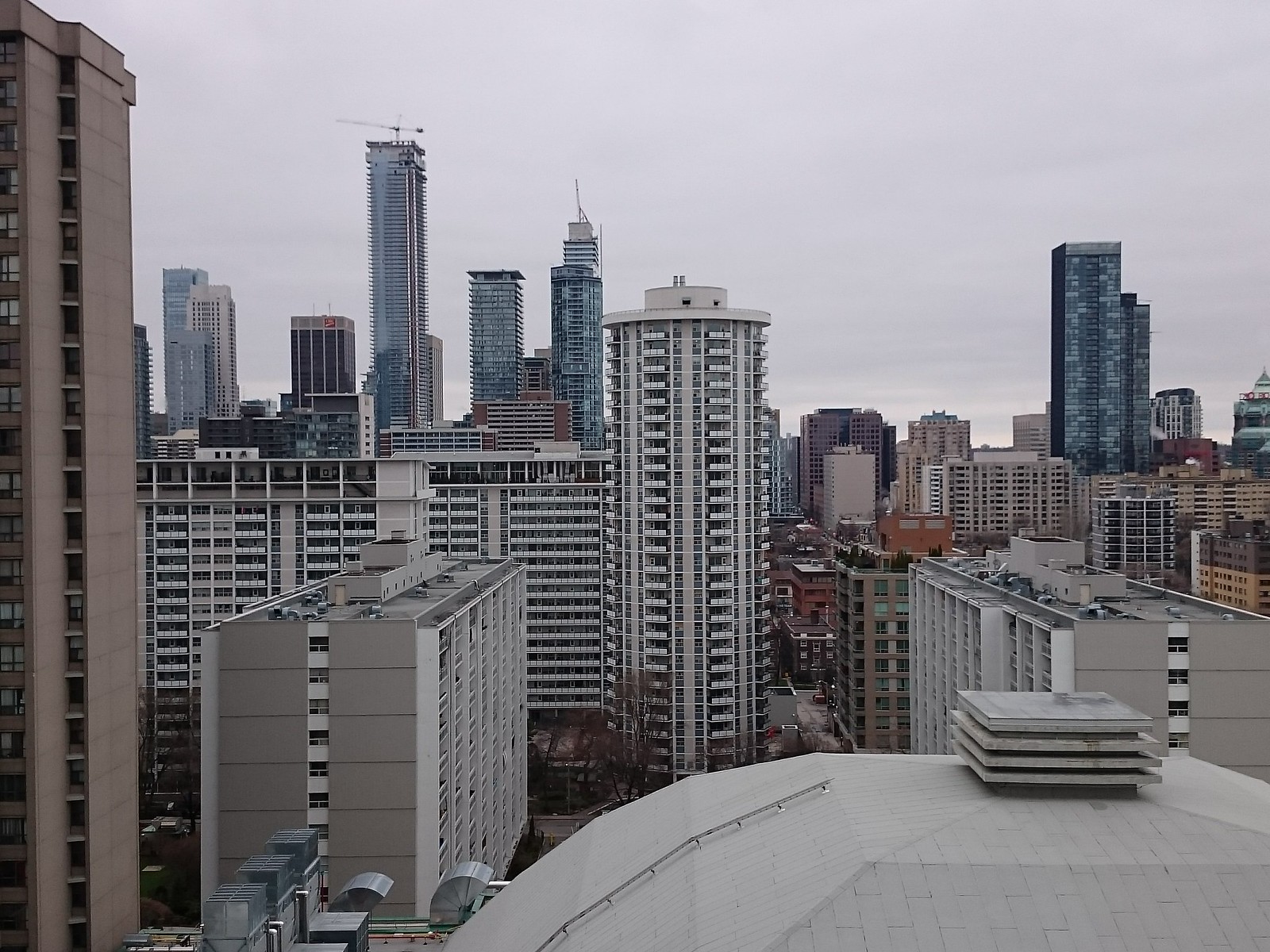
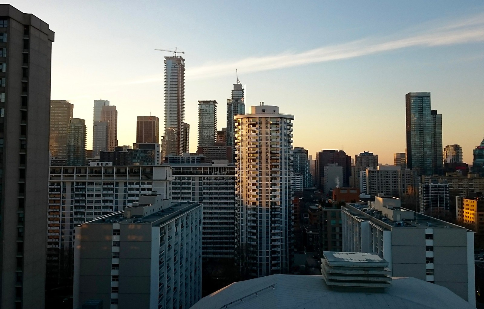

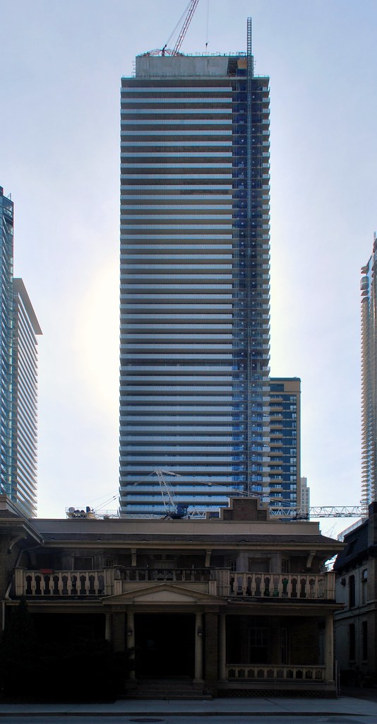 Casa II by Marcus Mitanis, on Flickr
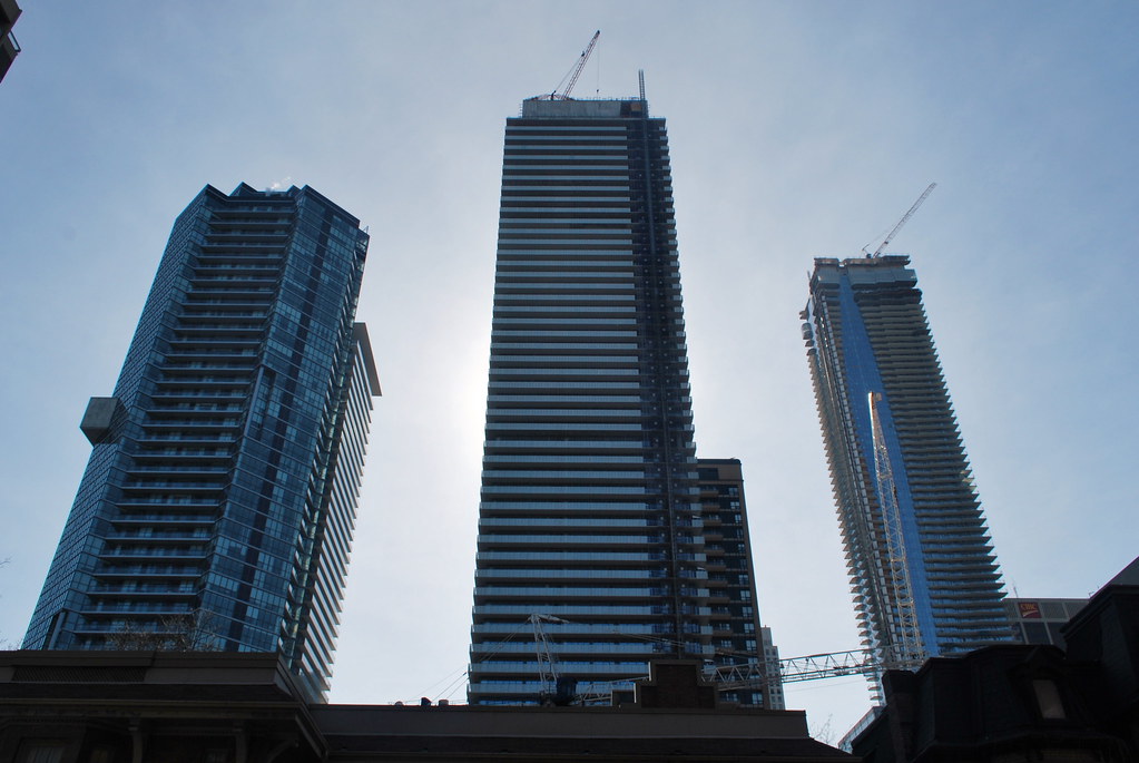 Casa II by Marcus Mitanis, on Flickr
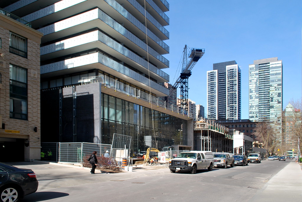 Casa II by Marcus Mitanis, on Flickr
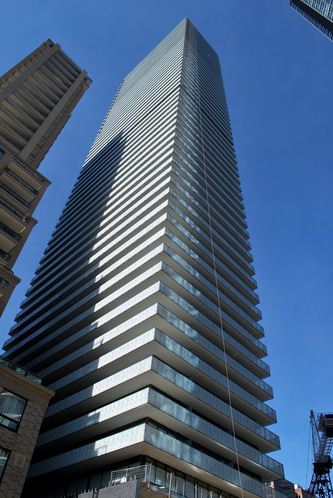 Casa II by Marcus Mitanis, on Flickr
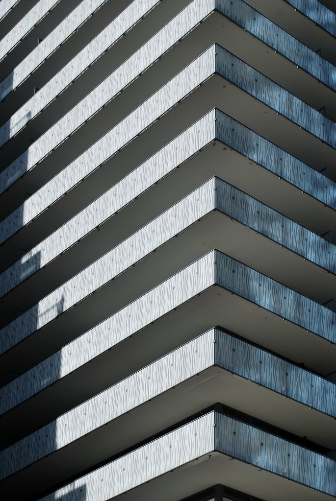 Casa II by Marcus Mitanis, on Flickr
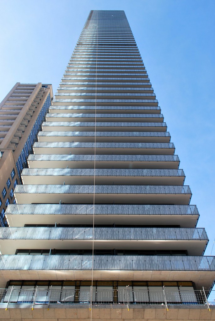 Casa II by Marcus Mitanis, on Flickr
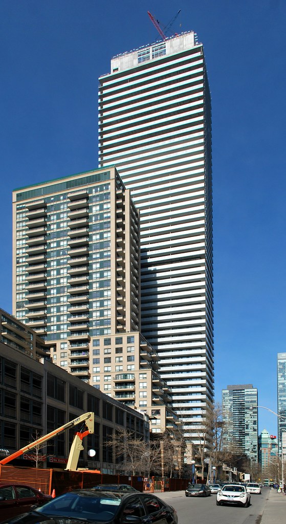 Casa II by Marcus Mitanis, on Flickr
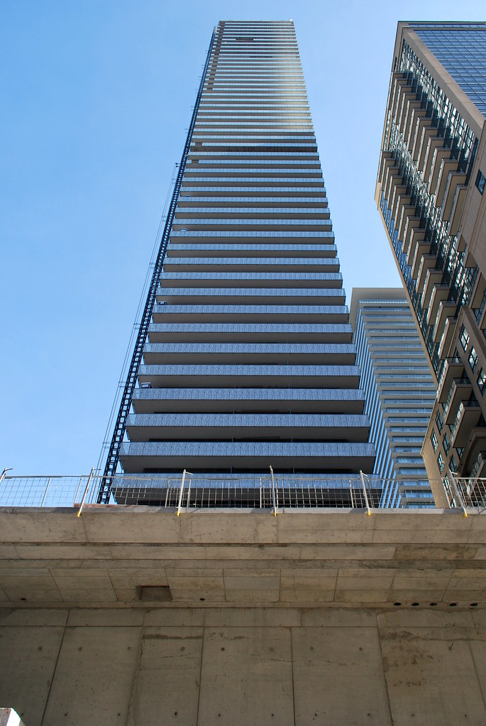 Casa II by Marcus Mitanis, on Flickr
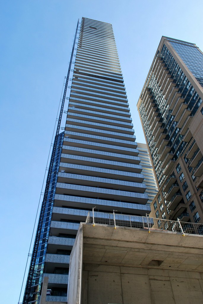 Casa II by Marcus Mitanis, on Flickr
Me too. The edges on this building look sharp enough to cut. I really like it.The simplicity of this one with the fritted white glass balconies wrapping all the around make this one a very sexy tower in my opinion..