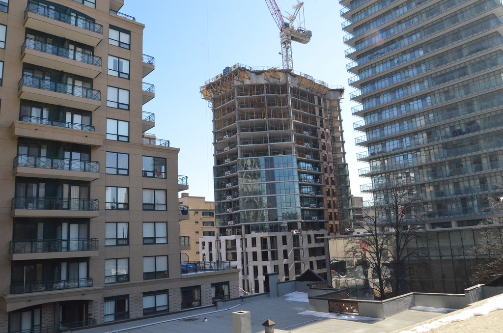
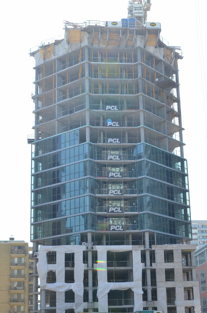
I disagree--it looks like your typical P+S crap. Walk by it closely and compare it to X/X2 or even Casa.

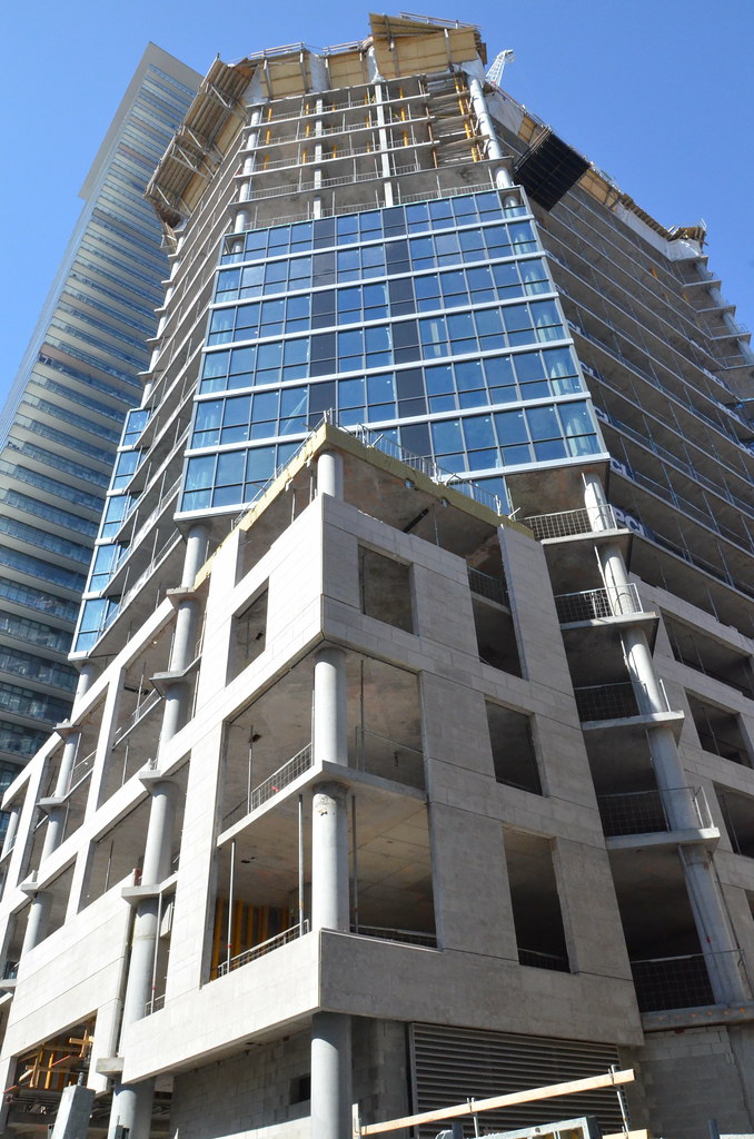
I think I may be a bigger fan of Casa than yourself, but I agree, the glass and spandrel isn't great when viewed in person. What I hope saves this building when all's said & done is it's unique shape, and base.
 
I disagree--it looks like your typical P+S crap. Walk by it closely and compare it to X/X2 or even Casa.

I would have liked to see higher quality windows but I just have a feeling that this will turn out well despite the basic materials. I like the shape of the building.
 
March o7
Lot more up on site and not a sq box building
13036460905_dcb6d1a100_b.jpg


13036821064_9382bd7419_b.jpg


13036769683_14771d2d55_b.jpg


13036992944_0172ea67e1_b.jpg


13036983634_c08c8b3726_b.jpg


13036687983_14678892f9_b.jpg


13036615563_a02c5fcc40_b.jpg
 
This is turning out better than I expected, though my expectations were incredibly low.
 
This is turning out better than I expected, though my expectations were incredibly low.

I like it as it not only not sq, but using {I am assuming} concrete slabs and mortar in place of precast panels. It not precast panels for sure. If the slabs were another colour, it would help the appearance of the base more.
 
This one isn't anything spectacular. Just mediocre if you ask me... about a 5/10. Nice filler but I personally prefer X and X2.
 
This one isn't anything spectacular. Just mediocre if you ask me... about a 5/10. Nice filler but I personally prefer X and X2.

How is this Mediocre? And what makes X and X2 different from all other boring glass boxes with balconies around the city?
Can you really tell me any aesthetic factor that makes the X and its clone under construction and proposed sisters better than this project?
 
I think the shape does it some favours, but I do personally like X and X2 more as well. They're authoritative, strong buildings. Always catch my eye.
 

Back
Top