Enbridge has rules about keeping their ugly utilities accessible.

42
 
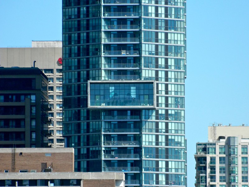
Still one of the cooler features I've seen in a condo high-rise:

27540234360_d43989c85b_c.jpg
 
I don't like that this is basically a tower in the park. The podium should have been flush with the street.
 
The plantings they did are horrible. They were just boring rows of grass and echinacea that are now full of weeds. I hope the condo corp eventually does something with the planting space in front of the building, it is currently a lost opportunity.
 
Charles Street is relatively narrow, so I appreciate the setback from the street. It means more light and space that could be used for wider sidewalks one day.
 
How does a slight setback from the street makes this a tower in the park?

While I don't know if I'd go so far as to call it a tower in a park, this building, and many of the new buildings on Charles Street in general, do not engage very well with the street. They're all separated by each other by driveways, so there is no consistent street-wall, and they are separated from the (relatively narrow) sidewalk by grass/plantings. Overall it's not a very urban experience. It is especially discouraging when one imagines what could have been possible on a street where almost every building is new/renovated.
 
So Charles Street's vernacular is not one which brings most buildings right up to the sidewalk, but neither is this "tower in the park", not the way that term conjures up images of typical towers in a park, anyway. And, if "urban" is only defined as right-up-to-the-sidewalk, then no the isn't urban.

Given that this is a 47 storey-high building only back 7 or 8 metres from the sidewalk, I'm thinking this (and the rest of the street) is still way more urban than suburban. Maybe compromising on "tower in an insultingly tiny parkette" would be a new term that would be acceptable? …or less facetiously, we need to expand a too-limiting concept of what urban is. Not every street needs to-the-sidewalk buildings to be good urban citizens.

42
 
Chaz is so much better with a rainbow over it.
IMG_5183.JPG
IMG_5185.JPG
IMG_5186.JPG
 

Attachments

  • IMG_5183.JPG
    IMG_5183.JPG
    870.9 KB · Views: 678
  • IMG_5185.JPG
    IMG_5185.JPG
    891 KB · Views: 626
  • IMG_5186.JPG
    IMG_5186.JPG
    824.9 KB · Views: 628
I know this thread died a year ago, but this has been bugging me for a year. I live south of the building and the lighting around the rectangle common area has NEVER worked. It started with one section out, which was annoying enough, but now there are a few sections out and some that change colour at different times then the majority of lights. For a new building it is ridiculous and it is an eyesore. If you are going to have a light feature, at least make sure it works or leave it off until you can get it fixed. I'm hoping that Vox is just high enough that it blocks my view of Chaz...
 

Back
Top