• Thread starter Suicidal Gingerbread Man
  • Start date
Thank you for sending me extra 30 minutes sunshine every day :)

IMG_4727.JPG
 
I often wonder if the architect got the idea from an old quilt with the diamond pattern. Possibly seeing one at their grandparents house, or their parents and think "WOW that would be awesome on a building". Reminds me of some of the ones my grandmother did over her years. Usually they were rectangle shapes sewn together to form a diamond pattern, (or any other pattern). It is mind boggling, however I am sure some computer programming helped, to figure out how to do this diamond pattern on a large building like this. 30 to 40 years ago this would have just been a concept in some architect's file cabinet. Today it can be reality.
 
It’s rare that a building under construction displays a rendering of a specific feature on the hoarding - which happens to be located right by the said feature (the canopy in this case). No room for cheapening or alteration - everyone can compare the built form with the rendering. Kudos to the developers for building the canopy exactly as depicted!
 
It's already looking so amazing, I can only imagine 4 years from now when it's all finished.....no sign of cranes/missing windows , the lighting feature is activated, building #2 is built. Pictures are going to be 10/10. A photographers dream.
 
CIBC will also carry over the diamond pattern into their own branding. I have seen some future marketing materials that strongly incorporate the diamond pattern. I believe they are also redesigning their logo.
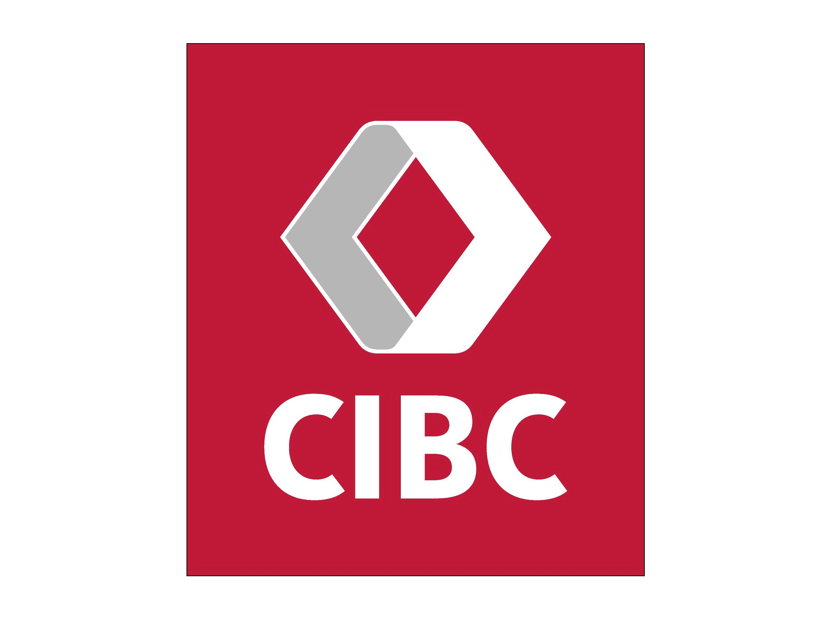
Great news for forumers that wanted a different logo at the top of the towers.
 
It's rather telling that in the signage application from last summer, signage for GO and Microsoft are fully rendered, yet for the actual CIBC logo, the plans just show "BANK"
If they planned to use the current logo shown in renderings, we'd certainly see that branding shown in the signage application like the other brands shown.
Capture11.JPG
 
^ That red kinda screams "debt" to me... at least the diamond is (appropriately) defined.

Maybe a burgundy (sort of like the old logo)... or a chianti or a montepulciano or....


cibc-newlogo.png


Either way the graphic designer billed $271,014 + HST... for ten minutes of drawing (and pages of design rationale).
 
^That looks a lot like Renault's logo
Here's hoping that Renault's attorneys won't show up in the lobby of CIBC's current head office.

Given the pandemic, they won't actually show up in the lobby. Instead, they'll e-mail CIBC about it.
 

Back
Top