You are using an out of date browser. It may not display this or other websites correctly.
You should upgrade or use an alternative browser.
You should upgrade or use an alternative browser.
- Thread starter cabeman
- Start date
Miscreant
Senior Member
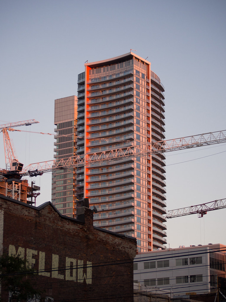
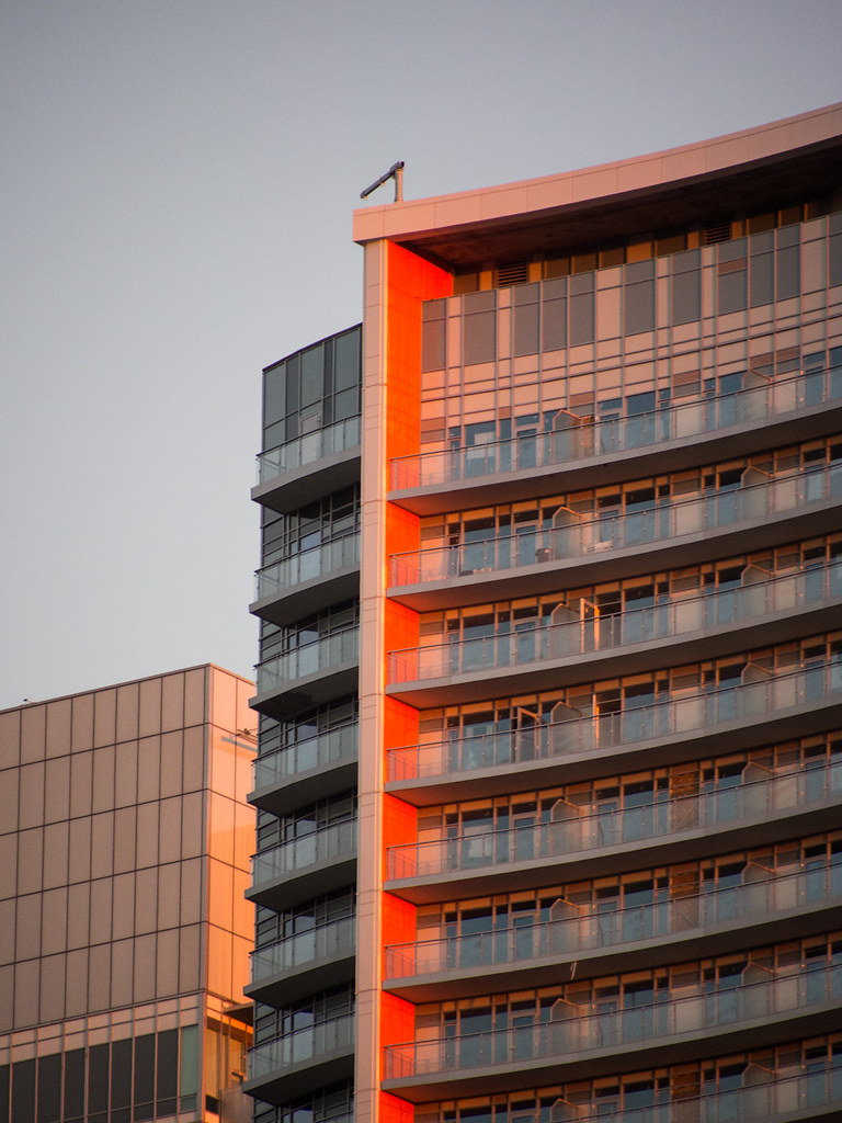
Nice shot. To my eye that's its good side. The orange strip up the side is tasteful, and the top of the building is elegant. The other side is very...'Markham.'
Last edited:
urbandreamer
recession proof
29 September 2013:


A unique look at an ugly building:


Note the contrast between architects' window dressing styles


A unique look at an ugly building:


Note the contrast between architects' window dressing styles

christiesplits
Senior Member
The tower looks too busy, unsure of what it is trying to accomplish. The orange stripe almost comes off as an after thought. Really disappointing.
Miscreant
Senior Member
Pinnacle's nothin to sneeze at there, though. Tall, dark and handsome.
junctionist
Senior Member
We need more photos of the zany entrance in all its ridiculous glory. To hell with what the art establishment thinks. The entrance provides some comic relief from a tower that looks so generic and devoid of inspiration that it makes me want to hit it with the wrecking ball before it's even used for any purpose more dignified than storing air.
rdaner
Senior Member
How is the multi-purpose space on the ground level working out? The addition of a theatre of that size is needed in this area and it seems that TIFF has already gotten a lot from it being next door. I am also waiting to see how the lane ways are going to be utilized; so much potential for setting strong precedents in urban space use.
Red Mars
Senior Member
Pics taken Oct 19, 2013
Every entrance seems to be an architectural afterthought. The front and back entrance doesn't blend with or compliment the building. I guess they take some of the sting away from the Flintstone entrance.
The chain link fence is outta the way.


Every entrance seems to be an architectural afterthought. The front and back entrance doesn't blend with or compliment the building. I guess they take some of the sting away from the Flintstone entrance.
The chain link fence is outta the way.


taal
Senior Member
Sure I agree but can we give the tower some credit ?? I like it, not a simple square, the orange accent strip all the way is great / balconies painted - I don't find the spandral horrendous as its not the typical grey, rather blue and white ...
condovo
Senior Member
Horrendous
Therion
Senior Member
There's a lot worse in this city. I'm liking the orange of the podium. A splash of colour in between the darker styles of Pinnacle and the Lightbox. The entrances are not great, or even good, but the tower itself, with the curves and the orange balconies does enough that I find my eye drawn to it much more so than the Lightbox.
Torontovibe
Senior Member
^^ + 1
innsertnamehere
Superstar
I hate the tower, it is the perfect example of the plain jane glass box that has no serious thought put behind it's design, but the splash of colour on the parking garage in the base adds a whole lot to the streetscape. If only they could have gotten the first floor right.
Miscreant
Senior Member
I can't believe how badly that meets the street. Unbelievably atrocious. Shocked people are paid well to design things like this.
tris
New Member
I can't believe how badly that meets the street. Unbelievably atrocious. Shocked people are paid well to design things like this.
Looks pretty good to me. How else could it meet the street?

