I'm not answering why they should not do more, I'm answering why they might not do more.

42
 
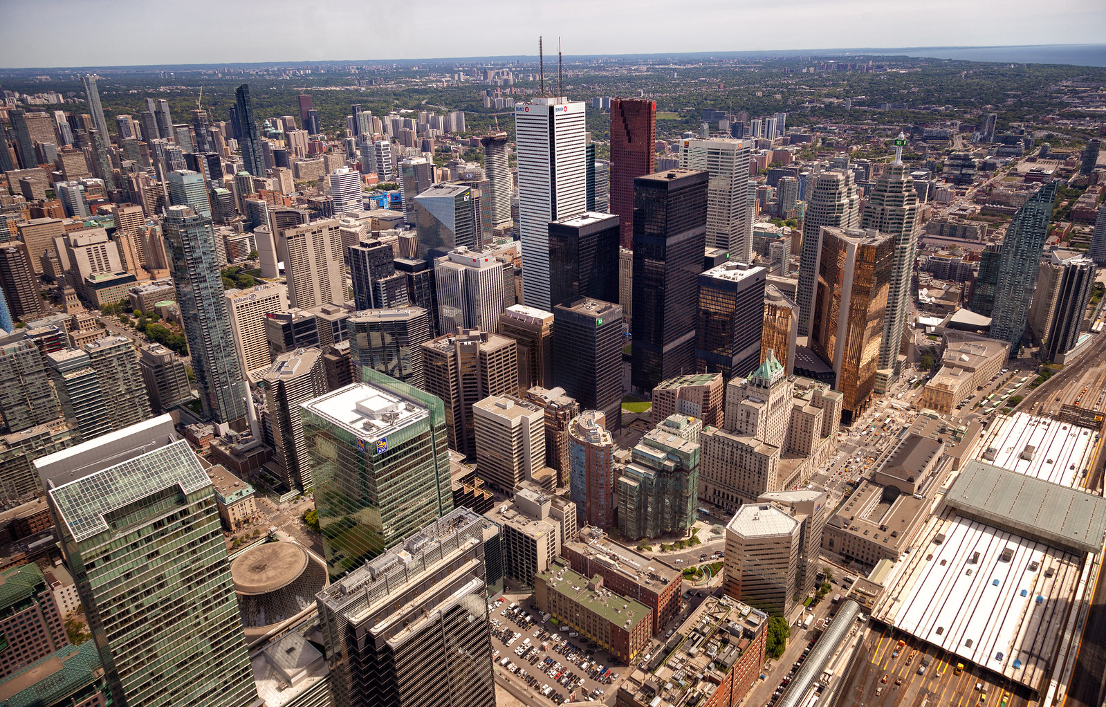
I just can't get over how much clearer the new glass is. Anyone who has struggled to get glare-free shots up there will be pleased with the improvement:
Downtown Toronto by Jack Landau, on Flickr
 
Brilliant capture of the core! Amazing.

I think I need to make my return to the observation deck.
Thanks! You should definitely go. Can't wait to see that set of photos!
 
It is.


Here's hoping they decide to do more of the windows… but inside, it has been completely updated, so it's not a given that there will be any more changes.

42


It's finished. They're not replacing the windows all the way around. Damn it. That's the one side facing me.

Is this the only section kept or are there more on the other sides?
 
Last edited by a moderator:
There are another two unmodified sections, facing southeast and northeast. You can see where one of them starts on the right right side of the indoor observation level above where you see the flash of silver on the right side of the windows.

Those other two sections are pretty much where the seating for the cafés are. Check out the interior views in this post to see what those sections look like inside.

42
 
Last edited:
From this area tonight --

Happy to see the salmon run fountain working!

20180718_205757.jpg
20180718_205809.jpg
20180718_205815.jpg
20180718_205909.jpg
20180718_205938.jpg
20180718_205941.jpg
20180718_205956.jpg
20180718_210018.jpg
20180718_210059.jpg
20180718_210108.jpg
20180718_210210.jpg
20180718_210218.jpg
20180718_210406.jpg
20180718_210427.jpg
20180718_210559.jpg
 

Attachments

  • 20180718_205757.jpg
    20180718_205757.jpg
    220.9 KB · Views: 1,018
  • 20180718_205809.jpg
    20180718_205809.jpg
    234.5 KB · Views: 2,638
  • 20180718_205815.jpg
    20180718_205815.jpg
    217.4 KB · Views: 1,017
  • 20180718_205909.jpg
    20180718_205909.jpg
    247.2 KB · Views: 982
  • 20180718_205938.jpg
    20180718_205938.jpg
    197.4 KB · Views: 1,000
  • 20180718_205941.jpg
    20180718_205941.jpg
    198.4 KB · Views: 1,005
  • 20180718_205956.jpg
    20180718_205956.jpg
    200.9 KB · Views: 992
  • 20180718_210018.jpg
    20180718_210018.jpg
    240.5 KB · Views: 1,449
  • 20180718_210059.jpg
    20180718_210059.jpg
    213.8 KB · Views: 994
  • 20180718_210108.jpg
    20180718_210108.jpg
    199.8 KB · Views: 1,024
  • 20180718_210210.jpg
    20180718_210210.jpg
    225 KB · Views: 1,023
  • 20180718_210218.jpg
    20180718_210218.jpg
    170.7 KB · Views: 1,014
  • 20180718_210406.jpg
    20180718_210406.jpg
    125.4 KB · Views: 996
  • 20180718_210427.jpg
    20180718_210427.jpg
    261.7 KB · Views: 990
  • 20180718_210559.jpg
    20180718_210559.jpg
    159.9 KB · Views: 1,020
Indeed, great to see, and not to beat a dead horse, but holy cow this area has become a cheap and jumbled mess.

The CN Tower entrance structure at the bottom of the first photo above looks like a temporary structure that's been plopped down. The neon blue stripes on the planters on the Rogers Centre stairs looks tacky as hell and the (I think faux) wood finish looks like that which you see on, like, suburban mall parking lot Jack Astor's patios. Then someone plopped down a CANADA sign.

If Nathan Phillips Square and its generally awful state of repair is the worst example of how inadequately the city tends to some of its most heavily trafficked tourist spaces, this has to be a candidate for second-worst.

No kidding - it felt like they went shopping at Dollarama or something. Incoherent, placeless and graceless - right beside the national landmark.

AoD
 
Last edited:
i spent canada day weekend in toronto and was staying at the ritz. went for a jog around the waterfront and walked around the city.
i felt like everything was done on the cheap. Cut and paste. no attention to detail. nothing was pretty and found the city to be dirtier than what i had seen 20 years ago. the city is not aging well. no trees, no street ornaments, gum stains all over the concrete floor.
i liked king west and west queen west area
Then i went to montreal... much prettier, cleaner maybe? when they do something they do it once and do it well
 
Montreal has a few standout pieces of public realm - but I find that it's general state of maintenance is far below that of Toronto. Quebec as a whole has a very poor level of public realm - way more gravel roads, parking lots, less landscaping, pedestrian crosswalks, etc.
 

Back
Top