You are using an out of date browser. It may not display this or other websites correctly.
You should upgrade or use an alternative browser.
You should upgrade or use an alternative browser.
- Thread starter urbandreamer
- Start date
drum118
Superstar
May 11


ksun
Senior Member
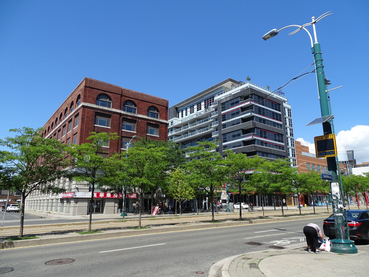
No matter what people say I think it is a nice and appropriate addition to the area.
Dragon City mall looks very outdated, more like a shopping centre from a third tier Chinese city back in the early 1990s. Need a revo inside and outside.
Dragon City mall looks very outdated, more like a shopping centre from a third tier Chinese city back in the early 1990s. Need a revo inside and outside.
Miscreant
Senior Member
Yeah, it is nicely proportioned to the area.
Well, then maybe Dragon City was ahead of its time when it was built in 1987, but yes, it definitely needs an interior renovation. I'm not so sure it needs too much done to its exterior though, other than updating the ads, like replacing that square LED board with a round one or completely getting rid of some of the ads on the ground level windows. The brick is a good record of the architectural times though, and not every building should have its exterior updated to disguise when it was built.Dragon City mall looks very outdated, more like a shopping centre from a third tier Chinese city back in the early 1990s. Need a revo inside and outside.
42
sunnyraytoronto
Senior Member
May 11

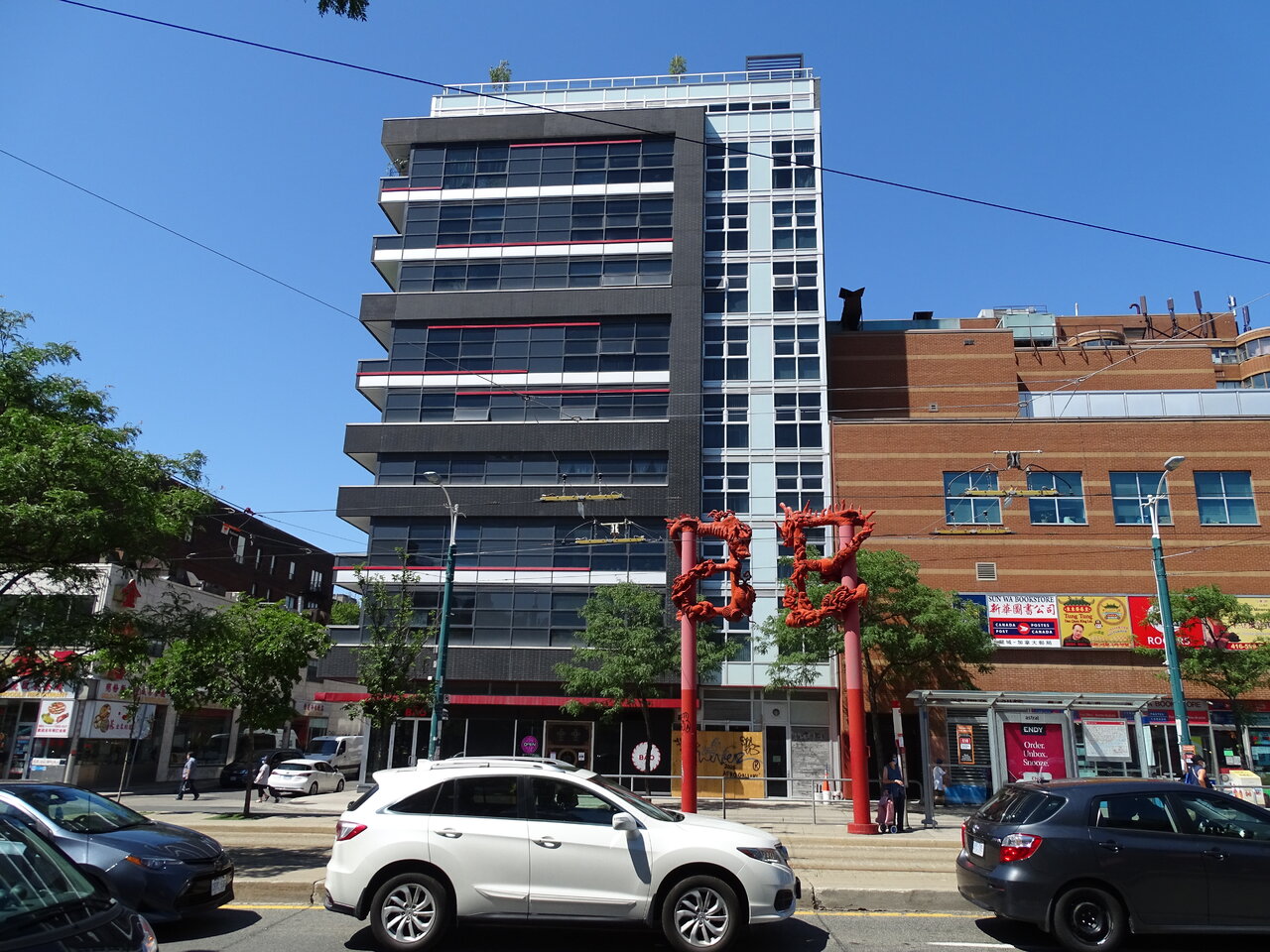
I find Drum118 last photo interesting,.....it seems that in the 1980s and 1990s when DragonCity and ChinaTown Centre were built, the retail-commercial mall component (podium or base) on Spadina could not go higher than the existing older buildings in the area,..... so it seems that for both these mixed use developments, their higher residential components were set back off Spadina,.... and thus, the residential components are basically hidden from pedestrians on Spadina street-level,.... they only see commercial retail. But the current DragonCondo residential component is built right up on Spadina, much like other residential developments along major arteries, where residential condo are built right up to street without any set back and often without podium or base these days.
Miscreant
Senior Member
PMT
Senior Member
ProjectEnd
Superstar
What the hell is 'Ideal' about this hulking turd?
Gotzvon
Active Member
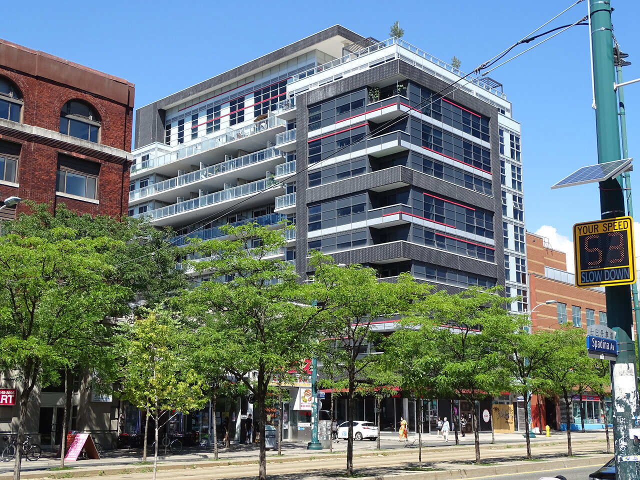
Reaaaally could have done without the blue-grey spandrel.. why not black? Why not red?
James
Senior Member
All in all, given its surroundings, I don't think it's a bad fit albeit somewhat of a safe design. The bits of subtle red livens things up a bit against the dark on light building facade.
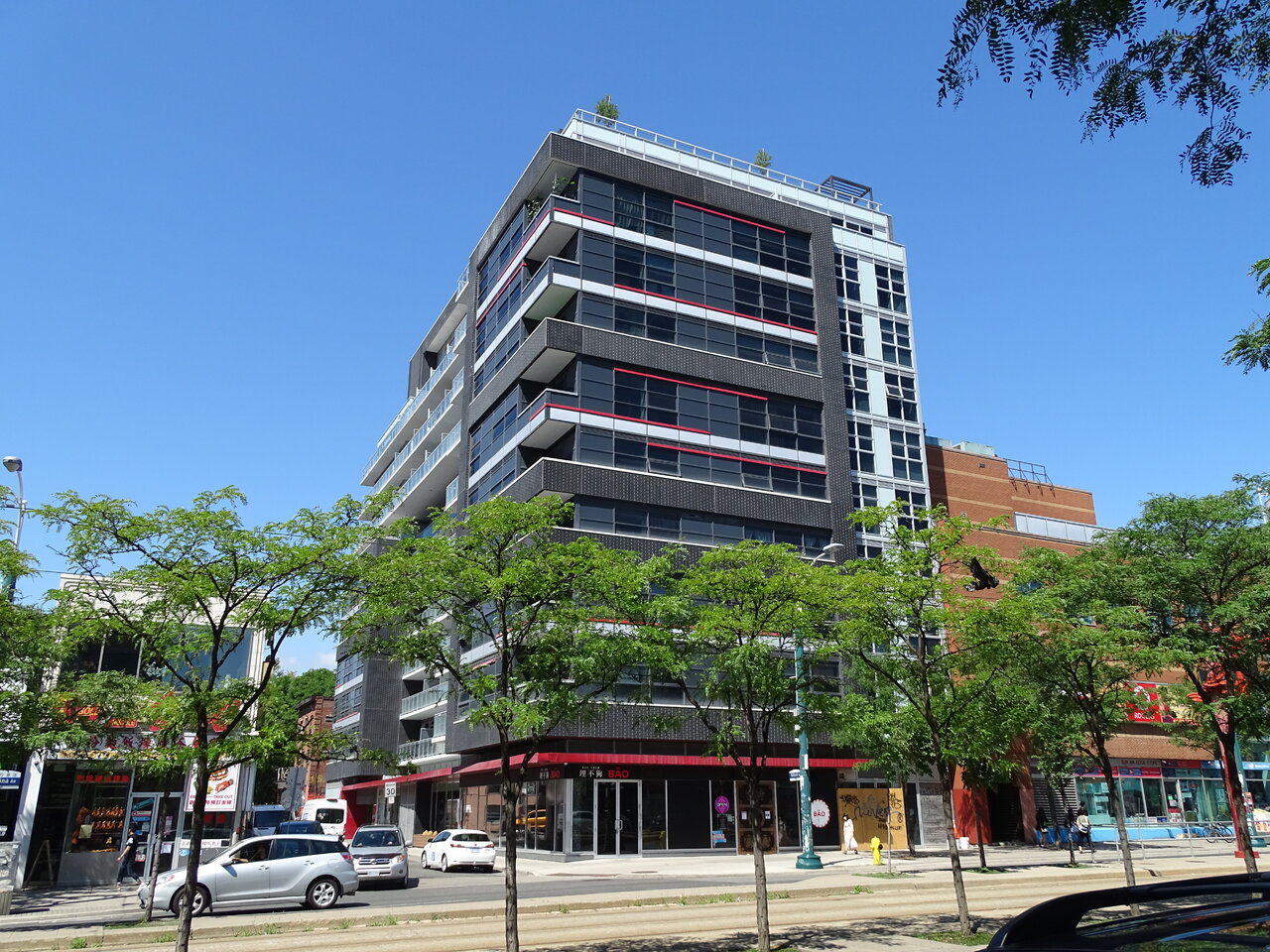
Why have they spent money on brick on the mechanical penthouse level, but not at street level? Speaking of street level, why, on one of the city's most prominent shopping streets, did they not add another metre of height to the floor—at least a metre—to keep the retail from looking like an afterthought? On the southeast corner volume, why don't the floors with white slab covers actually go white all the way to the corner? On such a short building where you don't really need relief from an unrelenting grid, why mess with the grid in that southeast corner volume so much that no pattern is established at all, so that it's all just a mess? If you're going to use randomized red mullion caps to bring colourful relief to all that black, why not employ enough of it to be effective? Why, where the building butts up against the red brick Dragon City, do they use very pale blue back-painted spandrel for the wall sections, when they could be tying in their design contextually with it?
Why why why why why?
42
Why why why why why?
42
someMidTowner
¯\_(ツ)_/¯
We have updated our dataBase to reflect that Young + Wright Architects has been folded into IBI Group. Though this project was originally credited to Young + Wright Architects / IBI Group, the dataBase file now simply shows IBI Group as per their request.
neuhaus
Senior Member
Why have they spent money on brick on the mechanical penthouse level, but not at street level? Speaking of street level, why, on one of the city's most prominent shopping streets, did they not add another metre of height to the floor—at least a metre—to keep the retail from looking like an afterthought? On the southeast corner volume, why don't the floors with white slab covers actually go white all the way to the corner? On such a short building where you don't really need relief from an unrelenting grid, why mess with the grid in that southeast corner volume so much that no pattern is established at all, so that it's all just a mess? If you're going to use randomized red mullion caps to bring colourful relief to all that black, why not employ enough of it to be effective? Why, where the building butts up against the red brick Dragon City, do they use very pale blue back-painted spandrel for the wall sections, when they could be tying in their design contextually with it?
Why why why why why?
42
Totally agree with you. It's the development team's inexperience showing through. Everything about this building falls short and feels awkward.
This is Ideal's first condo project, likewise Lux Interior Design's first condo project (the layout and interiors are very amateurish and almost laughable) and IBI has done a handful of condos and none of them were done well.
They highly underestimated the value of the retail level by providing such a crummy commercial space -- maybe they were thinking it will be occupied by some mom & pop shop or café.
Those red strips on the façade seems like an afterthought, a quick and thoughtless way to dress up the exterior, but it looks haphazard in its placement, the way some wrap around the corner while some break at the corner, and they need to stick out more so it looks more substantial and intentional. The white/pale blue spandrel-dized portion of the building looks like the worst part of 300 Front was copied and used here.
This building is a huge missed opportunity. The lower property values in this building is reflective of its low grade design and finishes (and also the location which may not appeal to many). There should have been some involvement with Dragon City to also update the shopping centre and better incorporate this condo building with it. It could have been a much better marketing concept and strategy.
Red Mars
Senior Member
Fri Jul 24,2020


