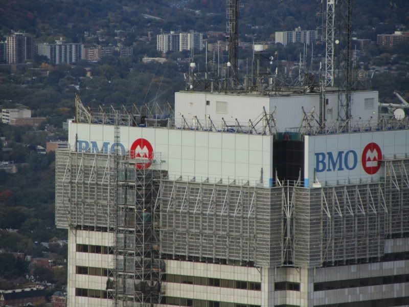
Nicetommy's pic is very impressive! :D it almost looks silvery! Like aluminum panels (but not). and i like the ripple effect it can have.

Quick question... i understand that there is a white layer behind the glass to give it the "white" look. was it possible to implement any colour you want behind the glass?. it would have been epicly cool if they used a different colour like blue, gold, black, etc... !
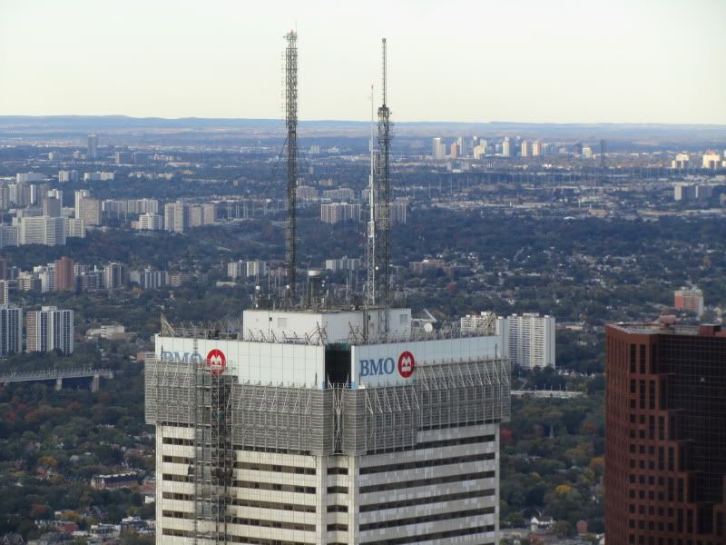
 
FCP as seen from the CN tower.
IMG_4986.jpg


IMG_4987.jpg
 
From York & Bremner:

FCPOct06.jpg


42
 
Looks like progress is being made rather quickly now, at least compared to how slow everything was moving before.

But with a project this complicated and unique, you're bound to run into snags. I for one like the new outer appearance of the building.. I wonder how it will look inside once the renovations are complete?
 
Now that more can be seen with the naked eye from around the city, I'm not sure I like the large squares. I thought it would be more seamless.

You may say that there were square there before, but they were much smaller so from a distance, they only appeared to give the building a texture. Now we have this visible pattern I'm not too sure about.

The thing is though, if you go back further, to the beginning and in the few years after it was completed, the effect was generally the same as it is with these new squares. When those tiles were snow white, you wouldn't really notice each one individually, but you would notice the group of 8 in the overall grid.
 
Does anyone have any pictures from when the building was first completed? It would be interesting to compare the new cladding to how it looked back then (when the marble slabs were all shiny and consistent)
 
Does anyone have any pictures from when the building was first completed? It would be interesting to compare the new cladding to how it looked back then (when the marble slabs were all shiny and consistent)

(I bet it didn't look blue...grumble...)
 
oh my god... scarborough city centre looks clear as day in Darwin's first pic!. and i could hardly recognize FCP in that first pic. it looks so much different now (it's an illusion).
 
Does anyone have any pictures from when the building was first completed? It would be interesting to compare the new cladding to how it looked back then (when the marble slabs were all shiny and consistent)

I thought the same thing, anyone have a pic?
 
it would be hard to compare. different camera technologies, camera settings, lighting, etc.
 
There are a couple of pics on the website, but yes the change in camera technologies doesn't allow for a comparison.
 
Hooray - the slight green cast nudges it into the same chromatic fold as many of the other downtown towers. The design never justified this tower's irritating ability to stand out as much as it did - either when sparkling and new or when dappled 'n' dilapidated.
 
^Actually, I think the overall shinyness and the black racing stripes and will make it stand out even more.
 
Racing stripes!!!! What a great idea! Then the building will look all sporty and dynamic. As if it's moving when it's standing still.

However, the Montreal Canadiens' colours in Maple Leaf's territory may not go over well.

;) LOL

5062831209_edfe36d11f_b.jpg
 

Back
Top