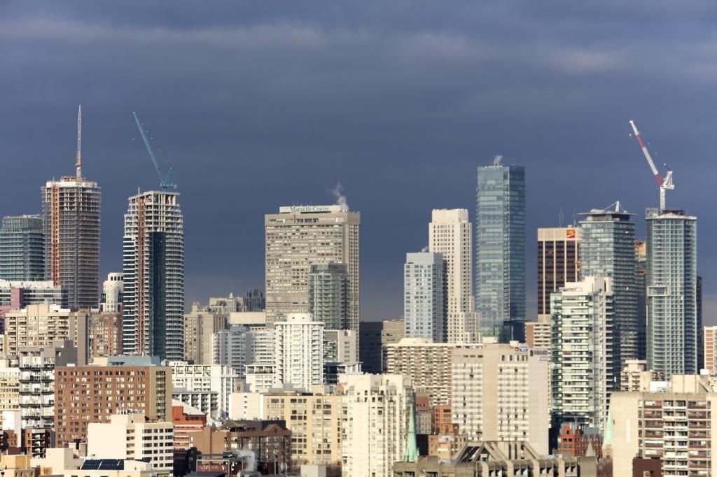
Yonge Street has a lot of old, dilapidated buildings that if cleaned up and restored, would look great and really transform the whole street. Toronto in general, seems to have a problem maintaining its buildings. I guess Five is a good way to get those buildings cleaned up but it shouldn't have to be that way. The city should force landlords to maintain their buildings. If other cities can have well maintained buildings, there is no reason why we can't too.
 
first time in this thread, not really an architecture guy, just thought i'd share this photo from last friday --

aura-from-alley.jpg
 

Attachments

  • aura-from-alley.jpg
    aura-from-alley.jpg
    101.8 KB · Views: 2,825
Application: Building Additions/Alterations Status: Not Started

Location: 5 ST JOSEPH ST
TORONTO ON M4Y 1J6

Ward 27: Toronto Centre-Rosedale

Application#: 14 267112 BLD 00 BA Accepted Date: Dec 23, 2014

Project: Restaurant Greater Than 30 Seats Interior Alterations

Description: Proposal for interior alterations for tenant fit up of a restaurant with more than 30 seats in unit R5-4 on the ground floor of the existing building.
 
Wow !! For the balconies their using glazed glass with black trimming around it. Its going to really pop out from the distance. This is going to be one of the better looking buildings in the city because its presence. Traditional antique podium with a flaring skyscraper on top! Love it !!
 
Question would such a building not be allowed anymore (if construction were to start today) i.e. as it is just about 100% glass ?
 
That balcony glass does not look quite as advertised. I was expecting the balcony glass to be cut in curves along the interior edges, not have squared off glass with the frit doing the curves. That would certainly have been more expensive, so I can see why this will not be the case.

I was expecting the curves to pop when offset against the sharp corners of the building. Now it's hard to tell how this will look. It's not bad, but what could have been...

Good eye, I didn't notice that at first.
 
That balcony glass does not look quite as advertised. I was expecting the balcony glass to be cut in curves along the interior edges, not have squared off glass with the frit doing the curves. That would certainly have been more expensive, so I can see why this will not be the case.

I was expecting the curves to pop when offset against the sharp corners of the building. Now it's hard to tell how this will look. It's not bad, but what could have been...

It'll look like a watered-down version of what was advertised and rendered, obviously. At this point I've given up expecting any design flourishes to be built as advertised.
 
The balconies seem to be much more grey than white like the renderings depicted.

Yeah, what happened to the white? The white would have really stood out.

And you guys wonder why I have issues with grey? It's because every white, black, orange, red and blue rendering somehow always turns to grey in this city. Toronto will one day be the greyest city on the planet. Oh well, at least we'll be known for something. (I hate!) Well, besides Rob Ford!
 
Last edited:

Back
Top