March 9, 2012


6970154527_23d5c7b8d5_b.jpg


6970154957_2abe157cd6_b.jpg


6970155337_b61d87ebdd_b.jpg
 
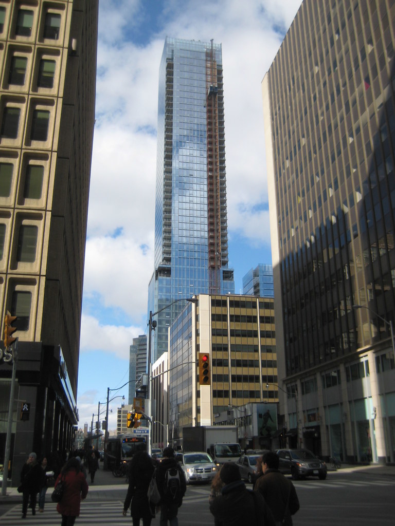
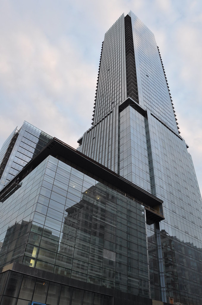
Walked past this today... up close the glass and the clean lines just look absolutely amazing. I loved the glass on the entrances with the floral frit.

The stone on the base looks great in person too, as do the scattered little opaque glass mock-windows. The bottom is welcoming enough to the street to please me while still having a large, "serious business" presence to it.
 
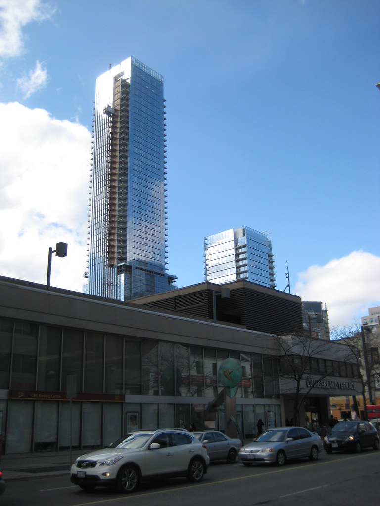
Cumberland Terrace is such an eyesore..

I haven't been up that way for a few months, how is the balcony cladding coming along? I saw that one picture on the last page but is it on more than one balcony/floor?
 
I just don't understand the love for this building. I personally think it is rather boring although I haven't been up close to it. will the fountain be an area where the public can congregate? It doesn't seem like an area where a lot of people would naturally migrate towards after a day of shopping on Bloor street. I just don't get it. it's a box.

Walked past this today... up close the glass and the clean lines just look absolutely amazing. I loved the glass on the entrances with the floral frit.

The stone on the base looks great in person too, as do the scattered little opaque glass mock-windows. The bottom is welcoming enough to the street to please me while still having a large, "serious business" presence to it.
 
I just don't understand the love for this building. I personally think it is rather boring although I haven't been up close to it. will the fountain be an area where the public can congregate? It doesn't seem like an area where a lot of people would naturally migrate towards after a day of shopping on Bloor street. I just don't get it. it's a box.

Before some forumers try to beat you over the head with 'academic' arguments to tell you why you SHOULD and MUST love this building and other neo-modernist pieces, let me tell you this:

I can understand why some people wouldn't feel particularly drawn to this building. Yes, it's quite simple and boxy. The reason I like it is that it exudes presence in a very subdued manner. The building doesn't beg for attention, but rather blends numerous design elements that have been tried around the city together with great attention to detail.

I really do feel it has such a presence about it, but that could be considered a very subjective evaluation. I also think the proportions, the materials used, and the effect of the finished building to be very successful and attractive. But it certainly is subdued.
 
Before some forumers try to beat you over the head with 'academic' arguments to tell you why you SHOULD and MUST love this building and other neo-modernist pieces, let me tell you this:

I can understand why some people wouldn't feel particularly drawn to this building. Yes, it's quite simple and boxy. The reason I like it is that it exudes presence in a very subdued manner. The building doesn't beg for attention, but rather blends numerous design elements that have been tried around the city together with great attention to detail.


I really do feel it has such a presence about it, but that could be considered a very subjective evaluation. I also think the proportions, the materials used, and the effect of the finished building to be very successful and attractive. But it certainly is subdued.


Great response Spire. Its nice to see thoughtful and rational responses when there is disagreement on subjective issues between posters.

I have no architectural background to back up my opinion, but I agree with you. Its a beautifully simple building with clean, clean lines and proportions that make me say "ahhhh"
 
I also like the building, but I don't love it. One thing that bothers me is its base, where it sits on a box-like structure that is slightly wider than its upper two or so thirds. It looks a bit stumpy.
 
The main tower is really nice, but I really don't like the shorter tower. It looks stumpy, I don't like the design of the balconies, and the treatment of the mechanical box is ugly, especially when viewed from afar.

That being said overall the taller tower and base is one of the best to go up in the past decade.
 
It's not the design that makes this building a stunner, but rather the quality of the materials used. That's not to say the design is deficient, but rather that there is nothing ground-breaking about it. Take away the Four Seasons association with this project and perhaps the building would be covered by a window wall with mullions rather than a curtain wall. Have precast or brick at the base, instead of slate. Make use of spandrels instead of shadow boxes. Etc, etc. The usage and noticeably of which I'm sure would be kept to a minimum but none the less would significantly degrade the effect this building creates; sublime opulence.
 
That is true. As far as I've seen, no building has gone so far in terms of quality of materials and finishes than the four seasons. And it's not just the things you see on the outside. The guts of the building (mechanical systems, etc) deserve as much praise as the exterior. There will likely never be a residential or hotel building built to the same standards as this building. Well, at least for a long long time.
 
I can't argue the point about the superior materials/mechanical guts since I have no idea but I have to respectfully disagree with this observation: "the building doesn't beg for attention." The one bit of publicity regarding this building which sticks with me had to do with the fact that the servants for the super rich living in the large tower are relegated to the shorter (yet attached) tower. Plus the fact that it's called the Four Seasons and is in Yorkville kind of makes me want to be wowed. but hey, maybe the superwealthy are trying to exude a subdued presence nowadays and therefore, this building may achieve that perfectly.

Before some forumers try to beat you over the head with 'academic' arguments to tell you why you SHOULD and MUST love this building and other neo-modernist pieces, let me tell you this:

I can understand why some people wouldn't feel particularly drawn to this building. Yes, it's quite simple and boxy. The reason I like it is that it exudes presence in a very subdued manner. The building doesn't beg for attention, but rather blends numerous design elements that have been tried around the city together with great attention to detail.

I really do feel it has such a presence about it, but that could be considered a very subjective evaluation. I also think the proportions, the materials used, and the effect of the finished building to be very successful and attractive. But it certainly is subdued.
 

Back
Top