junctionist
Senior Member
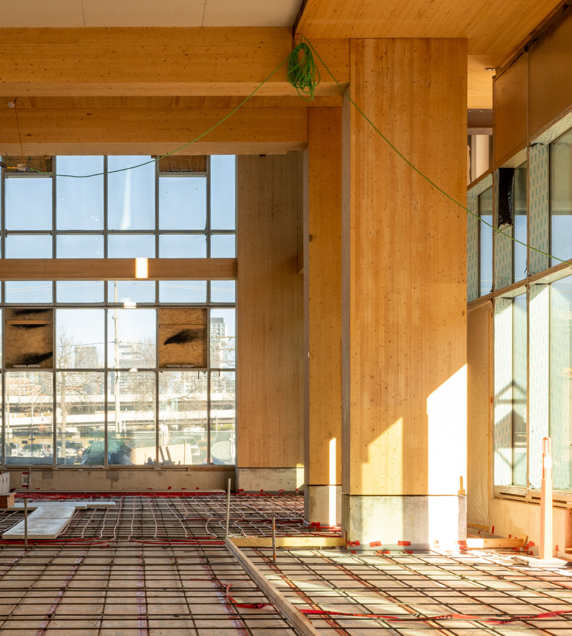
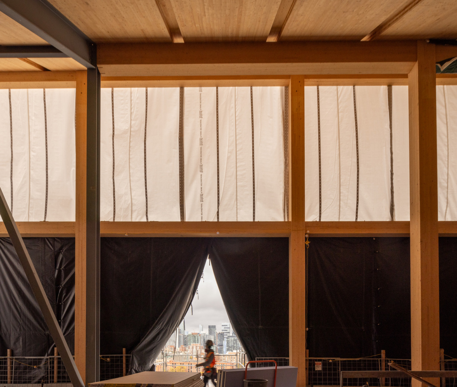
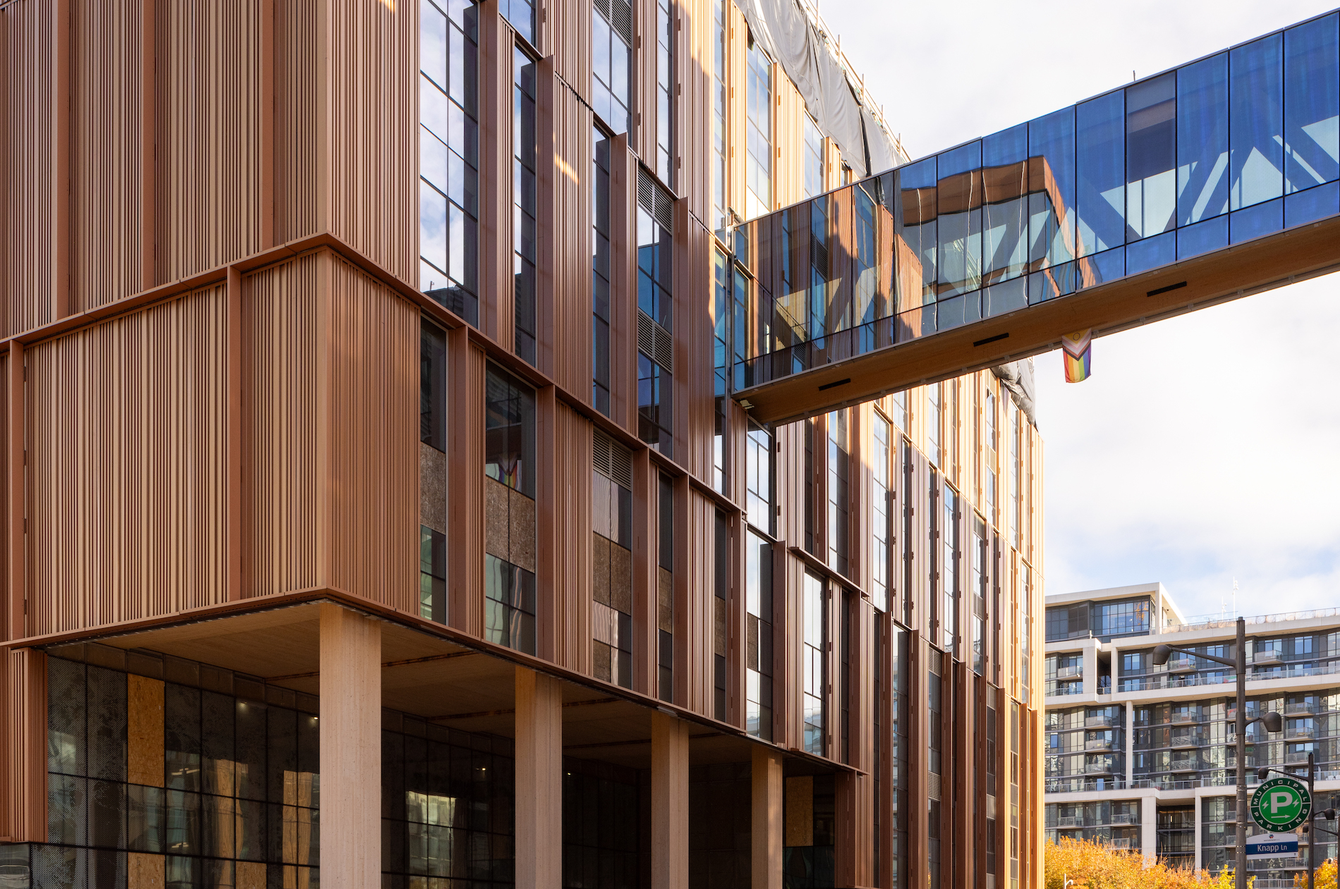
The more of these shades in out urban fabric - the better. I think Sixty Colborne might have started this trend back in the day, showing that bold colors of the orange-copper-metallic variety manage to create a warm and welcoming allure among the sea of cold glass boxes and grey spandrel galore. I'm glad it didn't go unnoticed and more and more projects start to venture in this direction. Some examples off the top of of my head: Aqualuna, St. Lawrence Market North, elements of The Well (though some of these are executed better than others).
The most pleasant parts of the city on a snowy winter day are often those where the built form has a lot of warm and vibrant organic colours. They really stand out on cloudy winter days.
I'm thinking of the Victorian parts of the city where the buildings were built of red, orange, yellow, and brown bricks with orange terracotta accents. It would be great to acknowledge the psychological value of that colour palette more often in large contemporary buildings.


