I agree with you, this building isn't a masterpiece. Or even that good looking at all. But it is important to realize that a building is much more than a facade.

I find modernism shouts efficiency, practicality and with that comes..... ZERO character.

This is designed to be a home. Why would anybody want to live in an inefficient, unpractical place?
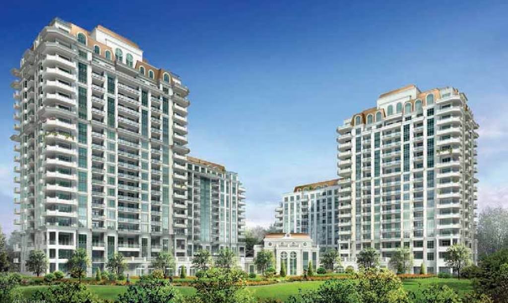
 
It definitely will be sandwiched when Charlie goes up. All that glass will offer a great view of your neighbours' units forty feet away.
 
I'm amazed you guys find this building at all interesting. It is as dull as condos IMO... not to mention charlie beside it will leave the south side in the dark, all the time.

I feel like those developers are trying to make a quick buck and run.
It's not spectacular, but it's suitably modernist. I think most of us would prefer to see this as decent infill and thank our lucky stars it wasn't this:

Aria_render.jpg
 
I'm an artist, and personally I find modernism shouts efficiency, practicality and with that comes..... ZERO character. This isn't europe, and seeing laundry or a BBQ on your ultra modern looking balcony will simply look like clutter.

In a way I agree with you that a building with a modern aesthetic loses something when it encounters the non-modern realities of life (bbqs, laundry, curtains etc). The ground level of Spire suffers in the same way with the commercial/retail almost ruining the close-up view of the building (keep far away to truly appreciate!).
 
In a way I agree with you that a building with a modern aesthetic loses something when it encounters the non-modern realities of life (bbqs, laundry, curtains etc).

Maybe the problem lies with the aesthetic of BBQ design?
 
The presentation centre, if you can call it that is pathetic.

That presentation is just an office for the last remaining unsold units, the original presentation centre was actualy quite nice. I think they tore the old presentation centre down about 1.5 years ago.
 
Quite a cool and unexpected view of Glas - thanks Catcher!

42
 

Back
Top