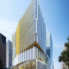
Hmm?...Elizabeth street is one block away from University Ave, from that height in the pic i assume you would clearly see the street wall of University Ave.

You definitely won't see it like that - you will get it from the current site of the old building though:

1548860892621.png


AoD
 
It's weird. Those interior renders are all of patient areas - which I don't think the first phase will have much, if not, any of. It was supposed to house administrative and support functions currently in the Gerrard (1960s) and University (1949) wings. Perhaps some outpatient clinics, to be close to doctors' offices.
 
The page those renderings are from discuss both this building and the new hospital building - perhaps they are interior renderings of the new hospital building that will be constructed in a few years along University - thus the unusually window views.
 
First thought the turquoise feature stairs were a slide. Wouldn't that be awesome?
 
I like how B+H is using Yellow color in their new projects. first 481 university and now this. I would love it if they design more stuff in Toronto.
 
I like how B+H is using Yellow color in their new projects. first 481 university and now this. I would love it if they design more stuff in Toronto.

If this were 1960 to about 1980, sure. The firm has fallen significantly since the Kaljo Voore / 'Spaces for People' days. It'll take far more than a couple of interesting concepts to bring them back.
 
If this were 1960 to about 1980, sure. The firm has fallen significantly since the Kaljo Voore / 'Spaces for People' days. It'll take far more than a couple of interesting concepts to bring them back.
What? It's nice and not boring, bring it on in 2019, ....haha, too many here won't give much thought to a new design unless it's done by their pet architectural firms
 
What? It's nice and not boring, bring it on in 2019, ....haha, too many here won't give much thought to a new design unless it's done by their pet architectural firms

He was pointing out that a very solid chunk of B+H's recent portfolio is pretty bland and boring, which is totally accurate.
 
Well, the problem isn't not giving much thought to a new design unless it's done by their pet architectural firms - but not giving much thought at all.

Having said that, this site doesn't need something that draws attention to itself - competent filler will do. If there are any fault to be had - it would be for projects like MarsDD2.

AoD
 
Site Plan application submitted:

 
Docs are up (as per above) and there are lots of new pics and details. We've updated the database (linked above) and put up a front page story here.

42
 
I like the overall design. But unlike a lot of the comments, I wish the fins had more of a pop (like a red). It may sound harsh, but I think the yellow will just blend into the overall bland urban backdrop.
 

Back
Top