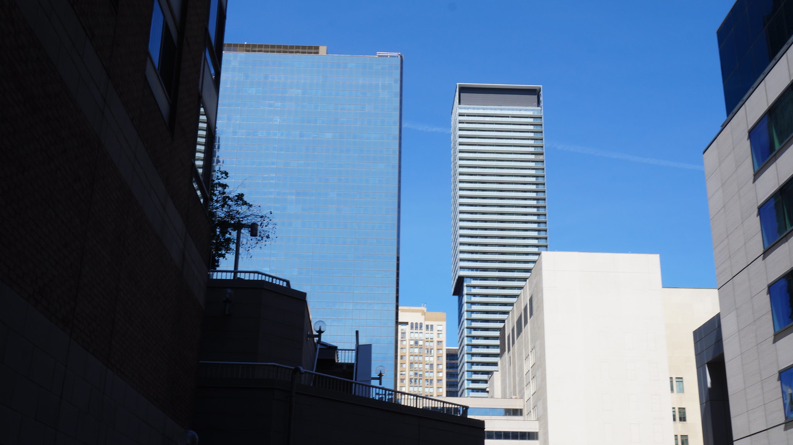
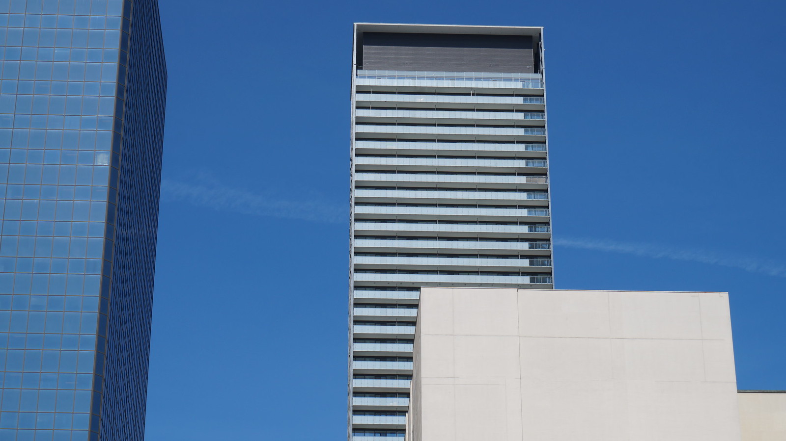
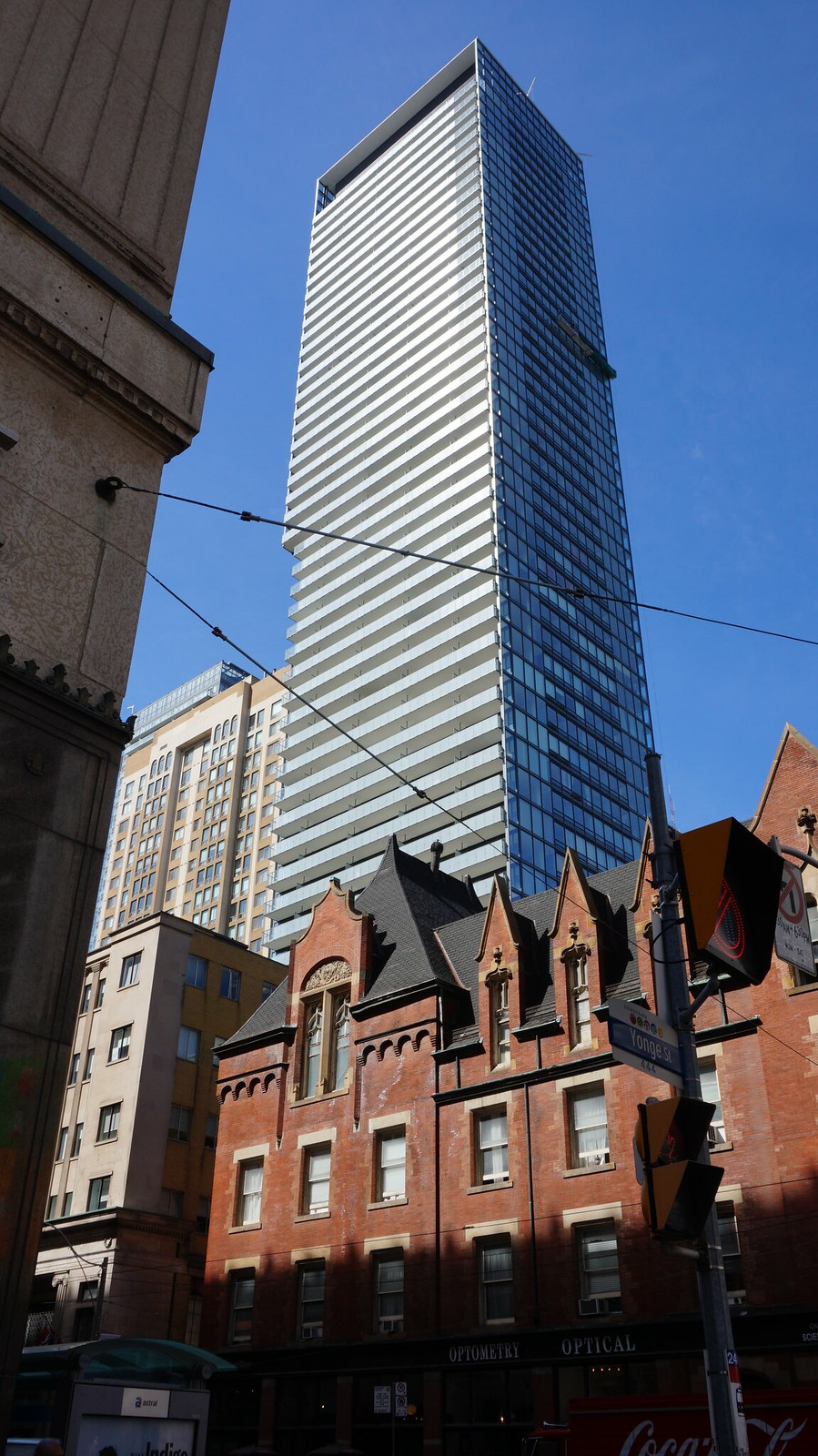
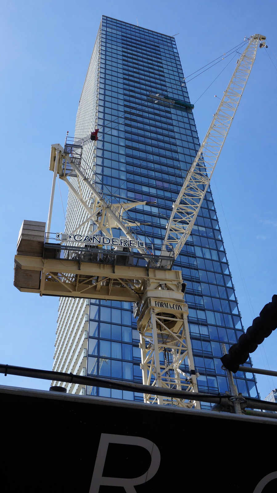
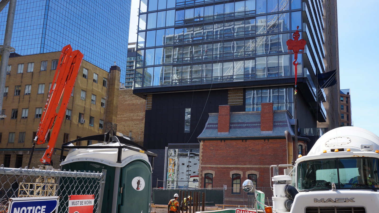
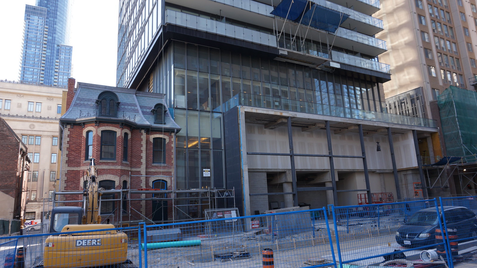
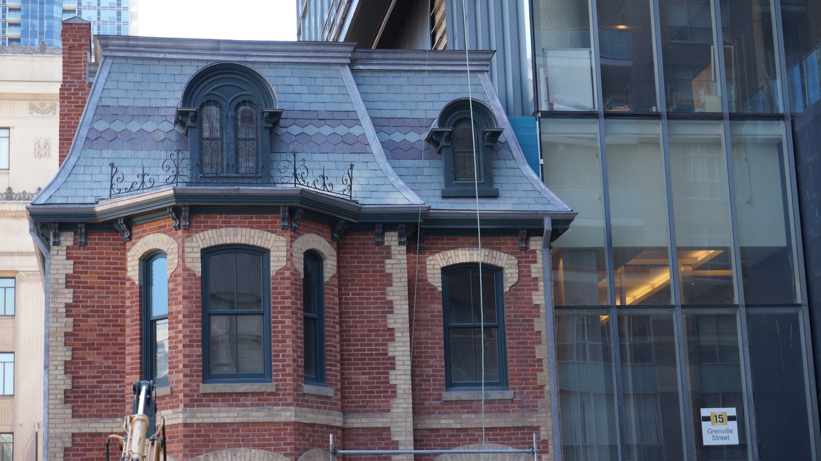
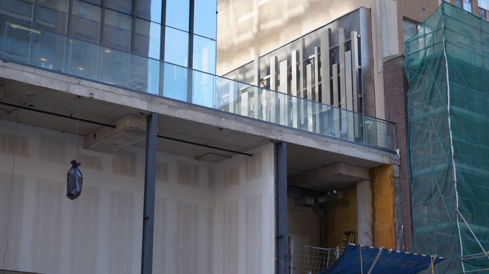
This is a really sharp building that shows off how much better a tower looks without an awkwardly tacked on mechanical box.


What's so great about this one? It's cladding is not much different from a tacked on "elevator overrun" and, IMO, ruins the whole point of the shadow effect with the balcony glazing; to give the impression of two offset stacked boxes. This is pretty awkward in its integration.
 
What's so great about this one? It's cladding is not much different from a tacked on "elevator overrun" and, IMO, ruins the whole point of the shadow effect with the balcony glazing; to give the impression of two offset stacked boxes. This is pretty awkward in its integration.

To me the mechanicals being integrated into the massing of the tower helps to maintain the impression of two offset stacked boxes rather than distracting from it. The cladding may not be seamless but the overall form and massing is consistent and far more important to my eye in creating a simple and coherent form/shape. I don't mind conspicuous mechanicals so long as some thought has been put into their design rather than being an afterthought.
 
I just wish Karma looked a bit more different than Murano and Burano, which all look like they share same outer-skins; not helped by the fact that all three are in such close proximity to one another. This almost creates a cancelling-out effect that leaves little room for architectural variety on this stretch of the skyline, which is a great area. I still like all three projects on their own, but I'm hoping YC can add some contrast to this silver-grey collection of towers.
 
To me the mechanicals being integrated into the massing of the tower helps to maintain the impression of two offset stacked boxes rather than distracting from it. The cladding may not be seamless but the overall form and massing is consistent and far more important to my eye in creating a simple and coherent form/shape. I don't mind conspicuous mechanicals so long as some thought has been put into their design rather than being an afterthought.

This would be problematic for the east face (unfortunately to be covered by the awful YC) but, a setback of the mechanical that lines up with the dark column of balcony glass would have greatly improved the effect when looking north or south.

I do like crowns on building but, I'm not huge on the unnecessary full floor mechanical penthouses that just add weight to the tops of buildings. The additional space is required for office towers and skinny point tower, of course, have limitations. However, for a building like X2, where its unneeded, I would have preferred to look up and see the building end at the top of the residential floors like X or Mies' mixed use Westmount Square in Montreal. Only the office tower has a mechanical penthouses. The residential have simple, black boxes.

Anyways, this is something we won't agree upon expect for 1000 Bay's colour choices being really unfortunate.
 
Agreed.

298687.jpg


mm_mies_lafayette_park_towers_01.jpg
 
From the roadwork on Grenville it looks like they're reconfiguring the street quite a bit. They've poured a new curb that shows a bumpout of the sidewalk on the north side (just west of the lane) and it's hard to see from the hoarding but I think they're doing the same thing on the south side. Is the plan to make part of Grenville one way?
 
The simple and elegant mechanical penthouse integrated into the facade is commendable. The crisp line of the flat roof is a sleek conclusion to the minimalist facade.
 
The simple and elegant mechanical penthouse integrated into the facade is commendable. The crisp line of the flat roof is a sleek conclusion to the minimalist facade.

Just to be clear. Have you not noticed the two types of balcony glass designed to give the impression of a more substantial offset for which the mechanical penthouse doesn't integrate with at all? I'm not trying to convince anyone otherwise. I just find this is the one detail that might be overlooked.
 
Taken last week from University and College SW corner:
DSC_0370.jpg

DSC_0371.jpg
 

Attachments

  • DSC_0371.jpg
    DSC_0371.jpg
    519.5 KB · Views: 1,029
  • DSC_0370.jpg
    DSC_0370.jpg
    462.4 KB · Views: 999

Back
Top