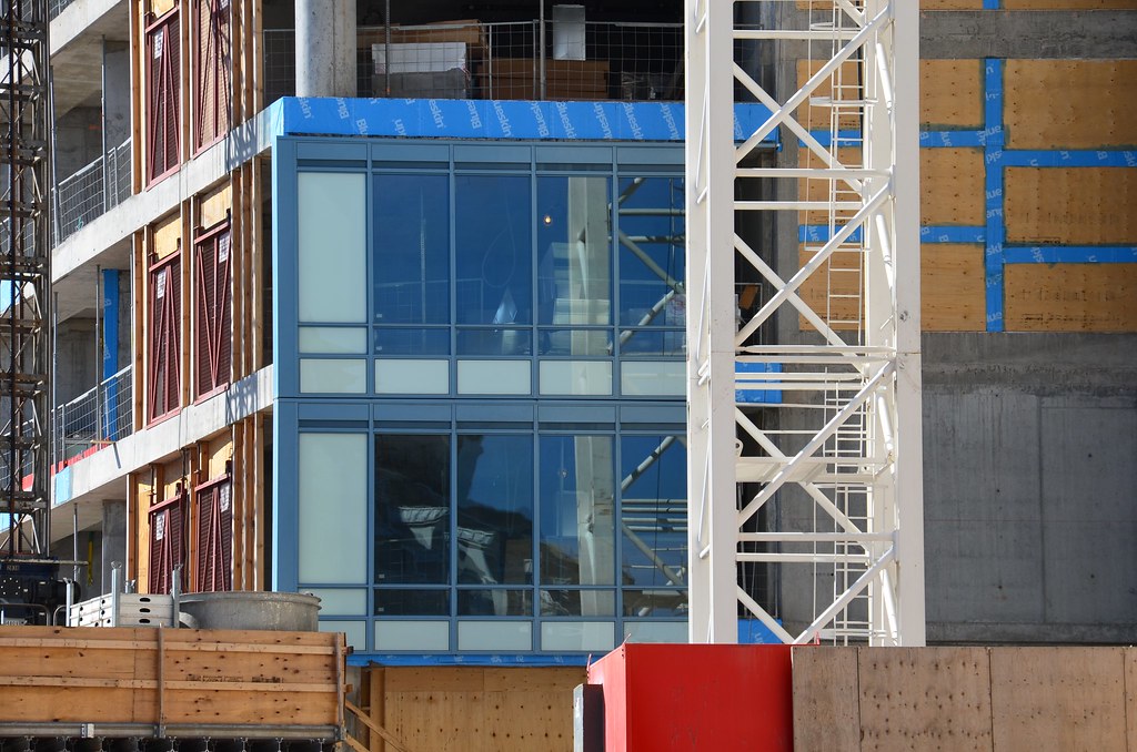
What they will see is a totally different building, in shape and colour. Some will hate it and some will love it, like ROM. But just look at some of the photos on this board especially of those cloudy grey days in Toronto and L Tower will stand out from all the other same coloured glass buildings around it (with a few exceptions - London, One King, Scotia).

Toronto can be pretty grim 4 or 5 months of the year so I welcome more colour - excluding cheap green glass - including more use of brick when possible. So I'm on board with that comment while still paying attention to shape, scale and form. Even though I don't like Trump much I really like the colour of the building, hell, I've even warmed up to the Ryerson student residence at Church and Gerrard which I totally slammed as it went up. I still think the ROM is an embarrassment with it's mismatched slats, but that's just me.
 
Since I hear a lot about L Tower being an "iconic building" I wonder if this label will really hold up. My guess it we won't know for years to come but one measure (and not saying it's the best) of an iconic building would be if you were being picked up at Pearson in a cab and told the driver to go to "The L" - would he/she know what you're talking about?

Think of it - no matter how much I can't stand The Donald as a person, a cab driver would obviously know what you mean by "Trump Tower". Same goes for "Shangri-La" or "Ice" or "Aura" or "the Ritz" or "1 Bloor" (although not really fair since it is an address). What about "The Four Seasons" - the driver would probably have to ask "which one?"

And since we always seem to talk cladding, design, height, name recognition when judging these condos, I'd like to add the fact that we floorplans should be considered to. I went to a lot of presentation centres (Aura, Ice, etc) and found most of their floorplans to be atrocious. Tiny boxes with kitchen tables that can only fit next to the bloody sink and bedrooms with sliding doors that are next to the kitchen table. I never looked at Trumps floorplans but glad I didn't since I couldn't afford over $1,000 a square foot.

Basic point, a lot more factors go into judging a condo rather than the cladding, and L Tower seems to get slammed a lot for that.


Toronto can be pretty grim 4 or 5 months of the year so I welcome more colour - excluding cheap green glass - including more use of brick when possible. So I'm on board with that comment while still paying attention to shape, scale and form. Even though I don't like Trump much I really like the colour of the building, hell, I've even warmed up to the Ryerson student residence at Church and Gerrard which I totally slammed as it went up. I still think the ROM is an embarrassment with it's mismatched slats, but that's just me.
 
I wonder if this will be one of those things you build up to be great so much that you end up disappointed, even if the result is in the "good" category.
 
March 11, 2012 by me:

6830100470_3226c7516d_b.jpg


6830098956_dc92974340_b.jpg

Looking west down Front:

6830107400_5cd7713acd_b.jpg
 
Looks like it's officially hit the halfway mark. It's been shooting up pretty quickly and without much attention, probably due to the poor reception of the cladding.
 
Looks like it's officially hit the halfway mark. It's been shooting up pretty quickly and without much attention, probably due to the poor reception of the cladding.

Lol yea a poor reception to the cladding that nobody has even seen yet.

People are hilarious.
 
We did see cladding, but it's since been removed. What was there wasn't promising to some (myself included).
 
the building will be blue. If everything was the same, would that better? would love to know how much the cladding on L Tower costs compared to Four Seasons or Aura. If it was more expensive would that make everyone feel better?

Its not more expensive. It is much cheaper. And if its more expensive, the developers were taken for a ride, as they could have received superior cladding for less cost (but alas, this is not the case).
 
I thought something more akin to the highly glazed look of CCW's curtain would be the way to go for this. Hard to get an overall sense of it with just a few test panels.
 

Back
Top