You are using an out of date browser. It may not display this or other websites correctly.
You should upgrade or use an alternative browser.
You should upgrade or use an alternative browser.
- Thread starter AMB
- Start date
toaster29
Active Member
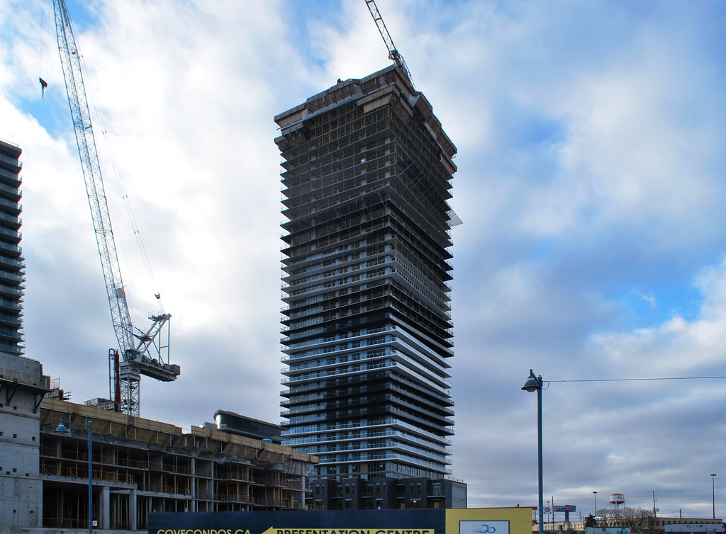
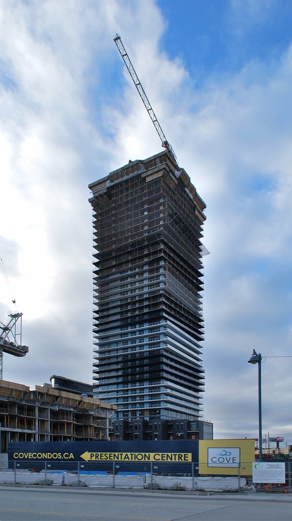
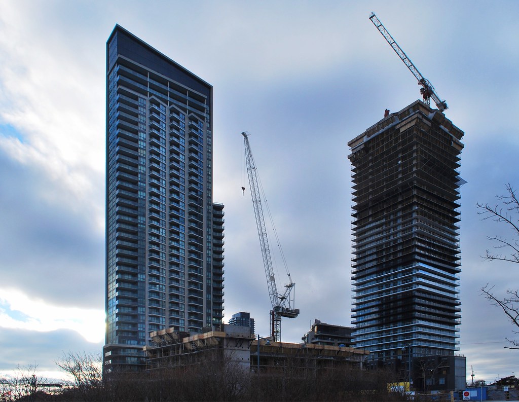
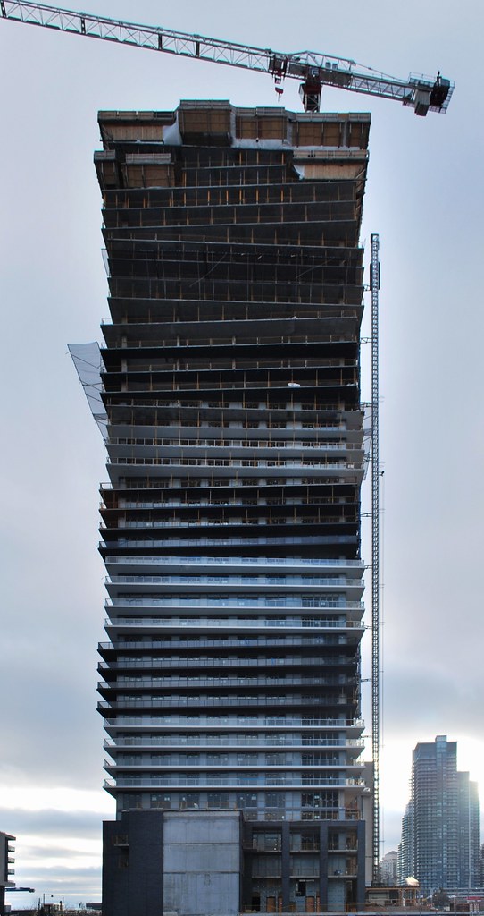
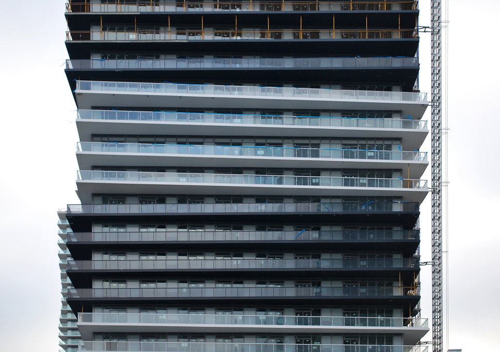
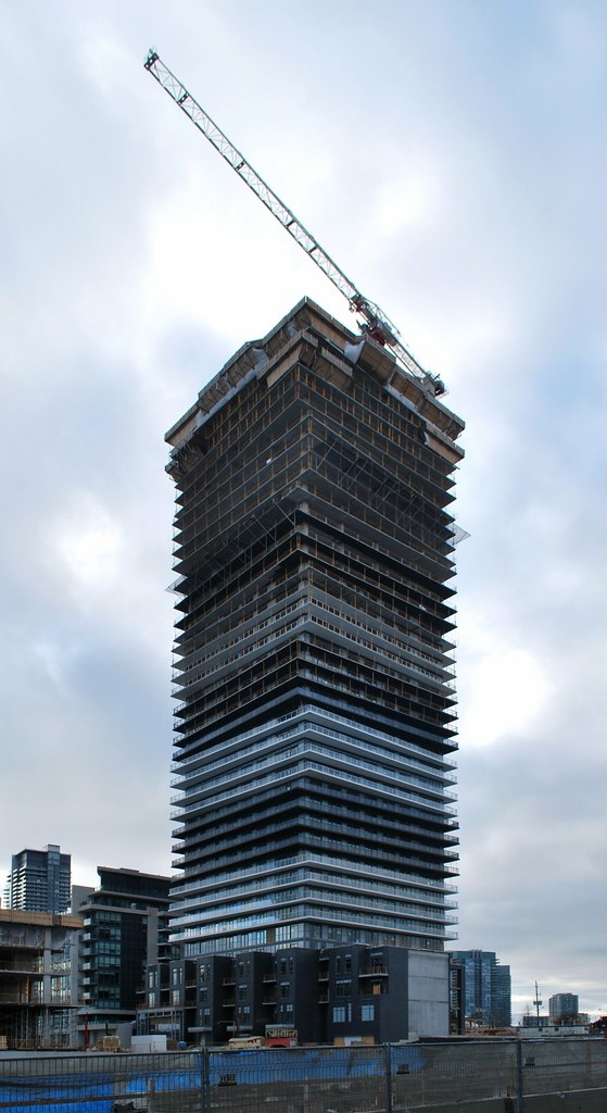
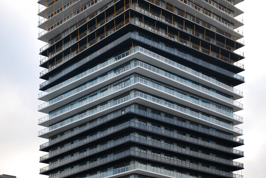
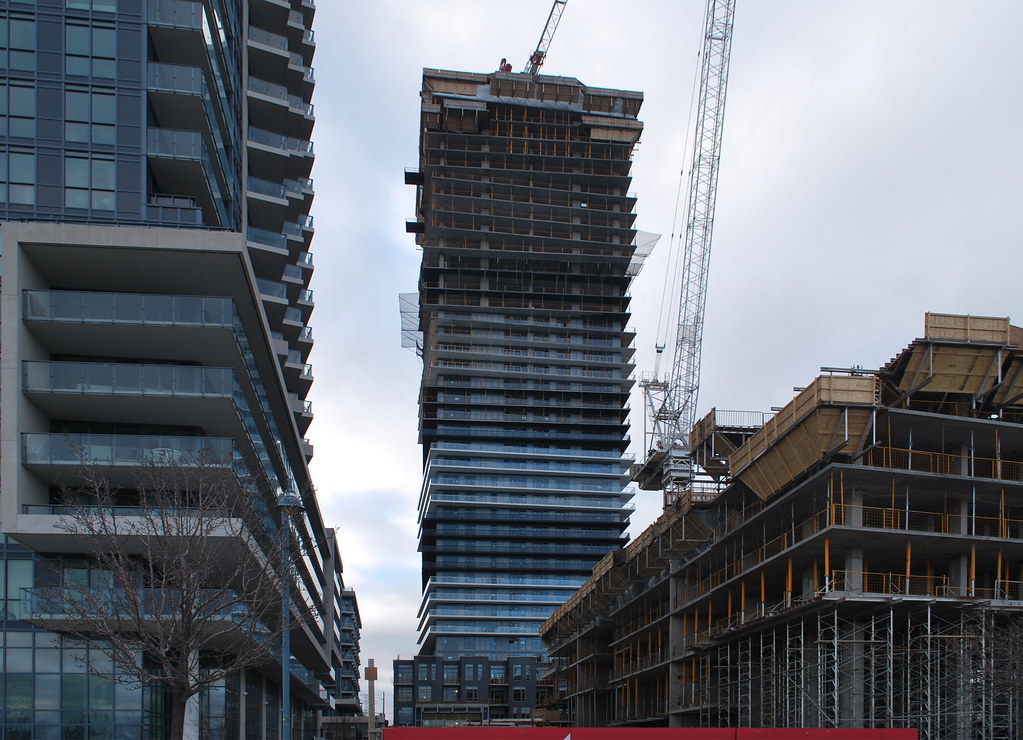
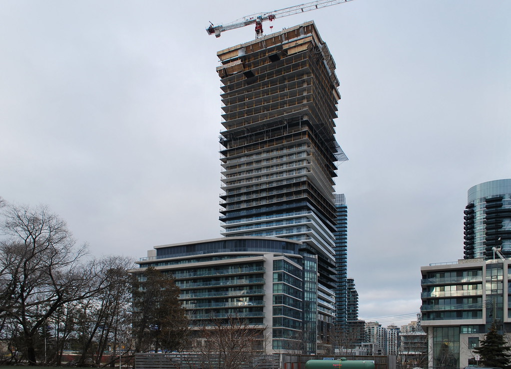
I know a lot of people don't like this one, but I really like the offsets and alternating colours. Something different for HSS, compared to all the plain glass we've seen, especially at Westlake.
stjames2queenwest
Senior Member
I like it, its my favourite in the area so far I think.
ProjectEnd
Superstar
Is that akin to having a 'favorite' wart or puss-filled-boil?
Lenser
Senior Member
Ha ha.
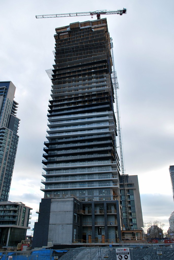
But seriously, I like the podium's dark grey brick.
But seriously, I like the podium's dark grey brick.
ChesterCopperpot
Senior Member
This will give us a good idea what the balconies at YC Condos will look like.
G.L.17
Senior Member
Marcanadian
Moderator
Saturday:
 Lago by Marcus Mitanis, on Flickr
 Lago by Marcus Mitanis, on Flickr
 Lago by Marcus Mitanis, on Flickr
 Lago by Marcus Mitanis, on Flickr
 Lago by Marcus Mitanis, on Flickr
 Lago by Marcus Mitanis, on Flickr
 Lago by Marcus Mitanis, on Flickr
 Lago by Marcus Mitanis, on Flickr
 Lago by Marcus Mitanis, on Flickr
 Lago by Marcus Mitanis, on Flickr
 Lago by Marcus Mitanis, on Flickr
 Lago by Marcus Mitanis, on Flickr
 Lago by Marcus Mitanis, on Flickr
 Lago by Marcus Mitanis, on Flickr
 Lago by Marcus Mitanis, on Flickr
 Lago by Marcus Mitanis, on Flickr
 Lago by Marcus Mitanis, on Flickr
 Lago by Marcus Mitanis, on Flickr
 Lago by Marcus Mitanis, on Flickr
 Lago by Marcus Mitanis, on Flickr
Jasonzed
Senior Member
someMidTowner
¯\_(ツ)_/¯
Keyz
Active Member
The white balconies should have been fritted to present a similarly translucent (as opposed to transparent) face as the black tinted balconies…
but despite that misjudgement, this building is going to look okay.
42
but despite that misjudgement, this building is going to look okay.
42
Marcanadian
Moderator
maestro
Senior Member
The podium is a mess. The tower is turning out better than expected which isn't saying much. I'm not liking the proportions which I don't believe will rectify as the tower reaches full height. It's too bulky. The window wall is okay. Spandrel is consistent.
Jacob Laponointe
New Member
I'm liking the tower, but that podium is repulsive.


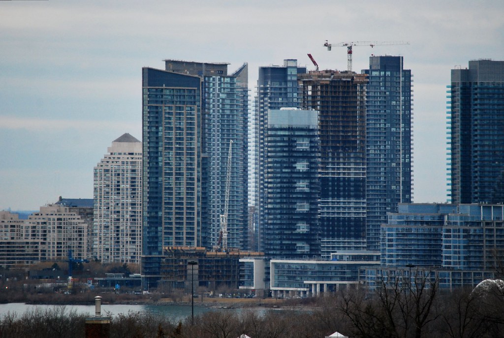 Toronto