A developer baiting and switching to a cheaper design you say? I'm shocked that such a thing could ever happen.
 
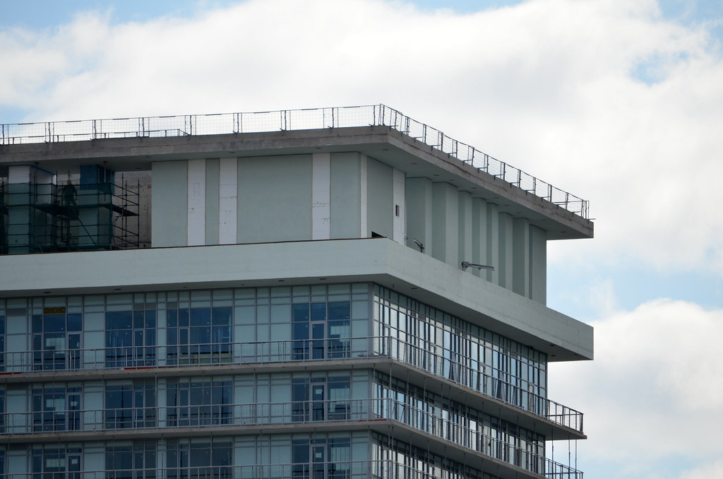
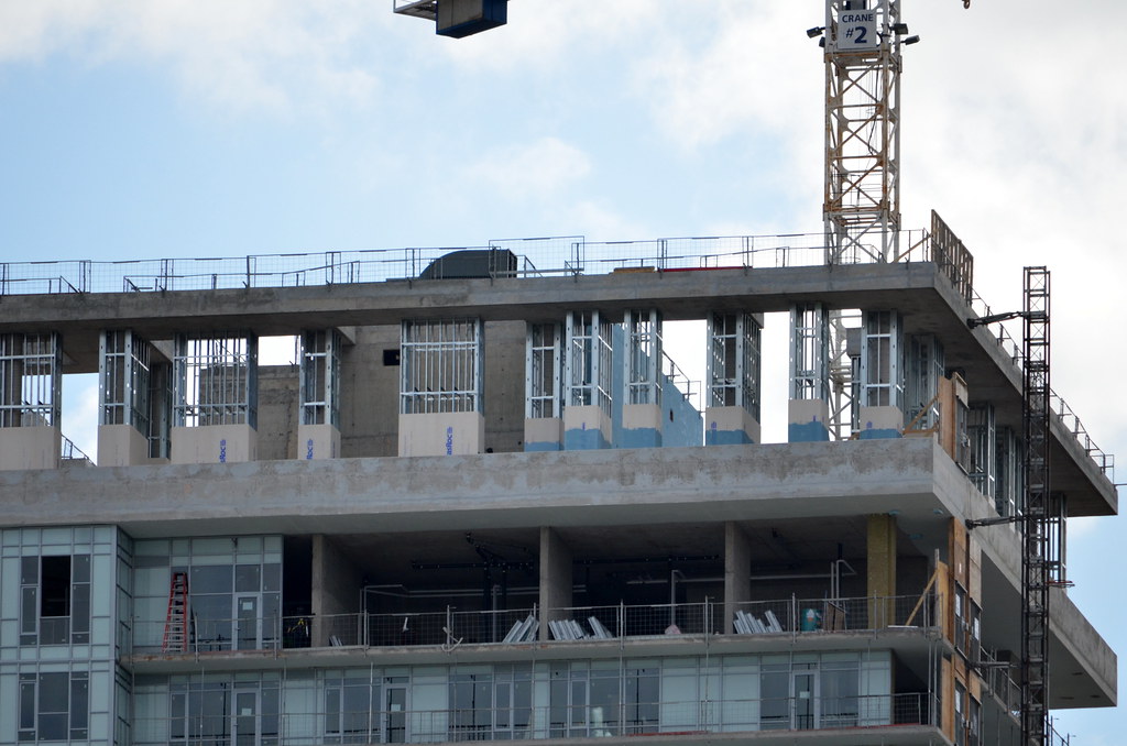
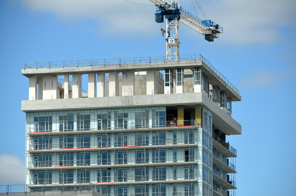
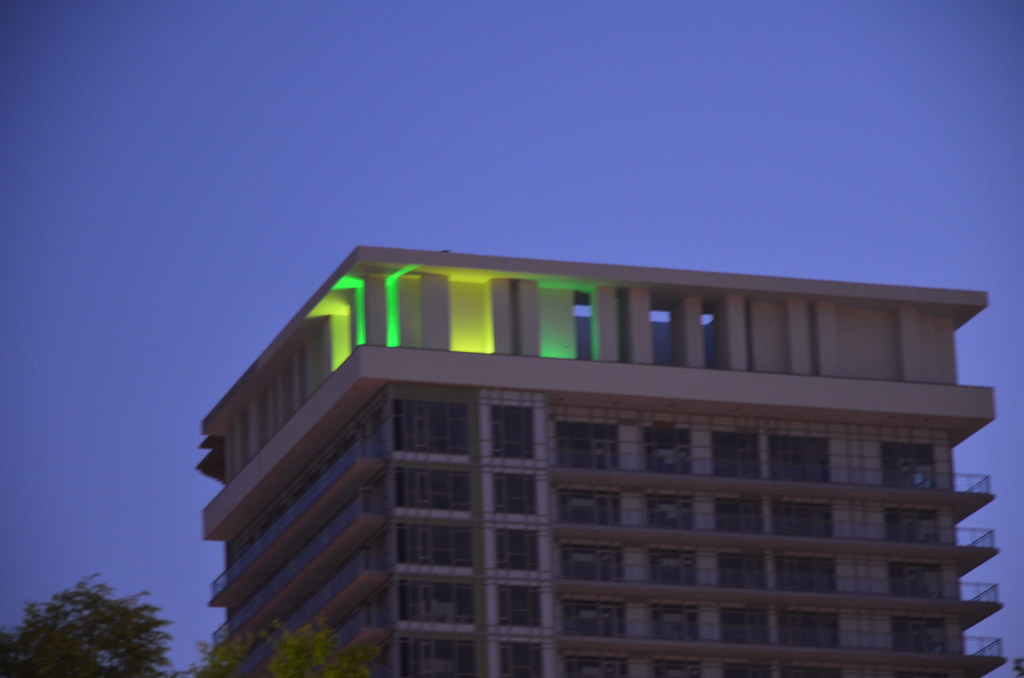
From the looks of things ... I gather the 'random sticks' theme around the mechanical penthouse has been scrapped? disappointing ...

home_render2.jpg


Thanks for the pics Jasonzed

Nope.

First of all it isn't finished.

Secondly, look at the rendering again. The columns at random angles do not wrap around the entire mechanical portion. There are still 90deg vertical columns on the sides of the building.
 
May 18:
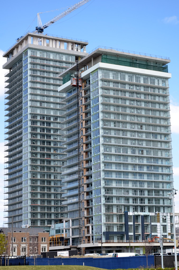
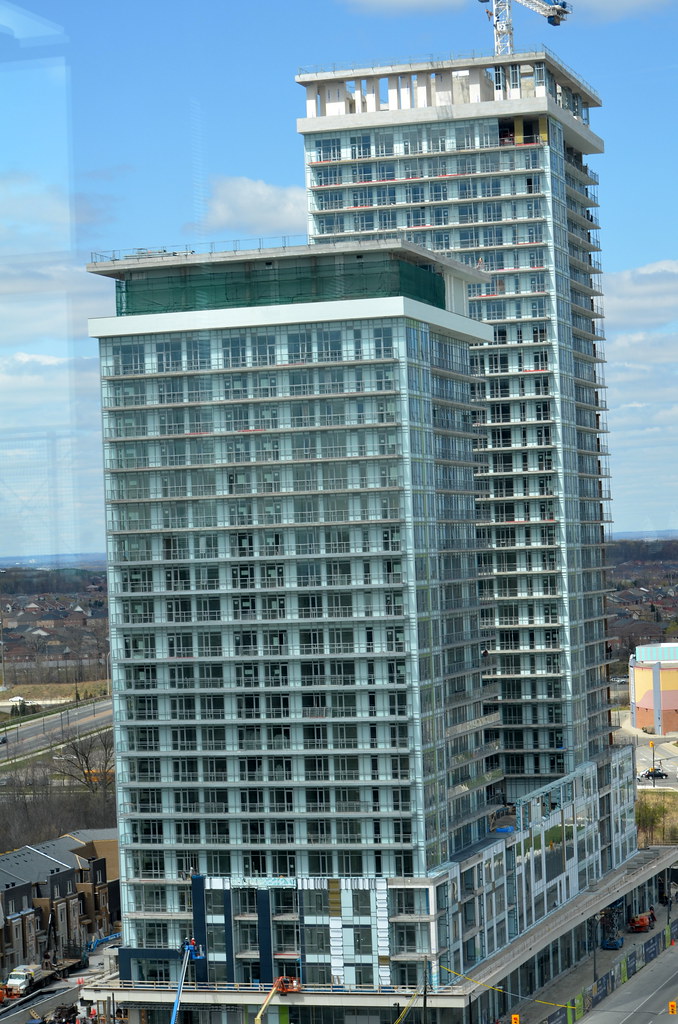
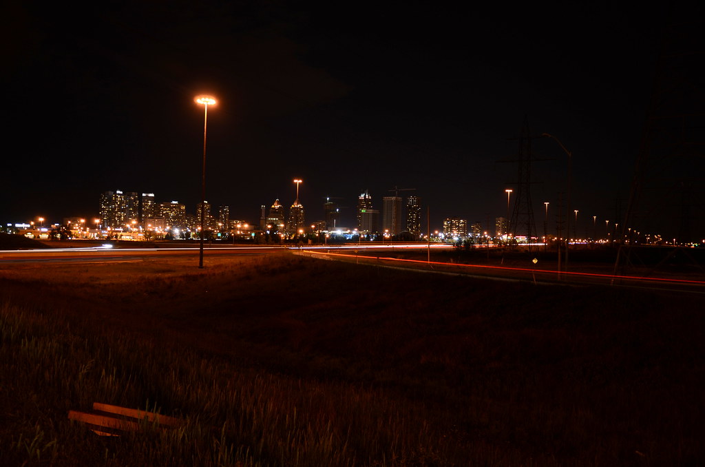
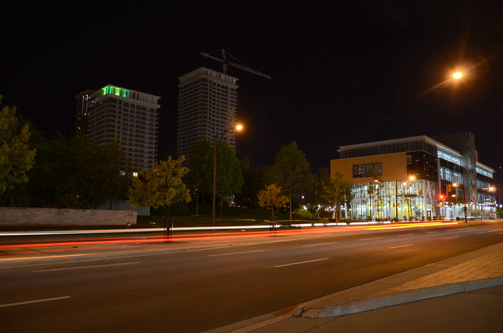
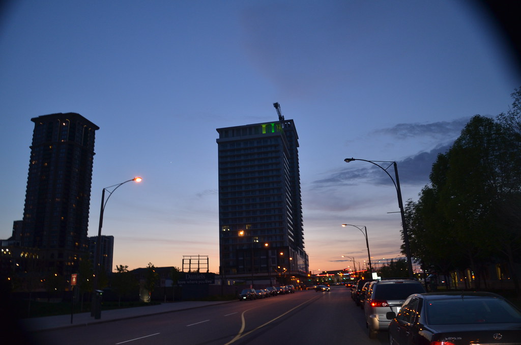
The testing of the lights at the roof for Tower One is underway.

Every time I try zooming in for a real close up shots, the camera goes nuts.
7225061242_5385d161b6_b.jpg


7225055226_033ea46368_b.jpg


7225080412_28deff7b1c_b.jpg


7225056596_7554e2895c_b.jpg


7224992362_649025ee46_b.jpg


7224997762_98a7a3d5f2_b.jpg
 
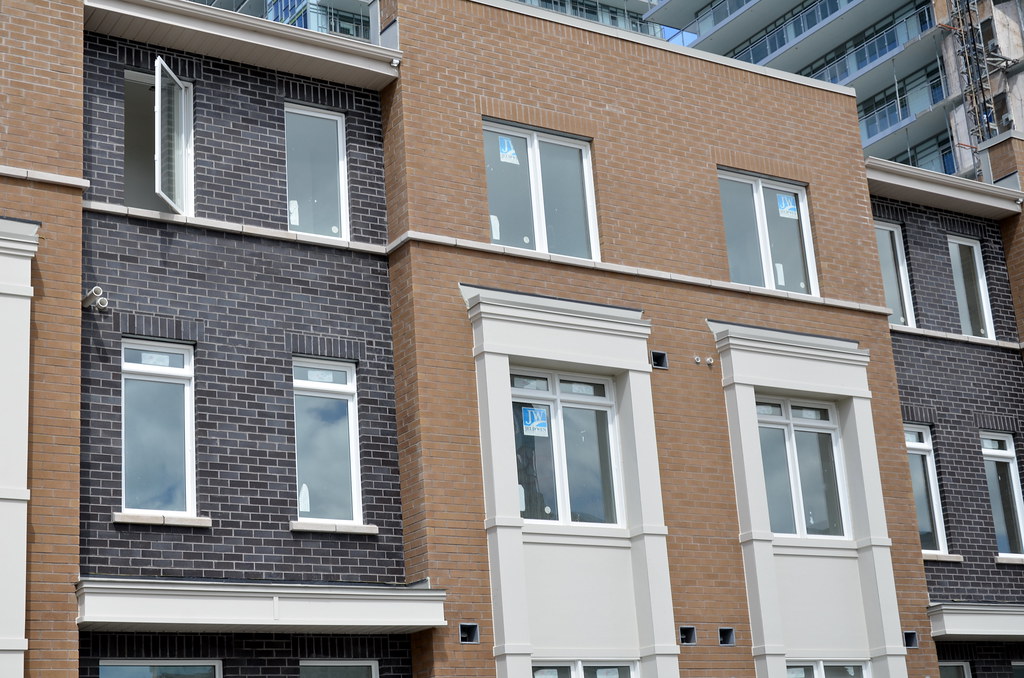
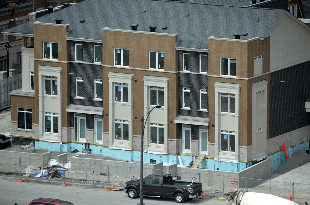
i think the townhouses are ok. they're a hell of a lot nicer than parking lots, suburban houses with snouts, strip plazas... its a good job on the townhouses! not everything can be high-rise.
 
i think the townhouses are ok. they're a hell of a lot nicer than parking lots, suburban houses with snouts, strip plazas... its a good job on the townhouses! not everything can be high-rise.

A 6-10 storey low rise would be a lot better than these townhouse, sorry to say.
 
I agree, handsome mid-rise buildings would have been perfect.
I agree with this completely, but as far as urban townhouses go, they could have done a lot worse. I don't hate them.

The lighting is going to look really good, though possible too bright once both are fully lit. They can be dimmed of course and judging by the 2 tones in the pics, it's probably an RGB system, so it may be that they're not always a static green either.
 

Back
Top