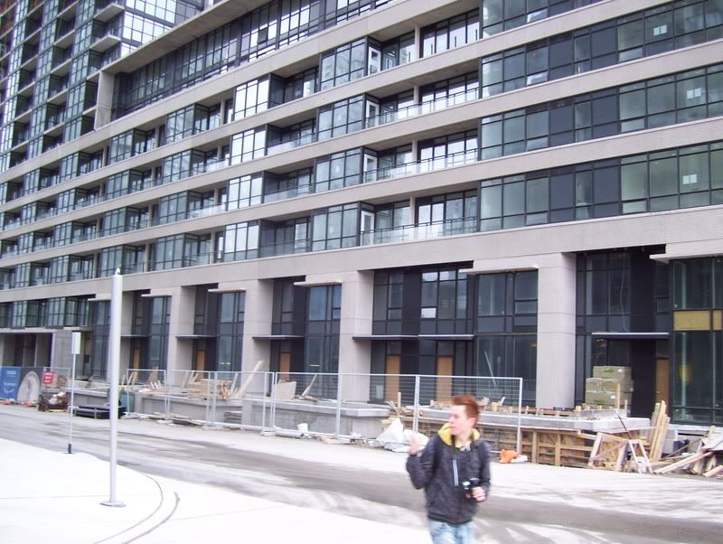
If you look at the plan, the two Luna buildings follow the same curve. But the rectangular atrium completely destroys any effect the curve may have for somebody on the street right in front of it. Seems like an afterthought if you ask me.

If it wasn't for the park being right across the street, I would say that a small public square (similar to Hullmark Centre without ads) would fit in nicely here.

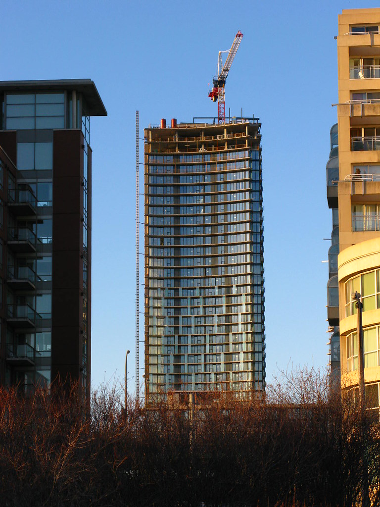
I love the random panes of glass going up the main facade though, hopefully the mid-rise building will have them too.
 
I'm not gonna lie, I thought Luna was turning out to be a boring complex. The only saving grace was the continuous curve between the main tower and the shorter tower. The instillation of these glass panels in front of the balconys definitely adds a dynamic flare to the tower, and I agree with MBS that I hope they put these on the low rise tower too!
 
If it wasn't for the park being right across the street, I would say that a small public square (similar to Hullmark Centre without ads) would fit in nicely here.

I agree that a small public square would be nice, but I am going to wait to see how the street is met once completed and what (if any) retail goes in. The park is the next block to the west, which will be across from Parade. Across from Luna are a pair of TCHC towers and two schools (public and Catholic elementary)
 
Perhaps if Luna was at Spadina/Bremner and Signature on Luna's site a small public square would be a success.

Or even better yet, keep things the way they are and hope that Signature includes some public space.
 
From yesterday:

103_2971.jpg


103_2971.jpg


103_2977.jpg
 
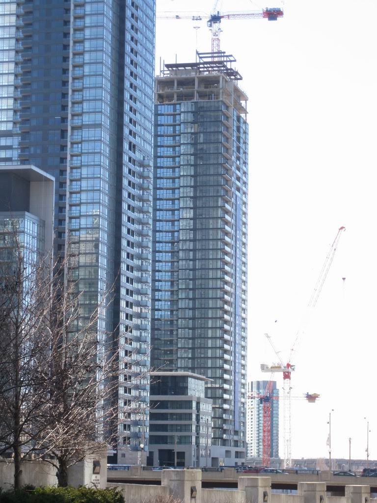
I find the Cityplace towers on the west side of Spadina better looking than the east.

I was previously dreading the thought of having the whole area covered with similar looking towers like Apex, Matrix, etc.
 
February 15 2009 update

Northeast View
IMG_3385.jpg
 
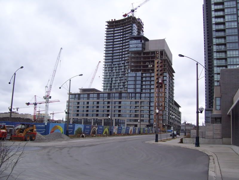
While trying to get to Fort York yesterday (From Spadina), I walked down Bremner, but since it was closed, had to walk down to Queens Quay. Luna is look really good from ground level. But to add, I gotta say, the N1 complex has a very nice courtyard. The townhouses have a cut little design, and their adress numbers are hanging from the cieling. Just goes to show, that tiny details can make or break the look of a tower. I hope Luna will have a pleasant walking area.
 

Back
Top