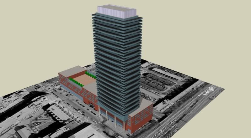
Sorry 3D, that height is to the tip of the tower. City hall was kind enough to have it marked on the report.
 
^ Time for me to go shopping...

rose_colored_glasses.jpg
 
Found this on Architects Alliance website. I know it's not Market Wharf (the tower looks curvy) but I am curious to know which project it is:

OURWORK3d.jpg
 
If that's it, then they're on the verge of reload and repeat.
 
Wylie - the rendering and the line drawings indicate an alternating pattern of indents and projections on alternating balconies as the building rises - so not quite so square as your model indicates.

42
 
to me it looks like the balconies are slightly curved as the alternate a bit forward and a bit back on each floor which would create those shadows and light areas on that elevation posted before.
 
I agree with whoever said they're getting a little sick of aA condos these days.

Although I would rather have another Clewes designed building than, say, a Grazziani and Corrazza, now that aA gets picked for seemingly every second downtown highrise project, their designs have started to become lazy and derivative.
 

Back
Top