You are using an out of date browser. It may not display this or other websites correctly.
You should upgrade or use an alternative browser.
You should upgrade or use an alternative browser.
- Thread starter maestro
- Start date
kweku
Active Member
This was building was "Round-edges" of the balconies away from being a fantastic addition.
They could have also incorporated the brown color in the top, but all the same, is a nicely executed, and way better than others....
They could have also incorporated the brown color in the top, but all the same, is a nicely executed, and way better than others....
androiduk
Senior Member
urbandreamer
recession proof
Provocative statement of the day: Market Wharf is better-designed than L Tower.
dt_toronto_geek
Superstar
Very provocative! I'm not sure that the two can or should be compared, but if one were to compare L Tower vs. Market Wharf simply as "buildings", I myself just may agree with you. It not only photographs well but looks just as great in person. This building is simply stunning and fits into the neighbourhood as if it was always meant to be.
someMidTowner
¯\_(ツ)_/¯
Provocative indeed. This sort of thing is open to interpretation though. I personally prefer L Tower but this type of thing is really an apples vs oranges scenario. Market wharf is pretty damn nice though!
Creighton
New Member
I don't get the slab comment. As I scroll up and down admiring the terrific photos above of this stunning building and with L tower in the background I'm nearly left breathless. I don't understand why this project gets so much less attention than something like the clearly inferior Aura, which see's five times the amount of traffic. This should be a strong cue for developers to build better and more attractive mid-rises and high-rises, I'd be proud as a peacock if I had have bought in here. Thankfully the tide is finally changing for many better looking, more interesting and engaging buildings in Toronto, but not quickly enough.
Holy hyperbole Batman, get the Bat-oxygen! "Breathless"? Only if glass were to fall off and hit me.
urbandreamer
recession proof
19 May 2013:


Xray_Crystal_Junkie
Senior Member
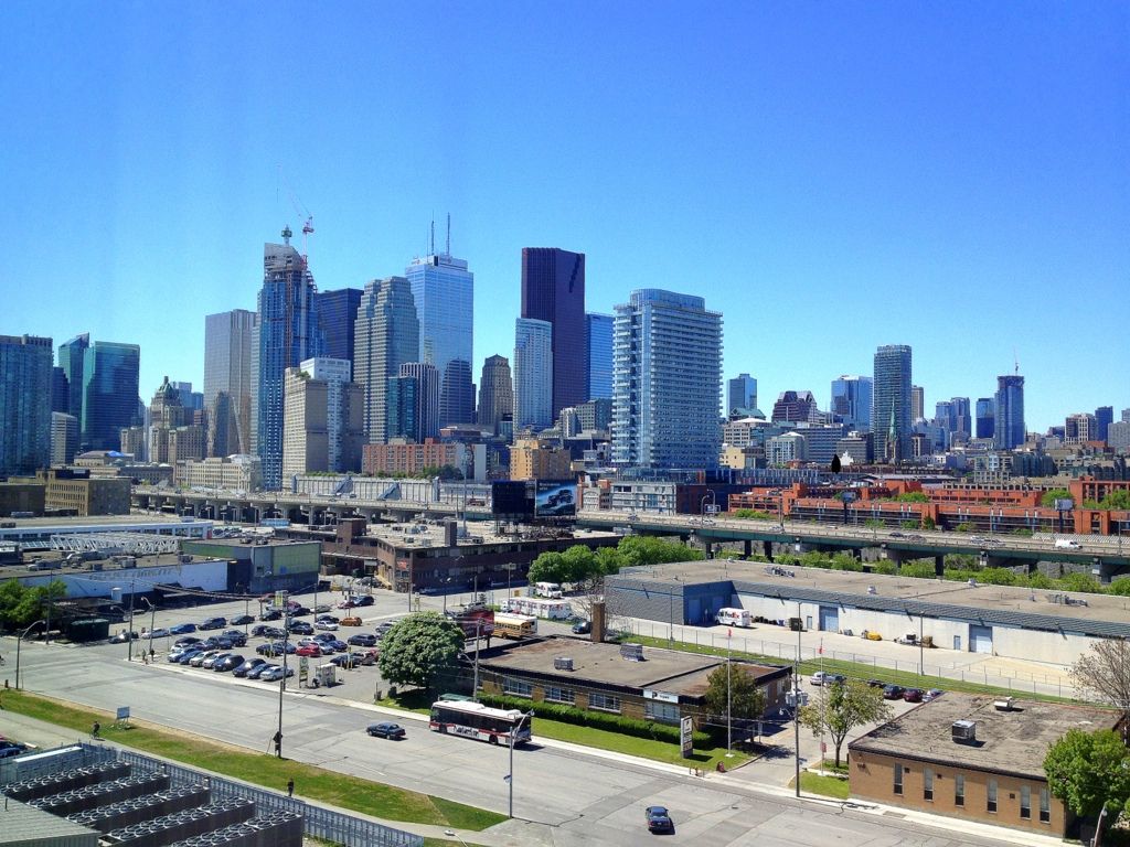
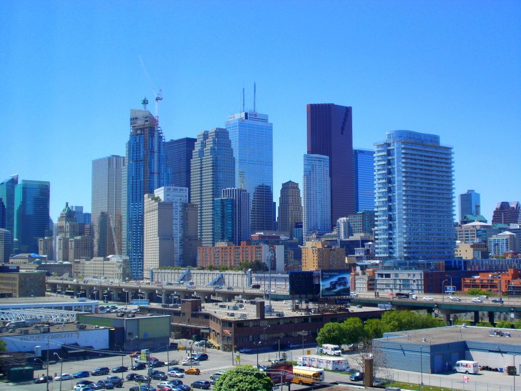
This looks good up close but dreadful from a distance. I suspect the opposite will be true of L Tower once it's finished, what with the very poorly thought out Yonge Street frontage.
metroTO
Active Member
This looks good up close but dreadful from a distance. I suspect the opposite will be true of L Tower once it's finished, what with the very poorly thought out Yonge Street frontage.
I totally agree with you.
The L-tower looks great from a distance due to its shear height and dynamic bulging and pointed massing, but up close the glazing detailing is lackluster and rather clumsy. Where as Market Wharf has some incredibly composed forms and massing when seen up close and is very contextual to its surroundings, but from a distance much of those qualities are lost and looks just as banal as other typical condos buildings.
RiverCity1
Active Member
japrologue
Active Member
May 25


Granny
Active Member
This looks good up close but dreadful from a distance. I suspect the opposite will be true of L Tower once it's finished, what with the very poorly thought out Yonge Street frontage.
X-ray
I think you nailed it.
Here are are two buildings that are truly polar opposites. For the longest time I have been struggling with what I like about these two buildings and yet there was always something that left me feeling solidly uncomfortable.
Your simple statement hit the mark. I couldn't have said it better.
androiduk
Senior Member
Xray_Crystal_Junkie
Senior Member
I guess the advantage of opaque glass if you can't see the junk on everyone's balcony.


