I really love this new design over the "original" one (which was not even an official rendering, but rather a massing study). The waves and ribbons (especially on the mechanical top) make this final version seem a lot lighter and airy than the prior one which was very top heavy.

I don't see the 1 Bloor comparisons though.
 
Why are people comparing the "Old" and "New" designs? They are one in the same (it was stated a few times that the "Old" one was just a massing study).

Anyways, I think it looks awesome. For those so passionate about the "Old" one, I will remember those posts and rehash them if you ever call something boring in another thread. Lol
(I'll agree however that the glass box at street level definitely needs some refinement)
 
Last edited:
Why are people comparing the "Old" and "New" designs? They are one in the same (it was stated a few times that the "Old" one was just a massing study).

Anyways, I think it looks awesome. For those so passionate about the "Old" one, I will remember those posts and rehash them if you ever call something boring in another thread. Lol
(I'll agree however that the glass box at street level definitely needs some refinement)

I only used "old" and "new" to differentiate between the two drawings.
 
Last edited:
Beautiful building. Gorgeous renderings. Yonge St. address. Across from the street from the Eaton Centre. A mere drunken flic of a cigarette butt to Dundas Square. I predict the investors, both foreign and local will gobble this right up to a 90% plus percentile in a blink of an eye.
Fourteen units per floor on a floor plate of this size? This has to be some kind of a new record.
What a beautiful beacon for every fifteen year old kid and above to age 30 located from Dundas Square to the outer 905 corners of the GTA who's looking for that Friday night 'let's get shitfaced, destroy something, puke out our guts-party.'
I predict this one will take on a very 'lived in' look on the inside in no time flat.

"I love the smell of industrial strength carpet cleaner in the morning. It smells like .. Party!"
 
Last edited:
Are people really actually satisfied with the base/podium of this design as it stands? I just can't wrap my head around how anyone feels it's up to par. And this is coming from a huge Hariri Pontarini fan!
 
Are people really actually satisfied with the base/podium of this design as it stands? I just can't wrap my head around how anyone feels it's up to par. And this is coming from a huge Hariri Pontarini fan!

I agree. I liked the barcode podium better. I am not impressed with base as it is now. The blank podium wall could actually be a huge opportunity for public art. Perhaps HP thought it would distract too much from the heritage buildings? I am fine with the entrance. It completely defers to the heritage buildings and I can imagine its relationship to the old beauty will function similar to the glass entrance at the TELUS Centre at the RCM.
 
I'm fine with the white-clad podium. I assume that's spandrel - haven't asked yet - or maybe it'll be a porcelain/enamelled aluminium, like at the Eaton Centre. What I find rather weak it the glass retail pavilion. While it is important that it not overshadow the banks on either side, I don't think its proportions are right yet. It does feel tacked on as opposed to integrated. I think there's room to grow it a bit, while still have it defer to the banks. It would likely benefit from a more minimal look too: probably a restaurant would better suit instead of what looks like clutter to me through the glass. I suppose a retailer could choose something more classically, cleanly modern looking (perfect spot for a Bang & Olufsen store?), but in this area I think most high quality retail is still pulled inexorably into the Eaton Centre. With the Elgin Winter Garden and Massey Hall practically on Massey Tower's doorstep, and nearly a thousand new residents in this tower, I think a good restaurant makes more sense here.

42
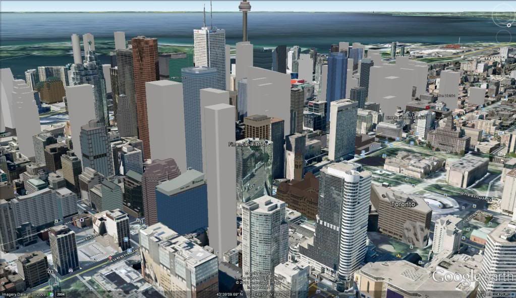
 
LOVE IT! I wonder what the final height will be? It should stick out in the skyline in this location.
 
a very basic version of this tower sitting in at 212m on toronto's future skyline;

massey-1.jpg
 
Last edited:
the renders look nice. hopefully, the official set of floor plans are revealed later this year.
 
This will sell like hot cakes, it's truly an urban dwellers wet dream. Maybe another five or ten floors after it sells? It's a good location for height here IMO, hospital helicopters notwithstanding.
 
What a beautiful beacon for every fifteen year old kid and above to age 30 located from Dundas Square to the outer 905 corners of the GTA who's looking for that Friday night 'let's get shitfaced, destroy something, puke out our guts-party.'

What's the matter Granny? Not been invited out to party much lately? Feeling a bit left out? :)

Besides, the amount of puking and destruction in Toronto is trivial. Try spending some time in the UK, and you'll really appreciate how good you've got it here.
 

Back
Top