You are using an out of date browser. It may not display this or other websites correctly.
You should upgrade or use an alternative browser.
You should upgrade or use an alternative browser.
- Thread starter urbandreamer
- Start date
Rascacielo
Senior Member
Today


ProjectEnd
Superstar
Cranesinthe6ix
Active Member
Cranesinthe6ix
Active Member
Cranesinthe6ix
Active Member
jackattack
Active Member
GenerationLee
Senior Member
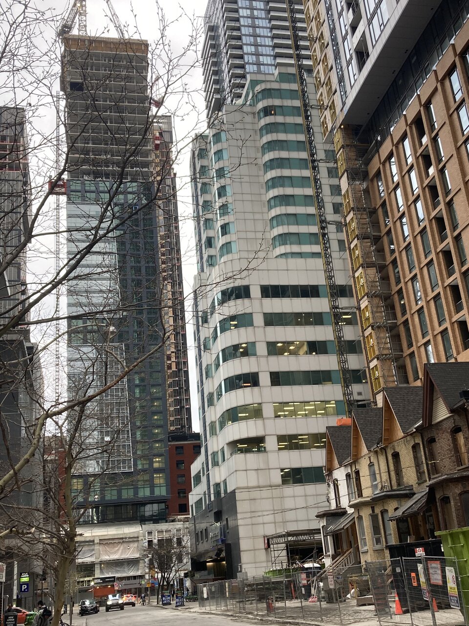
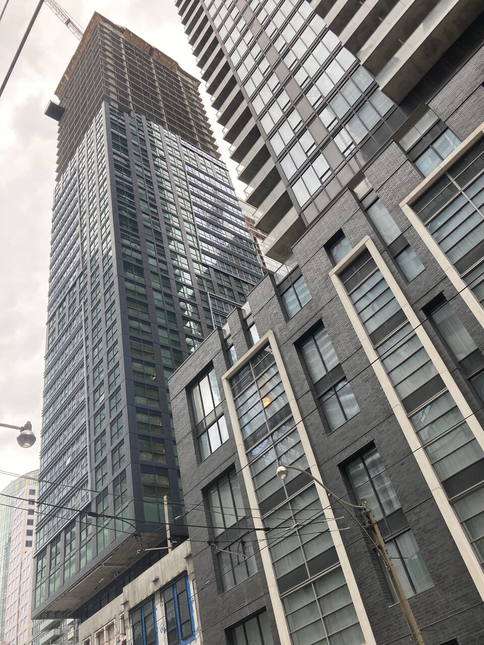
The green glass only detracts from the black gridded cladding. If that cladding was all we saw for this tower, it'd be borderline okay...but this looks and always has been rendered as a cheap "contemporary" design. It's better than Nobu sure, but this is another dud on King street, which is certainly unfortunate.
xy3
Active Member
The green dosent look bad to me. I think the grey glass cutouts with a billion mullions cheapens it.The green glass only detracts from the black gridded cladding. If that cladding was all we saw for this tower, it'd be borderline okay...but this looks and always has been rendered as a cheap "contemporary" design. It's better than Nobu sure, but this is another dud on King street, which is certainly unfortunate.
GenerationLee
Senior Member
Peehaps I should really reserve my judgement for whenever I get down to this area. The worst part is the mullions and silver/grey glass cutouts, but I'm not impressed either by the windows on the gridded cladding.
Cranesinthe6ix
Active Member
ProjectEnd
Superstar
Cranesinthe6ix
Active Member
Bjays92
Senior Member
It's funny, I actually prefer the grey sections myself.
I ultimately think this would've been better if they picked one pattern and stuck to it, rather than this mis mash of two. But I still think it's decent overall. Far from bad.
I ultimately think this would've been better if they picked one pattern and stuck to it, rather than this mis mash of two. But I still think it's decent overall. Far from bad.
The lack of balconies improves the look.