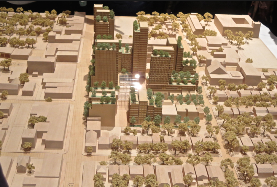
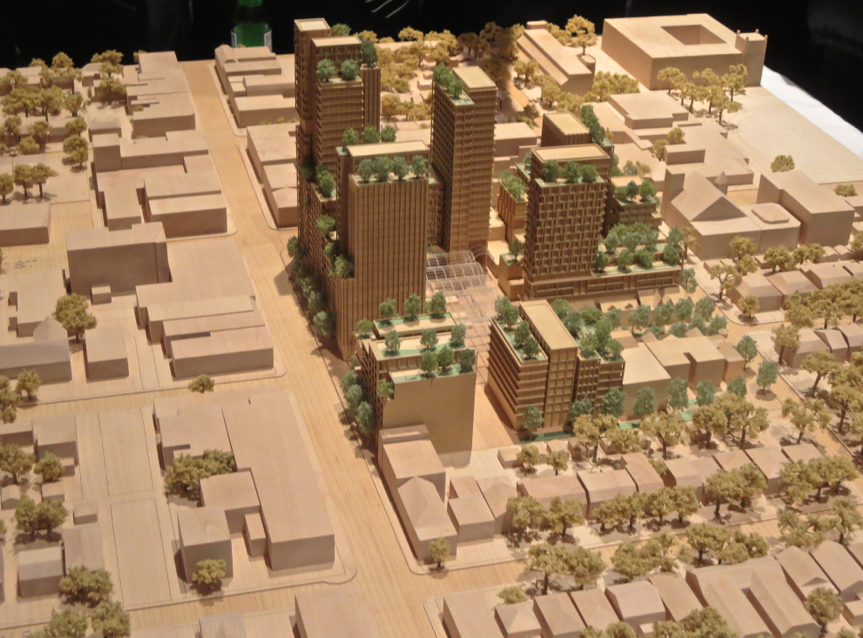
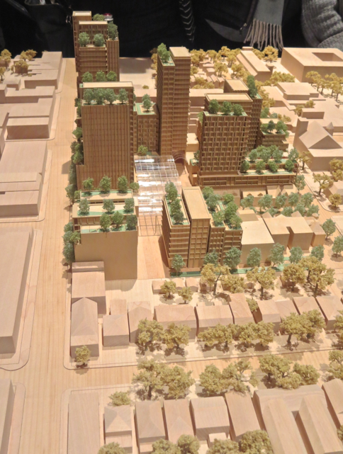
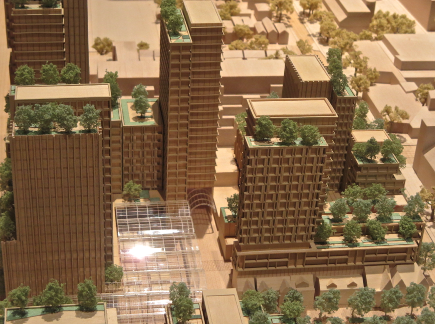
Photo dump:

Screen Shot 2015-03-03 at 9.40.34 PM.png


Screen Shot 2015-03-03 at 9.41.01 PM.png


Screen Shot 2015-03-03 at 9.42.28 PM.png


Screen Shot 2015-03-03 at 9.42.39 PM.png


Screen Shot 2015-03-03 at 9.42.50 PM.png


Screen Shot 2015-03-03 at 9.43.05 PM.png


Screen Shot 2015-03-03 at 9.43.19 PM.png


Screen Shot 2015-03-03 at 9.43.38 PM.png


Screen Shot 2015-03-03 at 9.43.57 PM.png


Screen Shot 2015-03-03 at 9.44.10 PM.png


Screen Shot 2015-03-03 at 9.44.21 PM.png


Screen Shot 2015-03-03 at 9.44.31 PM.png


Screen Shot 2015-03-03 at 9.44.45 PM.png
 

Attachments

  • Screen Shot 2015-03-03 at 9.40.34 PM.png
    Screen Shot 2015-03-03 at 9.40.34 PM.png
    1,001.2 KB · Views: 1,259
  • Screen Shot 2015-03-03 at 9.41.01 PM.png
    Screen Shot 2015-03-03 at 9.41.01 PM.png
    936.4 KB · Views: 1,593
  • Screen Shot 2015-03-03 at 9.42.28 PM.png
    Screen Shot 2015-03-03 at 9.42.28 PM.png
    554.5 KB · Views: 1,215
  • Screen Shot 2015-03-03 at 9.42.39 PM.png
    Screen Shot 2015-03-03 at 9.42.39 PM.png
    953.6 KB · Views: 1,220
  • Screen Shot 2015-03-03 at 9.42.50 PM.png
    Screen Shot 2015-03-03 at 9.42.50 PM.png
    974.9 KB · Views: 1,249
  • Screen Shot 2015-03-03 at 9.43.05 PM.png
    Screen Shot 2015-03-03 at 9.43.05 PM.png
    951 KB · Views: 1,206
  • Screen Shot 2015-03-03 at 9.43.19 PM.png
    Screen Shot 2015-03-03 at 9.43.19 PM.png
    937.1 KB · Views: 1,568
  • Screen Shot 2015-03-03 at 9.43.38 PM.png
    Screen Shot 2015-03-03 at 9.43.38 PM.png
    524.8 KB · Views: 1,197
  • Screen Shot 2015-03-03 at 9.43.57 PM.png
    Screen Shot 2015-03-03 at 9.43.57 PM.png
    987 KB · Views: 1,227
  • Screen Shot 2015-03-03 at 9.44.10 PM.png
    Screen Shot 2015-03-03 at 9.44.10 PM.png
    1,007.1 KB · Views: 1,219
  • Screen Shot 2015-03-03 at 9.44.21 PM.png
    Screen Shot 2015-03-03 at 9.44.21 PM.png
    991.8 KB · Views: 1,233
  • Screen Shot 2015-03-03 at 9.44.31 PM.png
    Screen Shot 2015-03-03 at 9.44.31 PM.png
    735.2 KB · Views: 1,535
  • Screen Shot 2015-03-03 at 9.44.45 PM.png
    Screen Shot 2015-03-03 at 9.44.45 PM.png
    727.1 KB · Views: 1,158
I like it too....
 
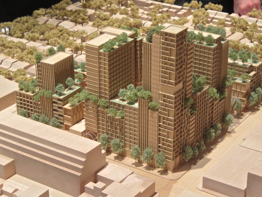
After reading the G&M article I gained more respect and appreciation for the design.
It captures and interprets the quirky and energetic spirit of the Honest Ed's well.
It is really growing on me.

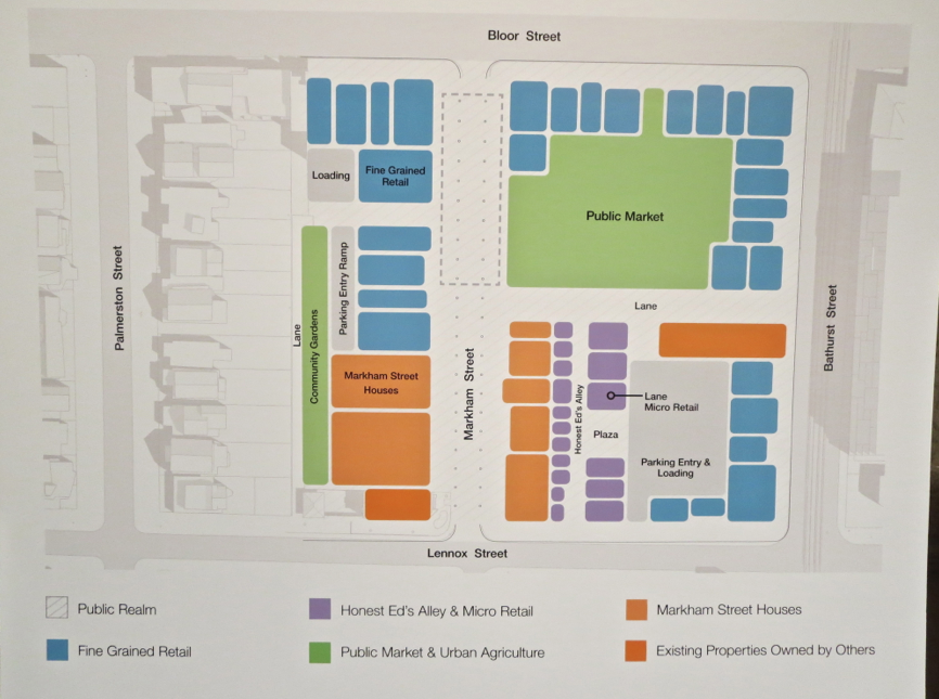
Having a good amount of small and micro-sized retail units will ensure a good amount of local businesses. I hope they can keep rents at a reasonable rate to make it affordable for new entrepreneurs.
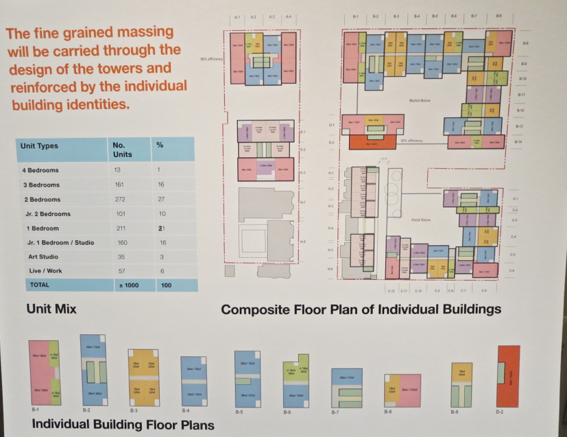
Residential being all rentals is good sign that the developer is in it for the long haul and shows true ownership and dedication in the project. The significant amount of family sized units is a huge plus and it would be great if there will be a school, daycare and/or community centre component to support the development and surrounding neighbourhood.
 
I went to the public meeting tonight. The turnout was very impressive. 500-600 people showed up. That says a lot. We really care about our city and want it to shine on its own terms. I think that's what this proposal is trying to achieve. I'm uncomfortable with the scale and density but I appreciate the fine grain they're trying to introduce here to break things down into manageable bits. I'm impressed by the project team's ernest desire to do some good and to engage the community with ideas. With a few tweaks, I think I'm on board.
 
Last edited:
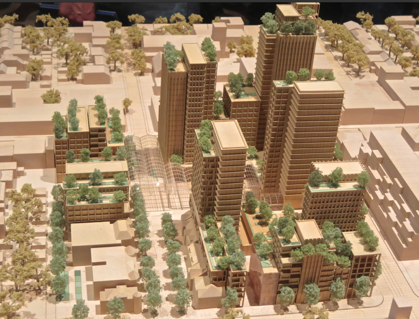
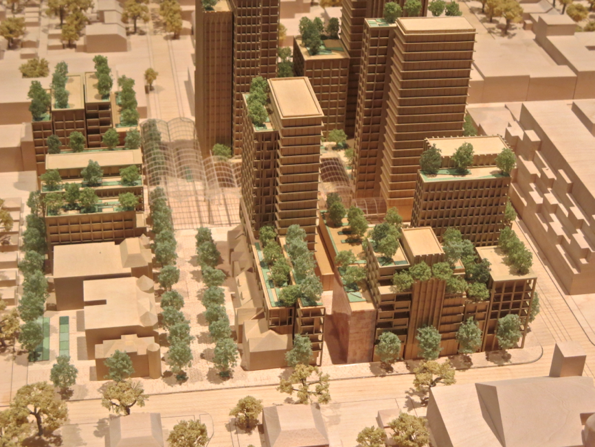
I don't care for the architecture, but the retail looks awesome.
You just know the trees on top of the buildings isn't going to happen. I don't care if it does anyway, as I think trees look silly on top of buildings.

I can't see there being signs beside people's balconies and windows like they show there. I know I wouldn't want one beside my balcony or windows.
Definitely happy to hear about rentals. Hopefully they are affordable!
 
Not a huge fan of the architecture, but I do like the integration of retail and the pedestrian street. This should be the norm for every project.

I'd love to see some more of the 'Honest Ed' audacity integrated in to the signage.

I wonder why Mirvish didn't just develop this on his own. Would've loved to have seen what Gehry could've done with a block like this.
 
[...] Would've loved to have seen what Gehry could've done with a block like this.

A big, flashy Gehry seems right for the Entertainment District, but not here. I doubt Gehry to deliver such a humane scale, such restraint, such a diversity of buildings and facades.
 
Depends how the city deals with it. Mirvish gehry was way out of context at the time but was allowed through and received a special focus from the planning department above what a normal building gets. This may get a similar treatment.

One thing I've been noticing is that people don't seem to care about density as much as they used to, I think people are starting to learn to accept it to a certain extent. That said, B Street had some opposition issues and it was a far smaller development than this.
 

Back
Top