UtakataNoAnnex
Senior Member
As long as they don't make it out of that mystery meat substance like they did for June Callwood Park....Not "may be".
"will be".
As long as they don't make it out of that mystery meat substance like they did for June Callwood Park....Not "may be".
"will be".
Ugh, imagine how bad this is going to look when value engineered to smithereens and then poorly maintained/managed by Parks for a few years.The winning design has been announced, and it is 'Wàwàtesí,' from West 8 and team. Front page story is here.


42
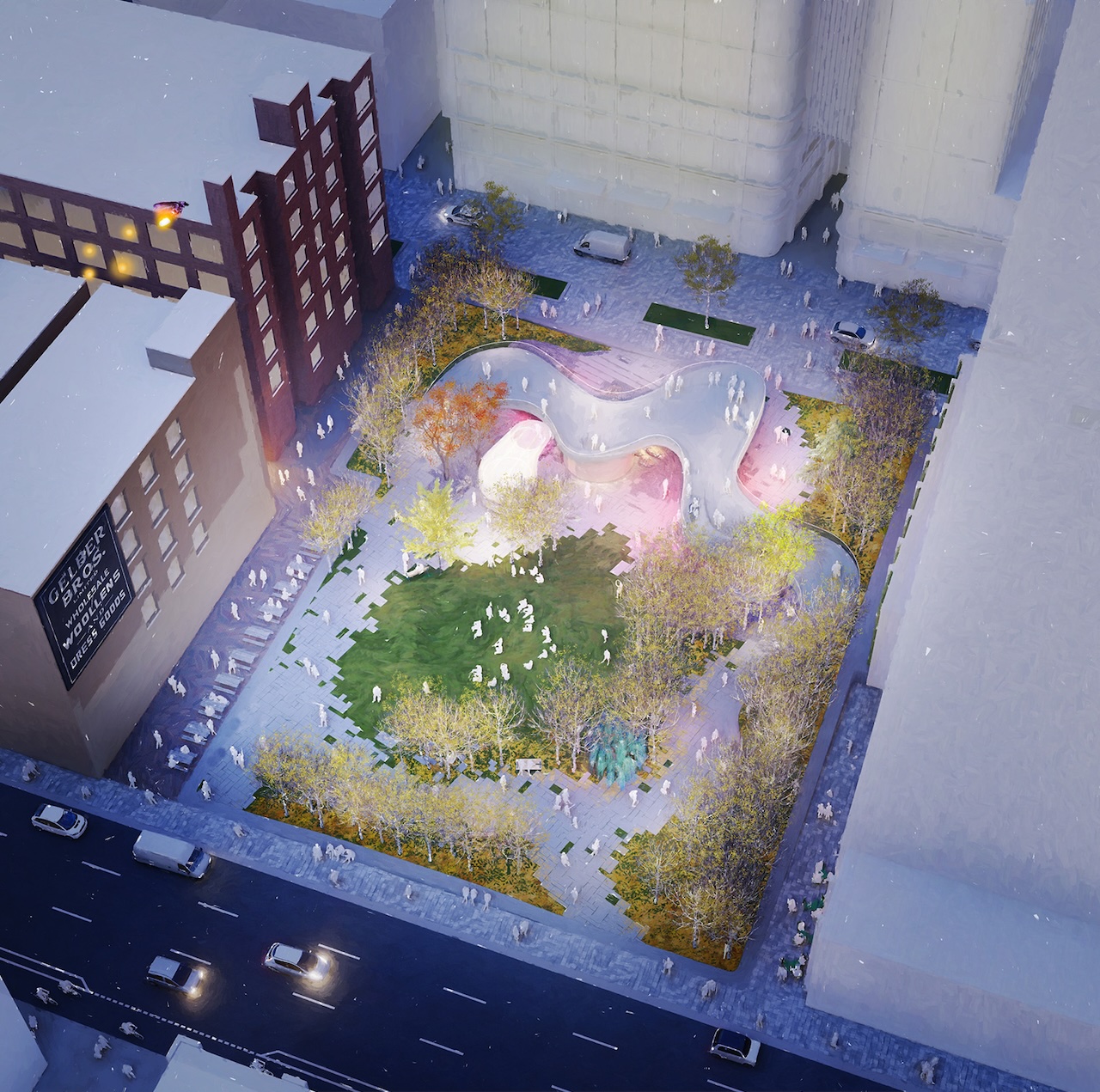
Also landscape architects - the jaggedy paving with plants growing around/through it never looks good in practice.
A real missed opportunity here, oneSKY looks so much better.
As a landscape architect, I'm not sure how they expect the tiny patches of grass to hold up any better than muddy patches of dirt.
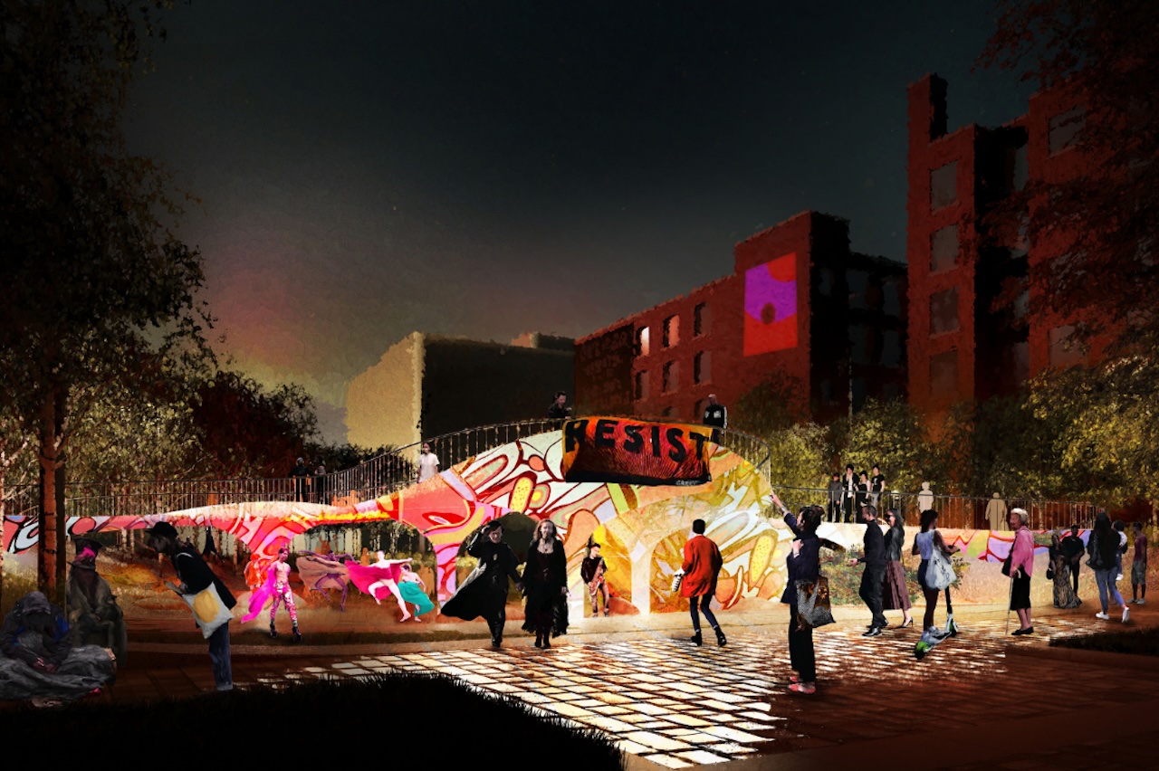
and I suspect the curator will be VE'd and receive the pink slip after the first few projects.. "Focusing on integrating landscape, light, and performance, the design team describe the design as Toronto's first park with a curator that will schedule arts events and installations."$10 says that any lights that make it through the VE phase will be maintained so poorly as to be useless. We may as well imagine and get used to a few dark concrete bunkers.
I imagine that to make this park work as proposed, the Downtown West BIA will have to hire someone to take on the curatorial duties, and hire maintenance for the park beyond what the City will provide, That may already be in the fine print that I don't have time to search through right now. It may be the case, in fact, that the BIA would be involved with any of the entries, had they won, here. They would probably want to be, since the City has been so awful with park maintenance for the last decade.and I suspect the curator will be VE'd and receive the pink slip after the first few projects.. "Focusing on integrating landscape, light, and performance, the design team describe the design as Toronto's first park with a curator that will schedule arts events and installations."
The oneSky design was the better choice imo. But I don’t have big issues w this design. It has good potential. Also, I bet your reaction will be different after viewing the finished park. Love Park had grumblers too. And that’s a great space. But, I do agree with the lousy Yonge Dundas Sq & the awful concrete dreary hell that is Nathan Phillips Sq aesthetic. They are both lacking & horrible. I’m actually surprised that more people don’t crap on NPS, which should be the city’s most important public space.I hate to pick on a specific project, but I really have a problem with these types of park designs. Parks are simple, and they don't need a bunch of stuff that looks flashy on a render to function well for the public, pixelated grass/hardscape surfaces included. Putting a giant walkway in the middle makes the space much worse, not better. It's not a cool "feature." Its an obstacle to the average park user and it makes the space smaller and less inviting. There is no great park in the world, nor in Toronto, that is designed like this. All they need is seating, shade, washrooms and the ability to walk through the space in a relatively straight line. This design emulates all the mistakes of Yonge & Dundas square, NPS, and June Callwood all while being way more expensive than it needs to be.
To me, this design is worse than whats there now.
Love Park is a great design and I didn't grumble about it at any point. It's very simple and achieves all the goals a park should achieve. It also doesn't have a wall bifurcating it for no reason.Also, I bet your reaction will be different after viewing the finished park. Love Park had grumblers too.