You are using an out of date browser. It may not display this or other websites correctly.
You should upgrade or use an alternative browser.
You should upgrade or use an alternative browser.
- Thread starter jaborandi
- Start date
scamander24
Active Member
Benito
Senior Member
From yesterday. Nicholas is looking great. The lobby is very nice as well, but I couldn't get photos yesterday. The landscaping is almost done.


Attachments
James
Senior Member
It's looking very nice indeed.
Tewder
Senior Member
The podium feels out of proportion to me, it needs some mediation between the brick and tower. Not sure who's designing buildings in Toronto these days. The materials do look good though.
modernizt
Senior Member
The materials do look good though.
White precast, standard red brick, and cheap-looking sconce lights that were apparently picked out of a Home Depot parts bin?
James
Senior Member
I'm not sure what's cheap-looking about the sconce lights. Is it because the design is simple and not ornate? I'm not sure having fancier, more extravagant exterior light fixtures will add that much more value to this building design.
Automation Gallery
Superstar
Hmm , everything above the red brick is blah
Lyphe
Active Member
Gotta say, looks pretty good to me. Especially where it meets the street.
Benito
Senior Member
I really like what they've done at the street level. It is very nice walking down that stretch of Nicholas St. now.
TheKingEast
Senior Member
Looks very sharp at street level. Red brick really has a timeless look. Much better than black brick.
stjames2queenwest
Senior Member
watching it go up I didnt think I was going to like it much, but now that its up its growing on me, especially the tower portion, seems to be just slightly lavender in colour, and the penthouse levels look nice especially at dusk. It's a simple, pretty, little tower.
salsa
Senior Member
I agree. I thought this was gonna look as banal as the renders, so it's nice to finally see a building turn out better in real life.
Watercolour renderings don't tend to impress on UrbanToronto. They are not an indication that the building is not going to turn out well though. It's just another marketing choice, one that is meant to emphasize the heritage aspects of the building in this case, and not an indication of the eventual build quality.
42
42
Automation Gallery
Superstar
It's looking very nice indeed.
Still, what it could have been
..oh well another box will do
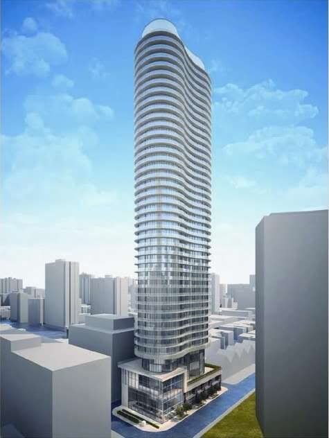
Or it could look like the original 'peanut' design for 75 St. Nicholas Street, only taller:


