Great angle. I have to try that.
You are using an out of date browser. It may not display this or other websites correctly.
You should upgrade or use an alternative browser.
You should upgrade or use an alternative browser.
- Thread starter iSlutsky
- Start date
someMidTowner
¯\_(ツ)_/¯
G.L.17
Senior Member
kris
Senior Member
Kamuix
Active Member
A neat comparison! I love how similar these two buildings are, Toronto and Chicago already has many similarities(expl: Climate Temp almost exactly the same, Both well know global north American cities, populations almost exactly the same(as of recent years)) now this! I don't see it as a bad thing either or that it's "copying" it was likely just inspired by the architecture


Height's almost the exact same 5 meters off

Height's almost the exact same 5 meters off
Attachments
TheKingEast
Senior Member
I know 1B isn't finished yet but Aqua > 1B
88drums
Active Member
Aqua is gorgeous from afar with its slick glazing and undulating balconies. But walking by its squat, lifeless podium feels like walking past the Sheraton Centre.
1B probably won't be as visually striking as Aqua, but its rockstar podium is shaping up to be both more engaging and more urban IMO. With direct TTC access and rumoured tenants like Apple, I suspect Torontonians will experience 1B much more than Chicagoans experience Aqua.
1B probably won't be as visually striking as Aqua, but its rockstar podium is shaping up to be both more engaging and more urban IMO. With direct TTC access and rumoured tenants like Apple, I suspect Torontonians will experience 1B much more than Chicagoans experience Aqua.
modernizt
Senior Member
Aqua is gorgeous from afar with its slick glazing and undulating balconies. But walking by its squat, lifeless podium feels like walking past the Sheraton Centre.
The wavy balconies and "pools of water" that visually form on Aqua are not visible from afar; you have to be close enough that you are looking up at the building.
The undulating forms of One Bloor's balconies is visible from any distance because it is visible in elevation.
Marcanadian
Moderator
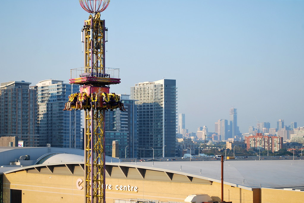 CNE 2015 by Marcus Mitanis, on Flickr
steveve
Senior Member
The undulating forms of One Bloor's balconies is visible from any distance because it is visible in elevation.
I think it's mostly in part to the frosted balcony cladding they are going to use. Whereas with Aqua, they've gone the railing approach - which works up-close with Aqua's particular design that puts emphasis on a more random pattern in which glass balconies might have taken away from.
That being said, I still believe Aqua is more of an eye catcher at street level looking up (minus the terrible podium of course, where One Bloor has it beat in every regard), but One Bloor's contrasting elements will make more of an impact when judging it from a skyline perspective.
Marcanadian
Moderator
I think it's mostly in part to the frosted balcony cladding they are going to use. Whereas with Aqua, they've gone the railing approach - which works up-close with Aqua's particular design that puts emphasis on a more random pattern in which glass balconies might have taken away from.
That being said, I still believe Aqua is more of an eye catcher at street level looking up (minus the terrible podium of course, where One Bloor has it beat in every regard), but One Bloor's contrasting elements will make more of an impact when judging it from a skyline perspective.
Agreed, Aqua looks amazing up close, but from afar, the effect is much less dramatic. There are also some glaring gaps in the balconies running up the building, which really breaks the cohesiveness.
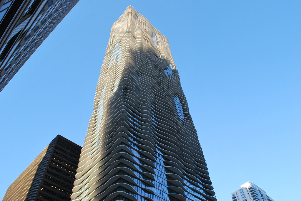 Chicago by Marcus Mitanis, on Flickr
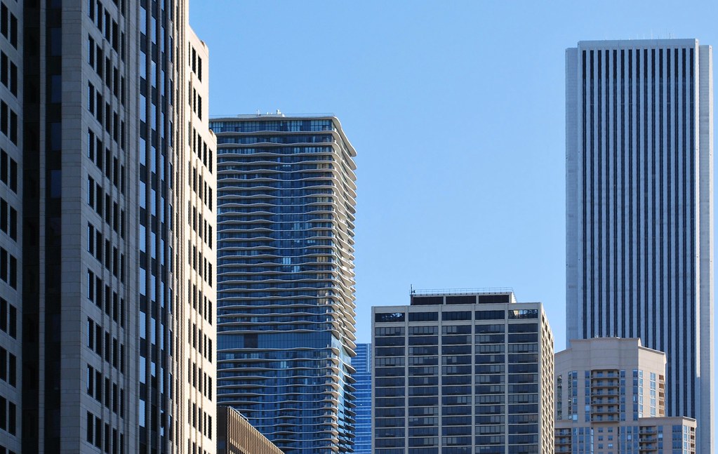 Chicago by Marcus Mitanis, on Flickr
drum118
Superstar
Sept 4
From Humber Shores
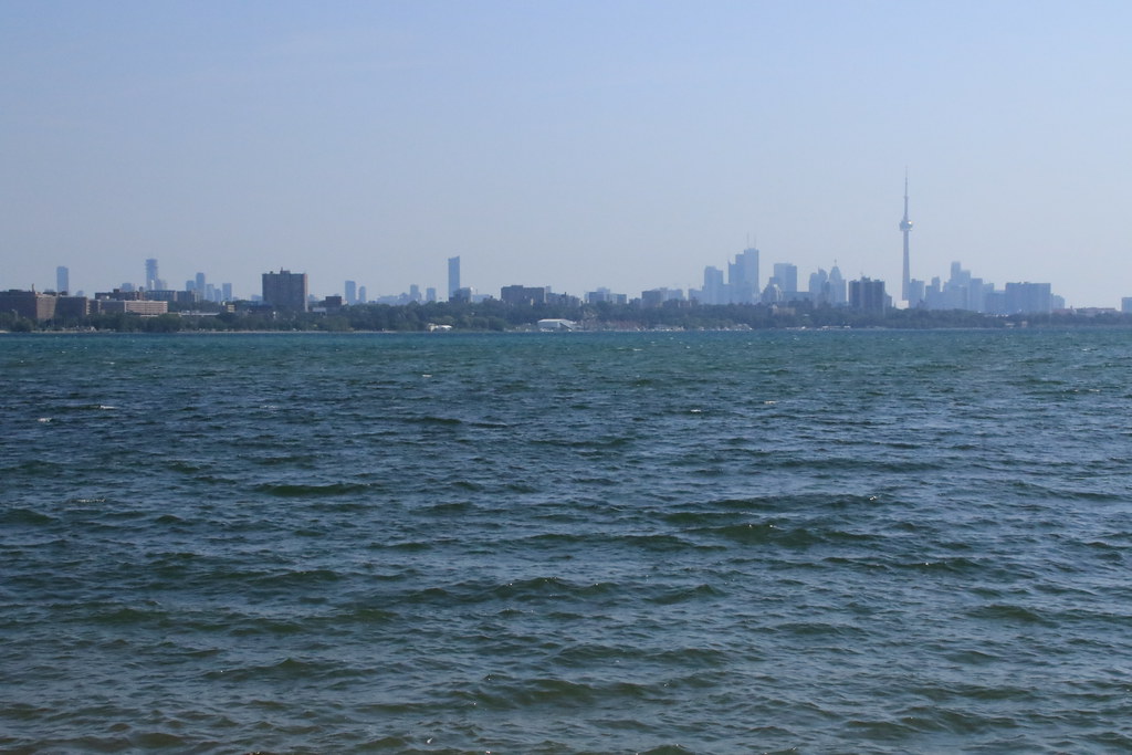
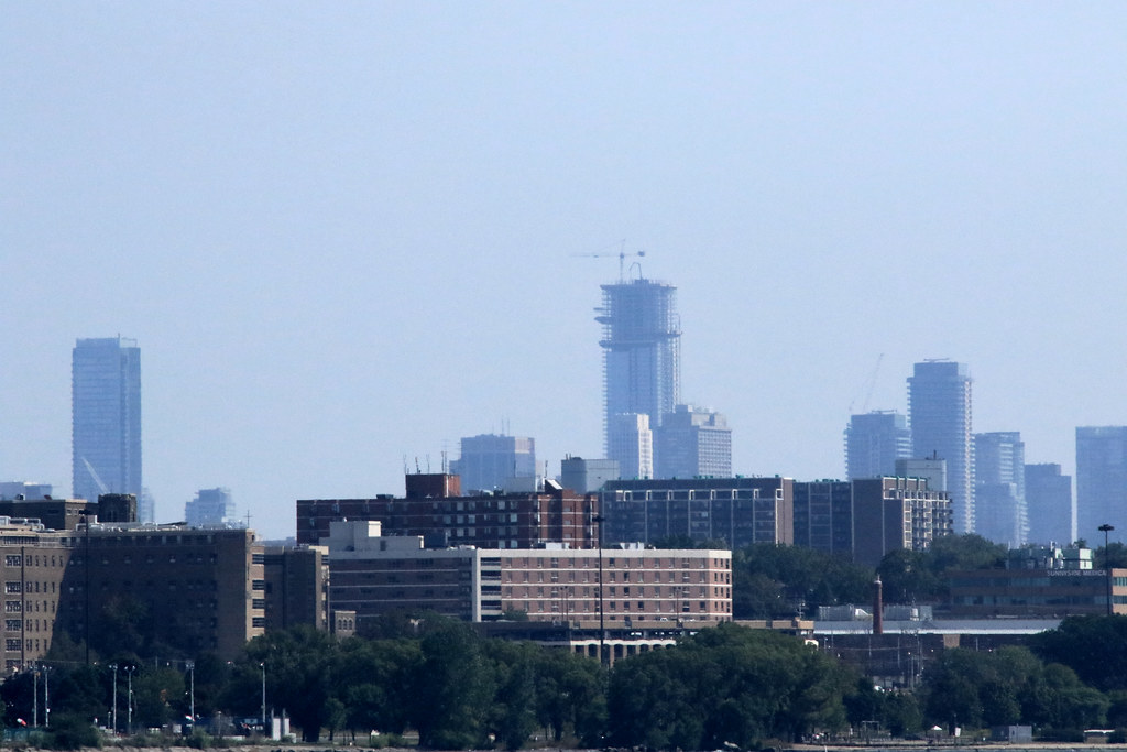
From Humber Shores


Stupidandshallow
Active Member
It's interesting that the Retail here isn't opened yet! I hope they don't screw it up.
ssiguy2
Senior Member
The building is very nice and helps to balance the skyline. The thing that I am most looking forward to is having that empty, ugly corner become active again after a long decade of being a scar on the face of arguably Toronto's most important corner.
Lenser
Senior Member
1BE yesterday morning.


