Of course we can. We haven't suddenly forgotten how to do it. The issue is won't not can't.
Those buildings were crafted by artisans that are few and far between, these days. Though, I suppose that it would be possible, at some point, if not now, to use 3D printers to bypass the human aspect of the artistic intricacy that is involved in such architecture. The question is: Do many developers and architects really want to revisit bygone architectural/design trends such as, Art Deco?
 
Those buildings were crafted by artisans that are few and far between, these days. Though, I suppose that it would be possible, at some point, if not now, to use 3D printers to bypass the human aspect of the artistic intricacy that is involved in such architecture. The question is: Do many developers and architects really want to revisit bygone architectural/design trends such as, Art Deco?

Economics aside, the contemporary design world has people thoroughly convinced that those prior styles are locked away forever as if people have forgotten how to design them- it's a cultural style influenced by economic costs that currently favors contemporary architecture in large structures. In addition, media, architects and developers have impressed upon the population (and on one another) an aspirational perception that sees glass and concrete buildings as being more 'progressive' than the previous generation's architecture (despite the fact that prior styles also saw themselves the same way).

The second issue that's harder to address is the fact that Architecture schools also largely encourage students to design 'contemporary' architecture, which emphasizes proportions that are far different from prior styles. As such, there's at least two-three generations by now that have not really designed in any of the older styles. That means that when you do get the occasional building that attempts to mime older styles, they're usually poorly designed (like suburban houses), leading back to the professional belief that contemporary is the only way forward. There are many reasons more, but all of this is really the result of a naturally uncontrollable cultural drift, which will continue despite our belief that the architecture of today is the architecture of tomorrow.

Like what's been said, styles are never bygone, people can, and will continue to reference and build in those styles (i.e. Robert Stern). Despite the architectural world pushing modernist housing as the way forward back in the 50s and 60s (to varying degrees of societal success), the fact that many suburban houses and townhouses still ape traditional styles (poorly) should come as no surprise- most people with little contact with the contemporary design world still want to live in a house that looks like a 'house'.
 
Last edited:
You guys have hit a nerve so I'm going to chime in as an architectural designer who is sick of the expectation that architects should be able to recreate 1800s or 1900s "style" or aesthetics on contemporary buildings. Let me try and illustrate, quite vaguely actually, why in the day to day practice of what we do, this is almost impossible, or at least, makes very little sense other than as a facade exercise. The economics and buildability are another matter and you can ask a developer or a bank about building one of those Art Deco towers and be laughed out of the room by them. But I will try to explain how the design of a building is more than an exterior "style" or wrapper.

Let me begin with a question - should we go back to using iceboxes for fridges, ask Ford to restart production of the Model T, and ride around on penny farthing bicycles again? No? Okay, good. We agree on that.

It's not just a matter of what architecture students are being "told" to do, or a cultural drift, or even large societal change. It's the fact that a building is based around function, use, technology, materials - and all of the ingredients therein have changed immensely. It should be no surprise that architects scratch their heads at the demands to return to an old "aesthetic" when the rest of the building would have to appease modern code requirements, use modern equipment, provide sufficient daylighting, and a host of other incongruencies with this heritage "style". It would be like designing a Ford Model T today and expecting it to function in the same way, day-to-day, as other cars on the road, and using the same kit of parts.

We don't design housing or office buildings (or many other typologies) that way we did in the past because the world has changed. Architecture is not just a "style" or "aesthetic" - that is the public's own confusion. Architecture schools don't "encourage" students to design contemporary buildings - the students just do, because there is no way to design a building that is truly traditional in 2019 given what we are designing for. A building is massed and designed around use, daylighting, circulation, thermal comfort, building performance, fire and life safety, building code, even cultural qualities (how we use our homes, what we value, how we lay out public spaces and buildings) and yes - the skillsets and economics of building in 2019. To meet those requirements simply does not result in a building that appears old - you could wrap it in a faux-historical shell (an unconvincing one), but the building massing itself, and everything within, would still likely would not look much like an old building. So why go through those gymnastics? For example, the American Radiator building and other old office towers posted a page or two back - they are dingy spaces to work in. At the time they were celebrated as advanced and beautiful, but they're not untouchable - we can do better. I appreciate them for what they are, but you can appreciate and respect history without attempting to recreate it. You should also note that their form is derived from NYC's zoning that restricts building envelopes in a certain way, and I also suspect their slim floorplate comes from the fact that their core size is quite limited and they probably do not meet modern exiting requirements for fire and life safety. Their final form and design is derived from a multitude of factors that simply do not apply in the 2019 context, or the Toronto context. And of course, the size of their floorplates are almost unfeasible today, as office developers demand floorplates of about 25,000 sq ft... this is for efficiency, elevator stacking, and their resultant economic formula.

Architects are not taught to design "old buildings" because this is 2019. We learn about them, we learn about how some of their detailing worked to resist rain and moisture from damaging the building over time, we learn about their organization and methods of detailing, and we appreciate them immensely. But like mechanics don't work on Model T's, we don't spend the years necessary to design old buildings because it literally would make no sense to in such a different time and different context where building design and the world around it has changed and mostly advanced. The public is welcome to have a nostalgia for old buildings and the idea that they are superior - they certainly are beautiful and I enjoy them visually. But beyond that they do not meet our needs for buildings in 2019.

The standard that architects are held to by some parties (often heritage advocates, other times laypeople) in the expectation of creating Disney architecture that magically wraps their 2019 building in an exterior expression from a different era - is ridiculous. Why do architects react poorly against it? Because it's nearly impossible; it doesn't make sense to us. If you see a building as more than its wrapper or expression, you quickly realize what a futile exercise it is to take a building from 2019 and try and squeeze it into an an early-1900s sausage casing.

So again, in summary - Ford no longer produces the Model T and couldn't even if they wanted to, because engines have changed, technologies have changed, life safety has changed, and people demand more comfort and performance from their vehicle. It's interesting to look at a Ford Model T, but a car is more than aesthetics. Same argument for an ice box instead of a fridge, or a penny farthing bicycle.

re: the point of people being drawn to suburban peaked-roof housing... There is a lot behind why people are drawn to particular styles - a bit part of it is that they are being told by cultural code and popular consumer culture that that is what a house looks like. But at the end of the day, it's cheap and it's what the market is providing en masse, and so it's less about choice and more about what people are being given by developers. Simple detailing, easy and cheap to build - and yes, a peaked roof to give the association with domesticity. I wouldn't consider that much of a choice but there you have it.
 
Last edited:
I guess we should go back to using iceboxes for fridges, ask Ford to restart production of the Model T, and ride around on penny farthing bicycles again?

It's not just a matter of what architecture students are being "told" to do, or a cultural drift. It's the fact that a building is based around function, use, technology - and all of the ingredients therein have changed immensely. It should be no surprise that architects scratch their heads at the demands to return to an old "aesthetic" when the rest of the building would have to appease modern code requirements, use modern equipment, provide sufficient daylighting, and a host of other incongruencies with this heritage "style". It would be like designing a Ford Model T today and expecting it to function in the same way, day-to-day, as other cars on the road, and using the same kit of parts.

We don't design housing or office buildings (or many other typologies) that way we did in the past because the world has changed. Architecture is not just a "style" or "aesthetic" - that is the public's own confusion. A building is massed and designed around use, daylighting, circulation, thermal comfort, building performance, fire and life safety, building code, and yes - the skillsets and economics of building in 2019. To meet those requirements simply does not result in a building that appears old - you could wrap it in a faux-historical shell (an unconvincing one), but the building massing itself, and everything within, would still likely would not look much like an old building. So why go through those gymnastics?

There is a lot behind why people are drawn to particular styles - a bit part of it is that they are being told by cultural code and popular consumer culture that that is what a house looks like. But at the end of the day, it's cheap and it's what the market is providing en masse, and so it's less about choice and more about what people are being given by developers. Simple detailing, easy and cheap to build - and yes, a peaked roof to give the association with domesticity. I wouldn't consider that much of a choice but there you have it.

Without getting caught up in the narrow specifics of one particular style, I don't think this is a fair analogy.

Certainly it is unlikely that economics or function will favour going back to making most/any buildings out of solid stone, unless we are trying to recreate a lost heritage gem.

But there is no reason we can't use brick; nor that we can't put a small detail or flourish above a door or a window.

There is no reason buildings have to be boxy. Curves are arguably more feasible today than they were in an artisinal age. Glass, metal, even concrete forms can be given visual interest in this way.

There is really no reason windows can't have arches. I'm not suggesting that should be the norm, but simply that there is no functional reason they must be square or rectangular.

Crown moulding in interior rooms is now more common that it ever was in the 19thC; there is no reason its exterior equivalent, a nice cornice can't be just as ubiquitous. Further, such need not be stuck
in a historical style, the idea is merely a border, added dimension a spot for a creative flourish, this can be done with any number of styles/colours and made to work quite well.

Hardwood floors and stone countertops are as normative as they've ever been, and composite stones and engineered hardwoods are reaching quality levels where non-experts have difficulty telling the difference w/cursory examination.

Yet the art of a good threshold between different floor treatments seems lost.

If we can spend on getting a good fire place mantle, we can equally spend on an awning, or a well detailed door. Todays' version might be hollow core, but it can look every bit as sharp; likewise a well crafted light-weight alloy might replace a full metal door, or bracket or corbel but still be every bit as nice.

Its a choice to include or omit such details. Its a choice to pick them well, to strive for quality and be willing to be a bit different.

We ought not to let developers off the hook because style has changed or we require greater energy efficiency or accessibility.

Double-glazing can be attractive, wheelchair ramps can have aesthetically appealing railings etc. etc.
 
The strategy behind the exterior detailing of old buildings did indeed have some inherent function, usually to do with protecting building openings and to help drain water appropriately. Some of those features were rendered useless as technology and construction changed, but I actually do think we need to bring some of those details back in a way that is integrated and for their appropriate use - and I do think this will begin to happen again.

Yes, we can start tacking cornices onto things, but is there any point to that when we don't even know why we're doing it? We should bring back the strategies of old details that could be of use to us again - but it's not as simple as attaching stylistic flourishes without an understanding of why.

The other things you are describing - floor treatments, types of glazing, and small details/flourishes - none of that needs to be historical references to exist, and I am advocating for them as much as you are. Plenty of contemporary projects and architects are famous for their rich material choices and detailing. So to suggest that detailing has been lost is entirely false. Details have changed, but many contemporary firms around the world employ stunning details in their work. It just doesn't look like the types of details we once used because those have evolved with function, technology, structure, and the way buildings are assembled.

Coincidentally, some of the things being asked for here - good glazing, the use of brick and masonry, and great detailing - are being done very successfully by contemporary firms like Shim-Sutcliffe, Hariri Pontarini and aA in their work, and those are all firms that would never touch the faux-historical aesthetic. (HPA uses arches, but those have a more recent tradition that is divorced from their historical use). Firms like Shim-Sutcliffe (incredible detailers; in their own league in Toronto), HPA and aA forego creating crappy/half-rate attempts at remaking historical details in favour of creating well-resolved and beautiful contemporary ones.
 
Last edited:
Details have changed, but many contemporary firms around the world employ stunning details in their work. It just doesn't look like the types of details we once used because those have evolved with function, technology, structure, and the way buildings are assembled.

This. Just look at how meticulously detailed some of the works by say Piano. It might not be the same kind of detailed as in the "good old days", but detailed it is.

Also, massive panes of high quality glass is simply a non-starter back then - you have to look at glass technology back in the 20-30s and how it as evolved since then. We didn't even have float process glass.- that's invented post-war.

AoD
 
Last edited:
I still think we need to take a step back, as it everyone is still caught up and speaking from within contemporary culture of today, the same way futurists in the past projected futures painted in the stylings of their day.

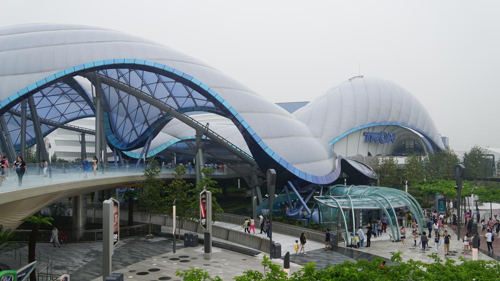
It's still contemporary cultural belief that drawing from old architecture is seen as a "creating Disney architecture". What is Disneyland architecture? Should Disney's Shanghai Tron ride be considered Disneyland architecture? Is it inauthentic from say, a work that Calatrava has created? Is the original Tomorrowland architecture of the 60s authentic architecture? What makes architecture faux-architecture, as if it were less authentic than the 'real' thing? Is the stuff that Cormier designs inauthentic because he references specific elements of the past?

TRON_Lightcycle_Power_Run%2C_attraction_exterior.jpg


No, there's no need to copy old building styles slavishly (there's plenty of badly-designed old buildings), but we should always be critiquing contemporary culture (especially things like greenwashing and architecture's endlessly progressive nature), and asking questions from the outside rather than being swept up in the cultural zeitgeist. Is a building with modern stylistic detailing inherently superior from one that's not? Is it purely economics? I don't believe that the building performance and programatic concerns should preclude architectural stylistic preference, as if the two were incompatible- I still think this lies in cultural aspirational codes and preferences.

And yes, I agree there's lots of modern architecture that draws richly and reinterprets older styles in proportion, urban contextuality, and materiality, if not in decorative styling. I think this should be the way architecture should be headed.
 
Last edited:
The strategy behind the exterior detailing of old buildings did indeed have some inherent function, usually to do with protecting building openings and to help drain water appropriately. Some of those features were rendered useless as technology and construction changed, but I actually do think we need to bring some of those details back in a way that is integrated and for their appropriate use - and I do think this will begin to happen again.

While we would agree on a great deal in terms of your above statement, I have the impression you're a little more attached to utilitarianism in design than I am.

I would use an imperfect example in fashion of where I think function has migrated to style, even if the function is largely lost.

Men's suits. A suit today, much like one of a century earlier often features a neck tie, a pocket square and cuff links.

The original purpose of the first was as a napkin when eating, that could be concealed in one's vest and under one's jacket.

The tie has not had such a purpose in over a hundred years, since restaurants made serviettes a thing. (there are other stated purposes of the tie historically, none of which apply today)

The pocket square's function was that of facial tissue; and has likewise been usurped.

Cuff links still have a value if your jacket sleeves and shirt sleeves are too long or mismatched; but people routinely wear them for their stylistic flourish more than their utilitarian need.

I see the value in style for its own sake. I also see the value in making the useful stylish. I'm sure you do as well, but I might seem to place a greater premium on that.

The other things you are describing - floor treatments, types of glazing, and small details/flourishes - none of that needs to be historical references to exist, and I am advocating for them as much as you are. Plenty of contemporary projects and architects are famous for their rich material choices and detailing. So to suggest that detailing has been lost is entirely false. Details have changed, but many contemporary firms around the world employ stunning details in their work. It just doesn't look like the types of details we once used because those have evolved with function, technology, structure, and the way buildings are assembled.

I didn't mean to imply that quality doesn't exist today. Indeed, I pointed out the relative ubiquity of stone counter tops and hardwood floors.

Nor am I suggesting there aren't architects or developers with a sense of aspiration today; anymore than I would suggest that every building that went up before 1930 was a masterpiece (far from it)

Rather, I'm speaking both of where the median value is in such things; and also of the value the resident/employee/passerby places on a building.

To be overly simplistic, when one walks into University College, or Trinity or Vic on the U of T St. George campus one is taken by the level of detail and by the architectural ambition of the buildings.

The opinion of the vast majority of people would be that every effort be made to preserve these buildings in perpetuity.

You'd be hard pressed to find an academic building on the same campus, built after 1950 that inspires the same devotion.

Buildings that are now 70 years of age simply don't inspire their occupants or passersby in the same way.

They seem infinitely more replaceable, quite probably with something better.

Some here who appreciate architecture might defend brutalism as a style. It certainly was original and of a time. But like the majority I can't stand most iterations of it; and most people would oppose a historical designation to protect a building of this style.

My point would simply be, that outside of architectural fetishists who may find things to love the average person would not; there are too few buildings that make one stand back and appreciate them.

Yes, there are such buildings, but not enough; and the median level of design has slipped too much.

Coincidentally, some of the things being asked for here - good glazing, the use of brick and masonry, and great detailing - are being done very successfully by contemporary firms like Shim-Sutcliffe, Hariri Pontarini and aA in their work, and those are all firms that would never touch the faux-historical aesthetic. (HPA uses arches, but those have a more recent tradition that is divorced from their historical use). Firms like Shim-Sutcliffe (incredible detailers; in their own league in Toronto), HPA and aA forego creating crappy/half-rate attempts at remaking historical details in favour of creating well-resolved and beautiful contemporary ones.

I don't disagree that the firms mentioned above have done some very good work. Though i would offer than some of it is too forgettable.

I certainly don't want to see an era of mediocre copies of buildings from an earlier time.

But neither would I rule out bringing design elements from earlier periods forwards in time merely because they've seen earlier use.
 
Last edited:
I still think we need to take a step back, as it everyone is still caught up and speaking from within contemporary culture of today, the same way futurists in the past projected futures painted in the stylings of their day.

It's still contemporary cultural belief that drawing from old architecture is seen as a "creating Disney architecture". What is Disneyland architecture? Should Disney's Shanghai Tron ride be considered Disneyland architecture? Is it inauthentic from say, a work that Calatrava has created? Is the original Tomorrowland architecture of the 60s authentic architecture? What makes architecture faux-architecture, as if it were less authentic than the 'real' thing?

TRON_Lightcycle_Power_Run%2C_attraction_exterior.jpg


No, there's no need to copy old building styles slavishly (there's plenty of badly-designed old buildings), but we should always be critiquing contemporary culture, and asking questions from the outside rather than being swept up in the cultural zeitgeist. Is a building with modern stylistic detailing superior from one that's not? Is it purely economics? I don't believe that the building performance and programatic concerns should preclude architectural stylistic preference, as if the two were incompatible- I still think this lies in cultural aspirational codes and preferences.

And yes, I agree there's lots of modern architecture that draws richly from older styles in proportion, urban contextuality, and materiality, if not in decorative detailing. I think this should be the way architecture should be headed.

Bit of a tangent but I say that the TRON ride isn't Disney architecture based on a few nerdy points:
The TRON enclosure was designed by Grimshaw, and not Walt Disney Imagineering. It wasn't designed to replicate something and it doesn't use forced perspective.
 
Bit of a tangent but I say that the TRON ride isn't Disney architecture based on a few nerdy points:
The TRON enclosure was designed by Grimshaw, and not Walt Disney Imagineering. It wasn't designed to replicate something and it doesn't use forced perspective.
It's designed to encapsulate a certain feeling, that's what theme parks are designed to do. It's just another form of placemaking, doesn't matter who does it.

Elements like forced perspective (an architectural trick that's been around since the Renaissance, even back to Greece if you stretch the meaning) are also just tools used for that purpose.
 
It's designed to encapsulate a certain feeling, that's what theme parks are designed to do. It's just another form of placemaking, doesn't matter who does it.

Elements like forced perspective (an architectural trick that's been around since the Renaissance) are also just tools used for that purpose.
Just my personal checklist for the combination that makes "Disney architecture"
There is a huge difference between this and a fake castle
 
It's still contemporary cultural belief that drawing from old architecture is seen as a "creating Disney architecture". What is Disneyland architecture? Should Disney's Shanghai Tron ride be considered Disneyland architecture? Is it inauthentic from say, a work that Calatrava has created? Is the original Tomorrowland architecture of the 60s authentic architecture? What makes architecture faux-architecture, as if it were less authentic than the 'real' thing?

Personally I would consider Tron ride to be Disneyland architecture - it is designed to fit into a theme park and without a doubt intended to evoke certain feelings and responses. It can't get more Disney than that. Faux, perhaps not - entirely authentic? Probably not either, but the setting and the client precluded it. It is definitely not the same level of faux as building a Disney castle out of Cinderblocks (or whatever) - nevermind that Disney castle is itself a caricature of the Neuwachstein Romanticism, which is about as authentic back then as it gets (i.e. not at all). So not only is that faux - it is a faux of a faux.

Calatrava? No - Disney appropriated his designs for use in a film, not the other way around. His sculptural forms might have been foreseen in sci-fi, but AFAIK he wasn't trying to mimic them.

AoD
 
Last edited:
Personally I would consider Tron ride to be Disneyland architecture - it is designed to fit into a theme park for a very specific reason. It can't get more Disney than that. Faux, perhaps not - entirely authentic? Probably not either, but the setting and the client precluded it. It is definitely not the same level of faux as building a Disney castle out of Cinderblocks (or whatever) - nevermind that Disney castle is itself a caricature of the Neuwachstein Romanticism, which is about as authentic back then as it gets (i.e. not at all). So not only is that faux - it is a faux of a faux.

Calatrava? No - Disney appropriated his designs for use in a film, not the other way around. His sculptural forms might have been foreseen in sci-fi, but AFAIK he wasn't trying to mimic them.

AoD
But I'm asking if the canopy Grimshaw has designed is any less authentic than the things they've designed outside the park? Because it's in Disneyland, is it now fake architecture?

If Calatrava, god forbid, built a ride pavilion inside Disneyland, would it be less authentic than his other work? Is any of the architecture in Tivoli inauthentic?

Anyways, this is sort of drifting into a discussion on authenticity, but the term "Disneyland architecture" is syptomatic of the belief that we are culturally encoded to believe that traditional architecture is passé, and any attempts at referencing their forms and language is inauthentic (this has also led to the cult of preservation as a side effect)- much the same way McMansion architecture is encoded as being aspirational for the population outside the contemporary design world.

I still strongly believe that cultural preference has a large role in guiding architectural expression to this day rather, than the causes being purely technological as asserted by some- In fact, in seeing first-hand what's driving a lot of what's being built today, I would tie economics (what can be afforded/ is efficient) and cultural preference (what the architect and client want and agree on) together as the primary design drivers of most architecture, as befitting of the client-architect relationship. Technological advancement follows as the engineer/technologist/architect realizes said design- which is how a building like One St. Thomas can still draw from older forms (what the client wants/ Stern can deliver), while still being a throughly modern building inside.

I think people at the end of the day would still agree that regardless of style, architecture would do well to draw more from its context and past- this sort boils back to 1 Front, and what people want for an exceptional site.

Rather, I'm speaking both of where the median value is in such things; and also of the value the resident/employee/passerby places on a building.

To be overly simplistic, when one walks into University College, or Trinity or Vic on the U of T St. George campus one is taken by the level of detail and by the architectural ambition of the buildings.

The opinion of the vast majority of people would be that every effort be made to preserve these buildings in perpetuity.

You'd be hard pressed to find an academic building on the same campus, built after 1950 that inspires the same devotion.

Northern Light explains it clearly, and these threads are just yet another instance of what I'm getting at: https://urbantoronto.ca/forum/threads/6-hoskin-ave-trinity-college.29804/#post-1432775 , and https://urbantoronto.ca/forum/threa...hip-m-8s-u-of-t-montgomery-sisam.20054/page-9

Great sites- are the designs the right way to go? They certainly check all the boxes in terms of being serviceable and efficient contemporary architecture.
 
Last edited:
I think at the end of the day it comes down to that if an architect designed a building in a older style, say from the early 1900’s even, it would look odd and disingenuous, and like they’re trying too hard to harken back to an older style no longer used. A bit like McMansions.
 

Back
Top