What’s disturbing is the lack of significant change in plans despite major pushback from the city.
Yeah, normally any transit project would have a huge latitude in terms of how disruptive it can be, but given how much better the alternative plan is and how it aligns with future goals for University Ave, it's bizarre that they're so stubborn on this.
 
Agreed - I was going to say the only difference I see is the soffit being gray aluminum panel rather than wood, but who knows if that level of detail is accurate on the new rendering.

We don't even know if these are renderings of the actual buildings - my suspicion is that they aren't, given it looked exactly (with liberties) the same as previously released renders.

AoD
 
The original render was pretty Escheresque. The interior looked bigger than the exterior.
What’s disturbing is the lack of significant change in plans despite major pushback from the city. Apparently our strong mayor isn’t that strong after all.

- Paul
Look forward to the legal challenges.
 
HUGE day, Rolling Stock and South Construction Contracts preferred proponents which most notably include Hitachi and the companies that worked with them to build Metro in Copenhagen and Rome


View attachment 426986
The trains from Hitachi used on Line C in Rome have Overhead Line power and seem like a reasonable expectation for the OL, though there will likely be at least some visual changes!

From Infrastructure Ontario twitter.
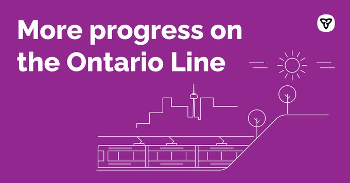
I see a train profile with flat front and pantograph, which looks more like Rome, than Lima.

Fcsr4G5XgAIX7A4
 
HUGE day, Rolling Stock and South Construction Contracts preferred proponents which most notably include Hitachi and the companies that worked with them to build Metro in Copenhagen and Rome


View attachment 426986
The trains from Hitachi used on Line C in Rome have Overhead Line power and seem like a reasonable expectation for the OL, though there will likely be at least some visual changes!
If I'm not mistaken, the numbers in the OL PDBC pointed towards Hitachi (formerly AnsaldoBreda) as the favourite to be the vehicle supplier due to it being the only vehicle capable of running driverless 90sec headways (most are 120sec) with steel wheels (as opposed to rubber tracked).
 
The original render was pretty Escheresque. The interior looked bigger than the exterior.
What’s disturbing is the lack of significant change in plans despite major pushback from the city. Apparently our strong mayor isn’t that strong after all.

- Paul
I don't like the looks of the counter-proposal; maybe because it's non-symmetrical.
I'd prefer they widen the median and place station building there. We'd have two narrower roadways instead on one wide one, which is a win for everyone.
 
I don't like the looks of the counter-proposal; maybe because it's non-symmetrical.
I'd prefer they widen the median and place station building there. We'd have two narrower roadways instead on one wide one, which is a win for everyone.

The counter proposal is linked with the idea of creating a long linear park on the east side of University avenue by moving the northbound lanes to the west and replacing the large centre medians of University.

Fore-Now-3_Univ-Park-Toronto_Plan_Proposed_RESIZE.jpg


Further, I think the counterproposal's key point is that the Osgoode Hall grounds and the large amount of greenspace does not need to be cleared in order to house the station entrance. For reference, this is how lush that area of the grounds is currently:

Screenshot_20220916-185143.png


Screenshot_20220916-185300.png
 
The counter proposal is linked with the idea of creating a long linear park on the east side of University avenue by moving the northbound lanes to the west and replacing the large centre medians of University.

View attachment 427343

Further, I think the counterproposal's key point is that the Osgoode Hall grounds and the large amount of greenspace does not need to be cleared in order to house the station entrance. For reference, this is how lush that area of the grounds is currently:

View attachment 427347

View attachment 427349
Now think of how much wider the median would be if it's expanded over both directions' left lanes. Turn that into the linear park. Add more pedestrian crossings connecting the median to both sides of University.
Osgoode Hall gets to keep the trees; University Av is narrowed; they can even do proper two-stage crossings.
 
If I'm not mistaken, the numbers in the OL PDBC pointed towards Hitachi (formerly AnsaldoBreda) as the favourite to be the vehicle supplier due to it being the only vehicle capable of running driverless 90sec headways (most are 120sec) with steel wheels (as opposed to rubber tracked).
Is Innovia no longer specced for that? It certainly was under ICTS branding.

Though it doesn’t have an overhead electrification option…. And the politics of bringing more ICTS to Toronto would be fun.
 
From Infrastructure Ontario twitter.
I see a train profile with flat front and pantograph, which looks more like Rome, than Lima.

Fcsr4G5XgAIX7A4
I don't think we should read that much into a stylised graphic. We know it will have a pantograph, Metrolinx has been clear about that. The design of the front, who knows? This really doesn't tell us anything useful. Unless we are to take this entirely seriously and assume Metrolinx will cut every tree along the line into a perfect sphere. Could it have a flat front? maybe. But this image is not some sort of proof. Worth noting, the train shown here has no doors.
 
I wouldn't be surprised if the TTC orders more TRs (or slightly updated versions) to replace the T1s (or orders new trains for Yonge and cascades the TRs onto Bloor), seeing how the TRs have been the TTC's most reliable subway stock.
I’d like to see some interior design improvements. The Montreal metro cars feel much more comfortable and modern. I’d also add more passenger amenities, such as hand sanitizer dispenses (very appreciated on the UPX, WiFi and mobile device chargers.


LCD screens that are actually useful would be nice too.

And then do the same thing for the Ontario Line.
 
This has always been the problem with Metrolinx's numbers. They are suspicious, and frankly not very realistic when compared to real world numbers.

The TTC uses a capacity of 1100 people for a 6-car T1 train. This is in order to allow for "bulges" in traffic flow, and to allow people to relatively easily get on and off of the trains.

Metrolinx suggests that they are going to get 1200 people in a train that is about 1/3 shorter, and potentially narrower. There is no way that is going to be possible on a regular basis.

Bombardier claims a capacity of almost 1500 in a TR with 1.8ft^2 per standee.....how much room do you think those 1200 people in an Ontario Line train will have?

Dan
I mean width should be practically the same. I do agree that as always Metrolinx' numbers feel off (though whether its up or down depends on the number) that being said, I do think we could eke out a lot more capacity from a train with a better layout for short trips - i.e. longitudinal.
 
If I'm not mistaken, the numbers in the OL PDBC pointed towards Hitachi (formerly AnsaldoBreda) as the favourite to be the vehicle supplier due to it being the only vehicle capable of running driverless 90sec headways (most are 120sec) with steel wheels (as opposed to rubber tracked).
Other systems are def capable of 90s. The REM folks have brought it up to me.
 
The original render was pretty Escheresque. The interior looked bigger than the exterior.
What’s disturbing is the lack of significant change in plans despite major pushback from the city. Apparently our strong mayor isn’t that strong after all.

- Paul
I don't think it's some case of Metrolinx implying the stations are some kind of TARDIS, but more that they initially showed the renderings from the most flattering angle, the 3/4 view. There's a reason most press photos of cars are taken from the same angle. It hides unwanted bulk. I don't think the two renderings show a structure any different in scale, one is just far more flattering to it's size than the other is. Now , it's totally fair to have issue with the angle Metrolinx to show the design from as artificially minimising the bulk of the station building, but I don't think this is some kind of bait-and-switch in terms of how big the building is, just some deceptive marketing (which is it's own separate problem). Ideally Metrolinx would just provide us with some diagrams of the stations instead of just shiny renders, but that would require a level of transparency they seem to hate.
 
Now think of how much wider the median would be if it's expanded over both directions' left lanes. Turn that into the linear park. Add more pedestrian crossings connecting the median to both sides of University.
Osgoode Hall gets to keep the trees; University Av is narrowed; they can even do proper two-stage crossings.

It wouldn't provide the same space as since you have 2 distinct roadways on either side, you'd have to put buffer items like planters and requirements for curbs on both sides of the linear park making that section of the new park less ideal for use. Additionally, the University avenue itself acts as a barrier to reaching this park. It takes an additional pedestrian crossing to get to the park reducing it's overall appeal as a public space. The current linear park is also broken up by numerous U-turn lanes between the intersections that are not signalled, causing added pedestrian safety concerns. Finally, having the station entrances box in the middle of the intersection means anyone wanting to transfer onto the westbound streetcar would be forced to have to cross the northbound University lanes to get to the stop.

If the northbound lanes are moved over to the west, and the park is built on the east side of University, you get a much larger overall park area as you'd only have to buffer one side of the new park with curbs and planters. Additionally, the current wide sidewalk on the east side is also added to this new linear park further increasing its overall width and area. And, as it is incorporated with the east sidewalk, anyone walking out of a building on University's east side is directly in the park. No barrier or intersection to cross. Finally, having the linear park on the east means the Osgoode station entrance is on the north east corner, meaning right on the doorstop of the westbound streetcar stop.
 
Last edited:

Back
Top