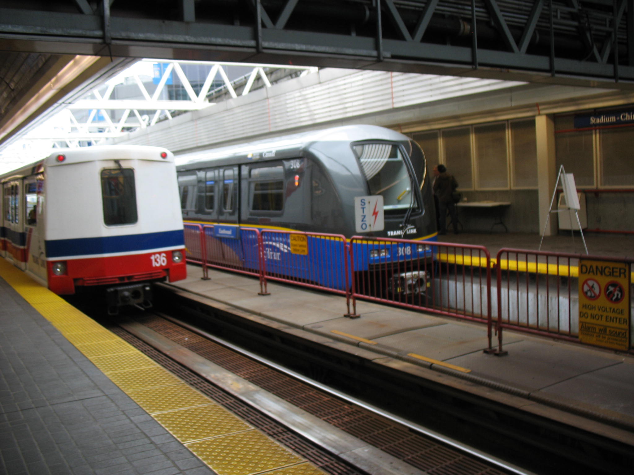
^ I suppose you'd have no issue, then, if your train pulled up to the station coated in grime, with peeling, chipped, or faded paint, or with visible rust spots, provided the interior was maintained to a certain standard?

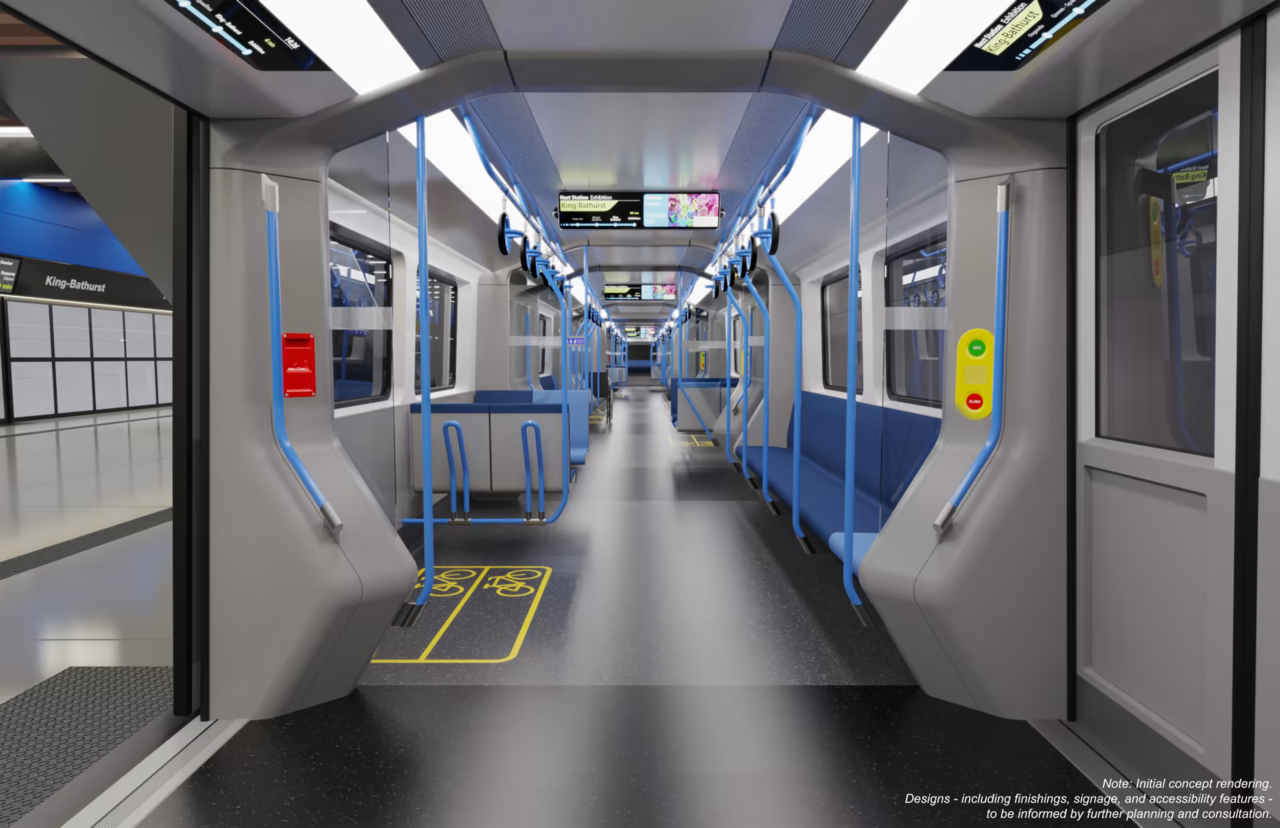
Not that the interior is anything to write home about, either. There's a lot of nice looking metro interiors around these days, like the Mark 3 in Vancouver or the Azur in the Montreal Metro. These ones make the T1 interior look bright and welcoming, itself a challenge. Hell, the TR interior is bounds and leaps more inviting than this.
1678815273484.png
 
A couple of additional renders, the direct link and then some comments:

1678815800389.png


1678815862723.png


Direct Link: https://gfgrail.it/ontario-line/

Note: Scroll to bottom then as you can see there are arrows and you can shift through a few different images, some of which we've already seen.

Comments:

I agree with @T3G the interior reads as cold. A change from blue to TTC burgundy would help, a bit, but it needs more, that that white needs a bit of cream in it, and some of the grey needs to exit for something else with a warmer hue.

I would really prefer recessed lights.

This pic of a Vancouver Skytrain interior shows blue seating, but yet doesn't read as coldly.

1678816164350.png

Taken from:
 
Last edited:
I suppose you'd have no issue, then, if your train pulled up to the station coated in grime, with peeling, chipped, or faded paint, or with visible rust spots, provided the interior was maintained to a certain standard?
Not really a top priority, but this is a not a relevant point because no design will entail the trains being poorly maintained. I don't care if the trains are zoomy or whatever else railfans care about. Users will not interact with the outside of the train much if at all due to PSDs.
 
A couple of additional renders, the direct link and then some comments:

View attachment 461490

View attachment 461491

Direct Link: https://gfgrail.it/ontario-line/

Note: Scroll to bottom then as you can see there are arrows and you can shift through a few different images, some of which we've already seen.

Comments:

I agree with @T3G the interior reads as cold. A change from blue to TTC burgundy would help, a bit, but it needs more, that that white needs a bit of cream in it, and some of the grey needs to exit for something else with a warmer hue.

I would really prefer recessed lights.

This pic of a Vancouver Skytrain interior shows blue seating, but yet doesn't read as coldly.

View attachment 461492
Taken from:
Don't we already know that the blue grab rails will be changed to yellow for visibility and accessibility?
 
Not really a top priority, but this is a not a relevant point because no design will entail the trains being poorly maintained. I don't care if the trains are zoomy or whatever else railfans care about. Users will not interact with the outside of the train much if at all due to PSDs.
What does it mean for a train to be “zoomy “?

Yes, we should consider ourselves fortunate for the PSD. With a more worthwhile train design they might even be a shame.
 
My hot take: trains are appliances and how they look on the outside is very unimportant compared to user experience.
Can't agree here. They gotta look sharp from the outside. Not saying these don't just focused on your post. Look at GO a few years ago. Drab faded kelly green, old locos. If it looks like that on the outside, how does it look on the inside: says the person opting for another mode. You want to represent, and entice. Not a big fan of the colour scheme now. But looks glossy, clean, cab cars and locos create a unified fresh unit.

OL will have not one but four bridges, two crossing an expressway, and one long guideway strafing the street. People will be seeing it everywhere. Exterior design and its effect on perception is probably the biggest bang for your buck when it comes to these things.
^Don't you love renders. So very wide.

As shown, the loading gauge must be at least 5' 6".

- Paul
Yea that train looks very wide on the inside. It's like Snowpiercer
 
Can't agree here. They gotta look sharp from the outside. Not saying these don't just focused on your post. Look at GO a few years ago. Drab faded kelly green, old locos. If it looks like that on the outside, how does it look on the inside: says the person opting for another mode. You want to represent, and entice. Not a big fan of the colour scheme now. But looks glossy, clean, cab cars and locos create a unified fresh unit.

OL will have not one but four bridges, two crossing an expressway, and one long guideway strafing the street. People will be seeing it everywhere. Exterior design and its effect on perception is probably the biggest bang for your buck when it comes to these things.

Yea that train looks very wide on the inside. It's like Snowpiercer
I'll go half way and say that for the vast majority of people a subway car doesn't have to look "cool" but it has to look well maintained. Dirty, poorly maintained cars with graffiti etc. will turn off riders, and contribute to the perception that transit is something for "poor people" or those that can't afford a car. Transit is in constant competition with alternative transit modes and must present itself as a safe, clean and viable transit option.
 
I'll go half way and say that for the vast majority of people a subway car doesn't have to look "cool" but it has to look well maintained. Dirty, poorly maintained cars with graffiti etc. will turn off riders, and contribute to the perception that transit is something for "poor people" or those that can't afford a car. Transit is in constant competition with alternative transit modes and must present itself as a safe, clean and viable transit option.
This has nothing to do with the body kit they put on the front of the train, though. Cleanliness and maintenance is a user experience touchpoint, and not a function of which cool looking train was selected.

I'm not saying that exterior aesthetics are completely irrelevant, just a very low priority.
 
Just want to make a note that the reason they are they're going with Blue and White renderings to try and subvertly communicate and wash into peoples minds this is a Conservative government infrastructure piece. Nothing more, nothing less. It's all about subtle communication with this government to entrench their grip on power on the electorate, and it's been working.

Some may say it matches the colors that the Ontario Line will operate under, and to that I say look at Line 5 and Line 6.
It was pretty obvious when they made those awful license plates.
 
Just want to make a note that the reason they are they're going with Blue and White renderings to try and subvertly communicate and wash into peoples minds this is a Conservative government infrastructure piece. Nothing more, nothing less. It's all about subtle communication with this government to entrench their grip on power on the electorate, and it's been working.

Some may say it matches the colors that the Ontario Line will operate under, and to that I say look at Line 5 and Line 6.
The crosstown trains were first rendered with a green livery. Anything can change.

What's not subtle? After the 2003 Ontario provincial election, the Ontario website's (gov.on.ca) colour theme was changed from blue to red in short time; with no layout changes.
 
Last edited:
The first meeting of the City's Ontario Line committee is next week. This report has some background:

Found this interesting. The last IO report we have says development phase in January 2024 with a year of development phase for both. Moving the timelines up or no?
North Pape Tunnel and Underground Stations contract – The scope of work for this contract includes three kilometres of twin tunnels underneath Pape Avenue between the Gerrard portal and the Don Valley bridge, underpinning of the existing TTC Pape Station on Line 2, two underground stations (Pape and Cosburn) and two portals. Request for Qualifications (RFQs) for the contract package was issued on November 17, 2022 and is expected to close by Q2 2023.
and
 North Elevated Guideway and Stations contract – The scope of work for the contract includes three kilometres of an elevated guideway (tracks and bridge structures) and five elevated stations (i.e., Riverside-Leslieville, Gerrard, Thorncliffe Park, Flemingdon Park, and Science Centre). RFQs were issued on November 17, 2022 and are expected to close by Q2 2023
 

Back
Top