You are using an out of date browser. It may not display this or other websites correctly.
You should upgrade or use an alternative browser.
You should upgrade or use an alternative browser.
- Thread starter JasonParis
- Start date
DirectionNorth
Senior Member
I don't feel that transit cost escalation is linked to extravagant design here. Maybe on TYSSE. I am only starting my research on this subject, but I believe the real cost savings are in good project design, depoliticisation, and management, while our classic value engineering crap is late in that process.Until we can build metro systems on par with French construction costs, I really don't see the point in complaining about the aesthetics of bridges
It should be possible to build functional and good looking transit for French prices - the new RER E stations make TYSSE look like a hovel, let alone the OL - though I do agree that this bridge is hardly an offender and certain other projects (looking at your exposed concrete and Toronto-grey LRVs, Eglinton) are worse.
Last edited:
Northern Light
Superstar
@DirectionNorth being the worldly fellow that he is made a fine reference to stations along the RER E, but failed to show an example. I will thoughtfully correct his oversight, LOL:
Source/Credit embedded.


Link: https://parisladefense.com/fr/decouvrir/projets/gare-eole-defense
Source/Credit embedded.
Link: https://parisladefense.com/fr/decouvrir/projets/gare-eole-defense
PL1
Senior Member
BuT tHe PuBlIc MoNeY!!@DirectionNorth being the worldly fellow that he is made a fine reference to stations along the RER E, but failed to show an example. I will thoughtfully correct his oversight, LOL:
Source/Credit embedded.
View attachment 566495
View attachment 566497
View attachment 566496
Link: https://parisladefense.com/fr/decouvrir/projets/gare-eole-defense
dullturtle06
Active Member
Well, I feel like they could have used faux or real stone/ concrete designed piers with black steel arches. Similar to the bloor viaduct with longer arches. It would compliment the bloor bridge and look very nice. It's not an issue with modern engineering just a lack of vision and toronto's love for Grey. The it's less visually entrusting is an excuse for crappy design. If it was nice it would be a pleasure to look at, and would be lit up at night.That wouldn't be feasible but technically possible. Look at how much closer the piers are in comparison to the Ontario line renders. You'd have to somehow span across the DVP with those piers being much closer together. That would result in a pier placed between every few lanes (not sure how many exactly) of the DVP which would be a major disruption and reconfiguration of that section of the DVP. Also considerably more expensive.
T3G
Senior Member
On further reflection, I think that rather than having a fancy bridge (if in fact it remains one) at the lower Don crossing, I would have preferred it here. The lower Don area is already urbanized, and crossed by a number of unremarkable bridges (Dundas, Gerrard, Queen, and the GO corridor). In a big natural space like this, a giant concrete bridge like the one shown is a real attention stopper and not in a good way (not that the Leaside bridge itself is very interesting, but that's all said and done, and this is still to come).
I would also be curious to see what kinds of speeds will be attained here. Given the long grade and its curvy nature, I assume not very high.
I would also be curious to see what kinds of speeds will be attained here. Given the long grade and its curvy nature, I assume not very high.
reinventingthewheel
Senior Member
~4% grade over the valley, no special track work, and only one curve between stations with 200+ metre turn radius. The westbound train may reach its highest speed on this section.I would also be curious to see what kinds of speeds will be attained here. Given the long grade and its curvy nature, I assume not very high.
Drawings of the rail profile can be found here.
allengeorge
Senior Member
This is the most disappointing design that anyone could have come up with. I agree with the posters above that we VE public works - to our detriment! People walk into public projects and walk out with no sense of attachment to the object or the process.
There is a way to make public projects beautiful without breaking the bank.
Designing a station to be more than the Metronlix concrete specials is not going to break the bank on our transit projects. There are SO MANY more things that would make a dent in these costs. It’s just easy for politicians, journalists (and the public) to point to something visible and claim it’s the cost driver as opposed to thinking critically and trying to solve the real, hard problem.
There is a way to make public projects beautiful without breaking the bank.
Until we can build metro systems on par with French construction costs, I really don't see the point in complaining about the aesthetics of bridges
Designing a station to be more than the Metronlix concrete specials is not going to break the bank on our transit projects. There are SO MANY more things that would make a dent in these costs. It’s just easy for politicians, journalists (and the public) to point to something visible and claim it’s the cost driver as opposed to thinking critically and trying to solve the real, hard problem.
T3G
Senior Member
Would the 4% grade not be exactly what prevents the high speed operation to begin with? Granted, I have not studied the entire world to see how things operate, but in my experience, what I have found is that rail vehicles descending down steep slopes are subjected to speed restrictions to avoid runaways.~4% grade over the valley, no special track work, and only one curve between stations with 200+ metre turn radius. The westbound train may reach its highest speed on this section.
Drawings of the rail profile can be found here.
smallspy
Senior Member
Provided that the equipment has enough power to sustain higher grades, a 4% incline will not be an impediment - especially since the trains accelerating away from Cosburn will first have a section of almost-level track on which to accelerate.Would the 4% grade not be exactly what prevents the high speed operation to begin with? Granted, I have not studied the entire world to see how things operate, but in my experience, what I have found is that rail vehicles descending down steep slopes are subjected to speed restrictions to avoid runaways.
On the Toronto subway (and New York, who's a large part of our subway signalling is based on) there is a concept called "Grade Time". And it does force a speed restriction, but that restriction is basically just less than "full speed". Think about the section heading south from St. Clair West to Dupont prior to the ATC/ATO going live - the operators wouldn't have to brake for the grade time signals through there. That's likely what the signalling system through this section will allow.
Dan
44 North
Senior Member
Loving the bridge renders. Look exactly as the mind's eye imagined it.
That being said, does seem Mlinx continually reduces the catenary masts and wires in the renders. They'll stand out a lot more IRL unfortunately.
CharmAlarm
Active Member
I think the design mentality at Metrolinx speaks for itself in statements like this (from the Star article):
The balanced cantilever method “accommodates a curved alignment ... We don’t have a lot of those type of structures (in Canada), so people don’t usually see that curved bridge and other fancy bridges that you see in Europe,” Wu said.
Because, you know, God forbid we should see something 'fancy' in Ontario...
Adjei
Senior Member
I think the design mentality at Metrolinx speaks for itself in statements like this (from the Star article):
The balanced cantilever method “accommodates a curved alignment ... We don’t have a lot of those type of structures (in Canada), so people don’t usually see that curved bridge and other fancy bridges that you see in Europe,” Wu said.
Because, you know, God forbid we should see something 'fancy' in Ontario...
It’s not just Metrolinx. It’s Toronto and Ontario as a whole. I would even extend it to all of Canada excluding maybe Quebec.
reinventingthewheel
Senior Member
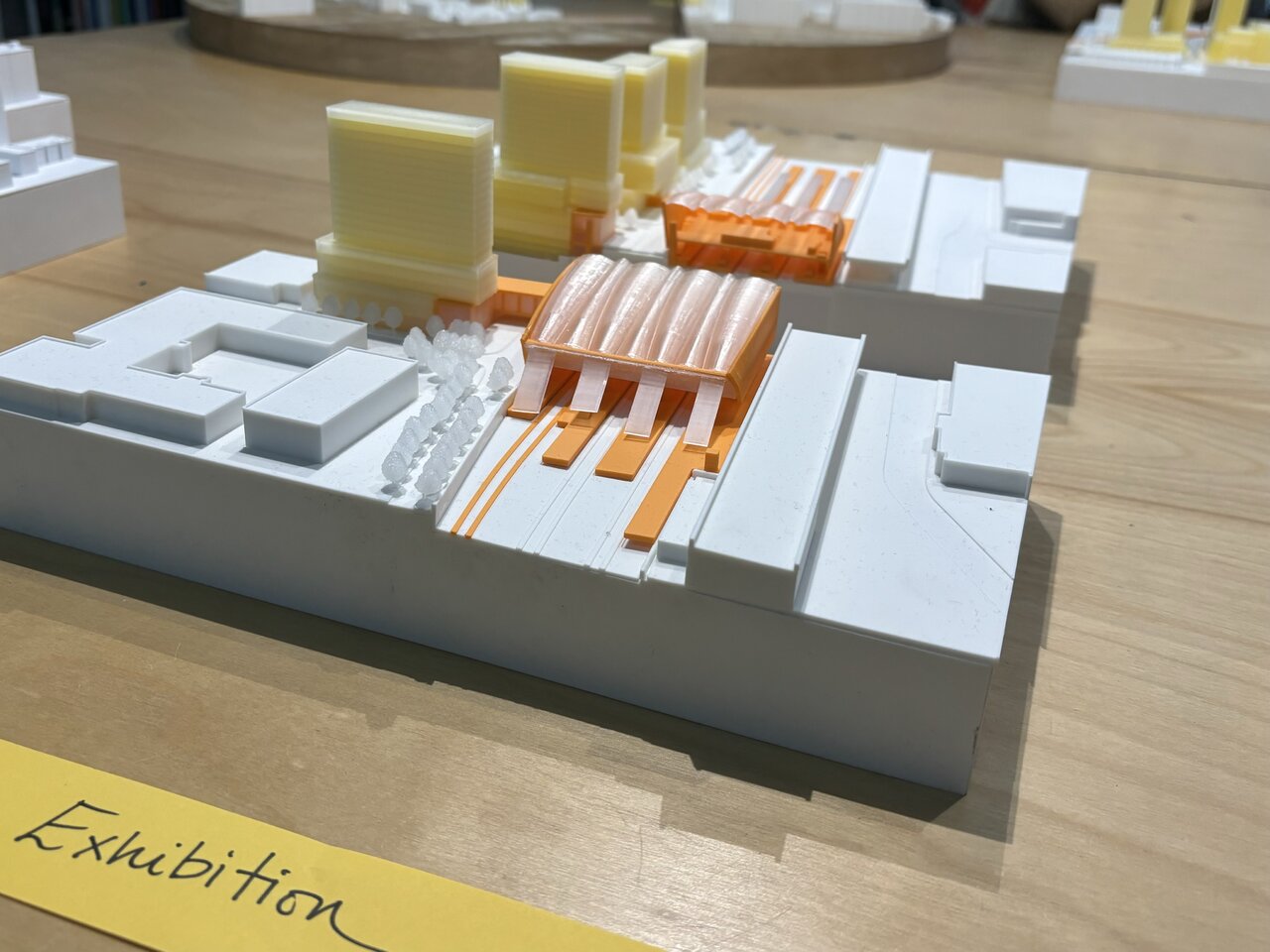
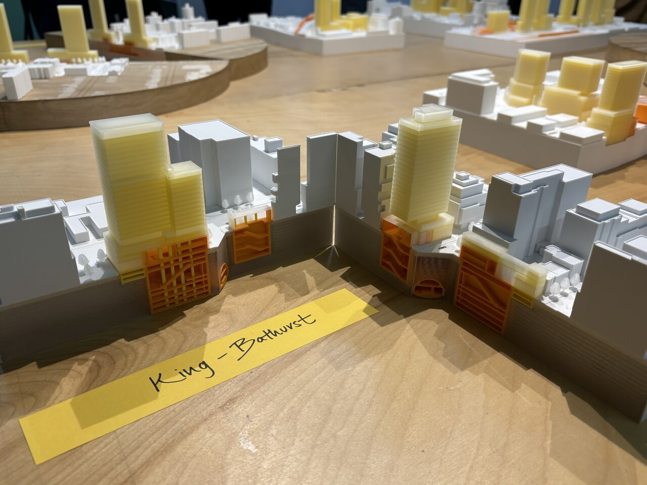
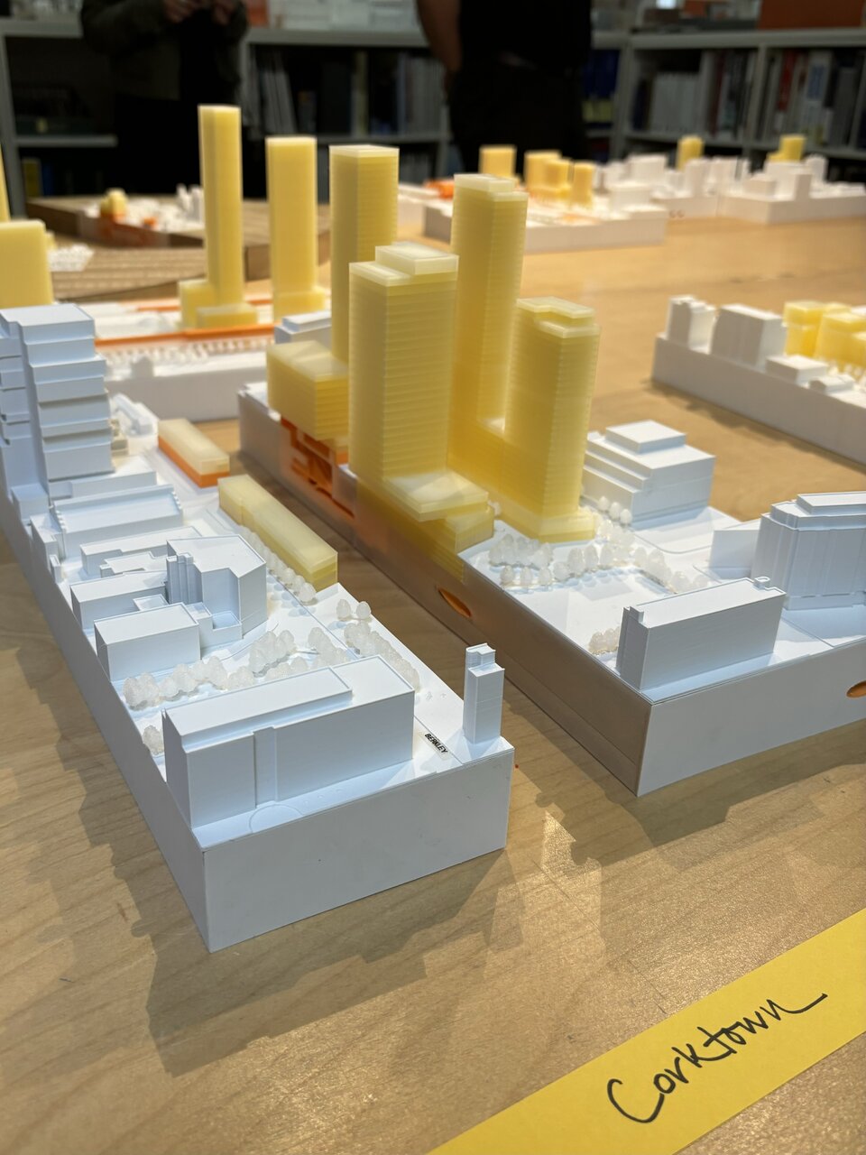
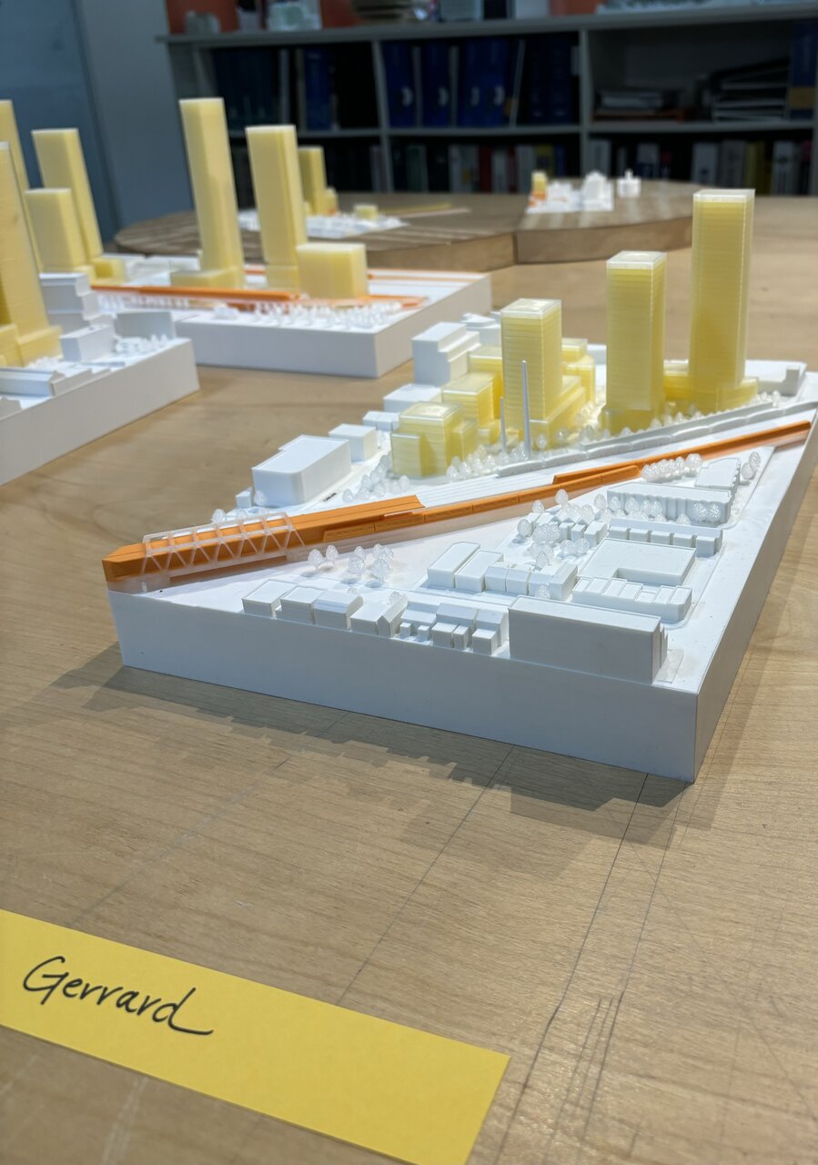
Another dump of Ontario Line content:
SvN Architects office is open for Doors Open TO, they are behind the design for many of the Ontario Line’s TOCs. They have cross-sectioned miniatures of each on display today and tomorrow along with many other projects.
Exhibition:
King-Bathurst:
Corktown:
Gerrard (South):
Pape:

Cosburn:
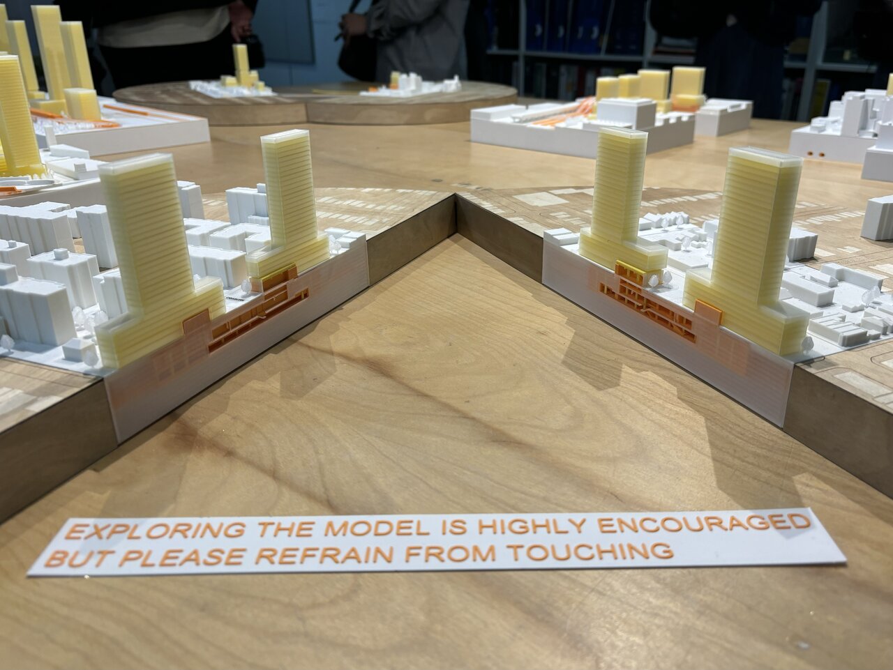
Thorncliffe:

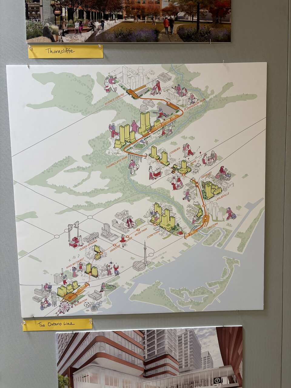
And a neat artistic depiction of the Ontario Line:
I believe they have also designed the Queen-Spadina TOC but it was not displayed.
The office is on Adelaide across from St James park in case anyone is interested tomorrow.
SvN Architects office is open for Doors Open TO, they are behind the design for many of the Ontario Line’s TOCs. They have cross-sectioned miniatures of each on display today and tomorrow along with many other projects.
Exhibition:
King-Bathurst:
Corktown:
Gerrard (South):
Pape:
Cosburn:
Thorncliffe:
And a neat artistic depiction of the Ontario Line:
I believe they have also designed the Queen-Spadina TOC but it was not displayed.
The office is on Adelaide across from St James park in case anyone is interested tomorrow.
Last edited:
Natika33
Active Member
Yes, that's my recollection as well. Thank you too for your photos of the models along the line from Doors Open today. Really neat!Your point stands about value engineering. However the criteria for this Don Valley bridge valued an unobtrusive design with low visual impact more than a cheap design. Consider that the lower Don Valley bridge for this same project has a much more stand out design, because the setting is more appropriate.