You are using an out of date browser. It may not display this or other websites correctly.
You should upgrade or use an alternative browser.
You should upgrade or use an alternative browser.
- Thread starter PMT
- Start date
VoicesCarry
Active Member
Looks like a prison.
Northern Light
Superstar
This one is dragging on like Molasses..............
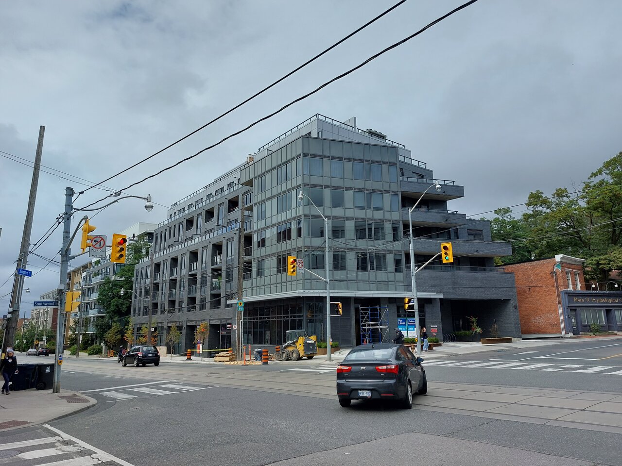
A couple of images, Nov 2nd, 2021:
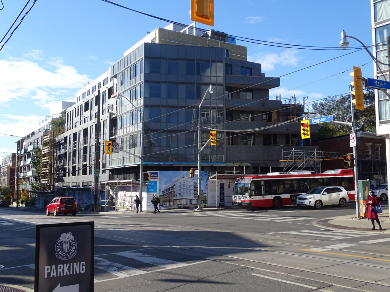
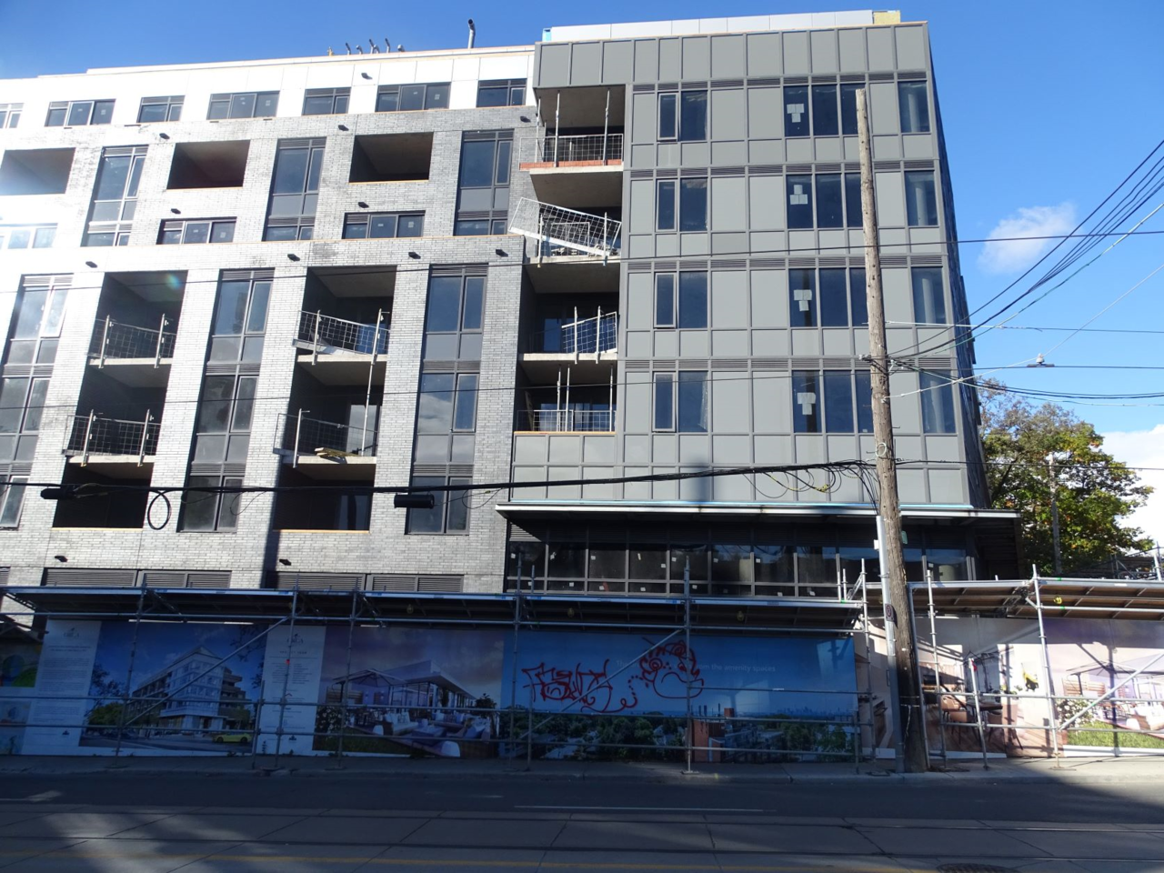
A couple of images, Nov 2nd, 2021:
VoicesCarry
Active Member
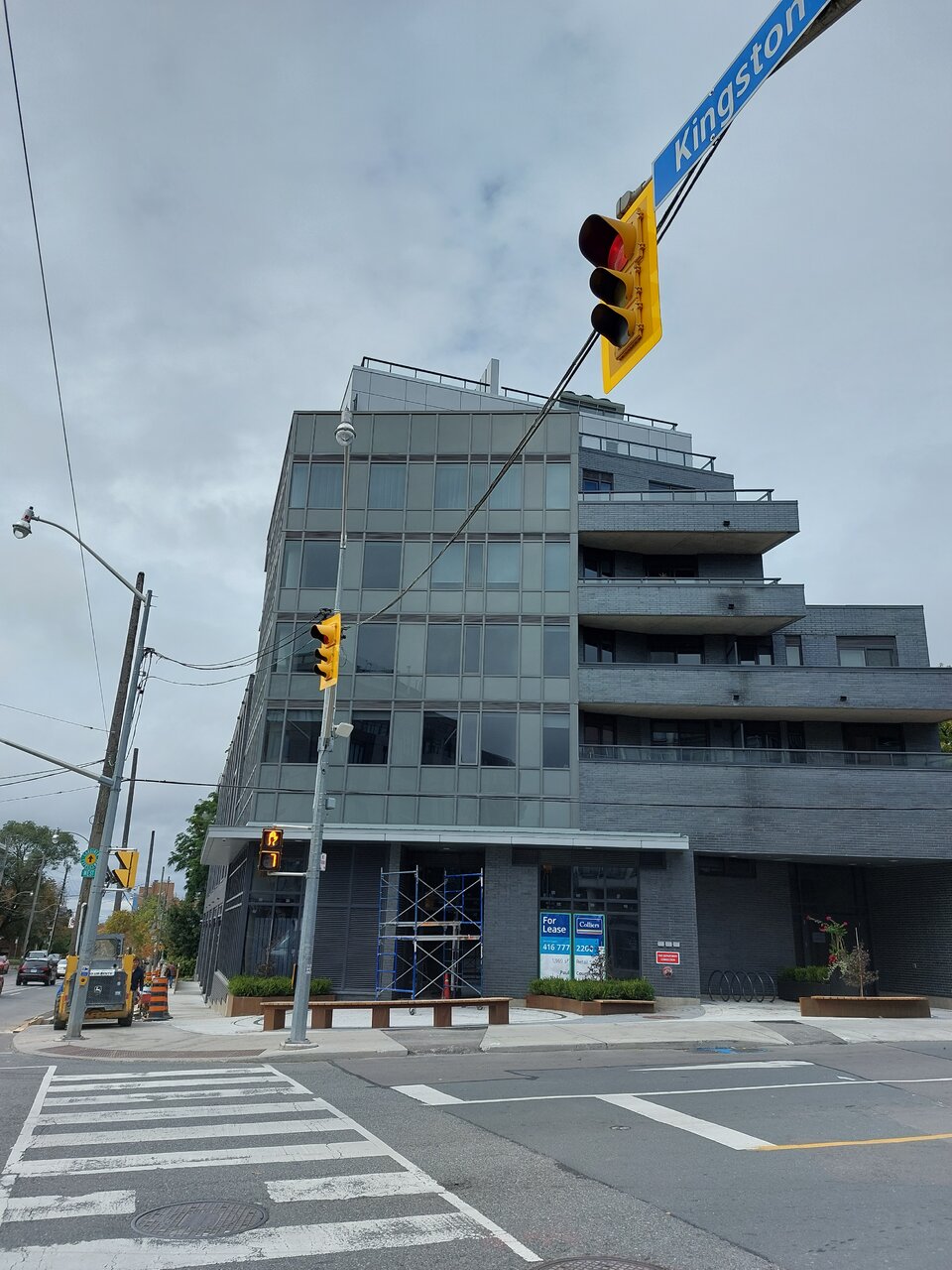
That corner is like a scab.
Toronto1834
Active Member
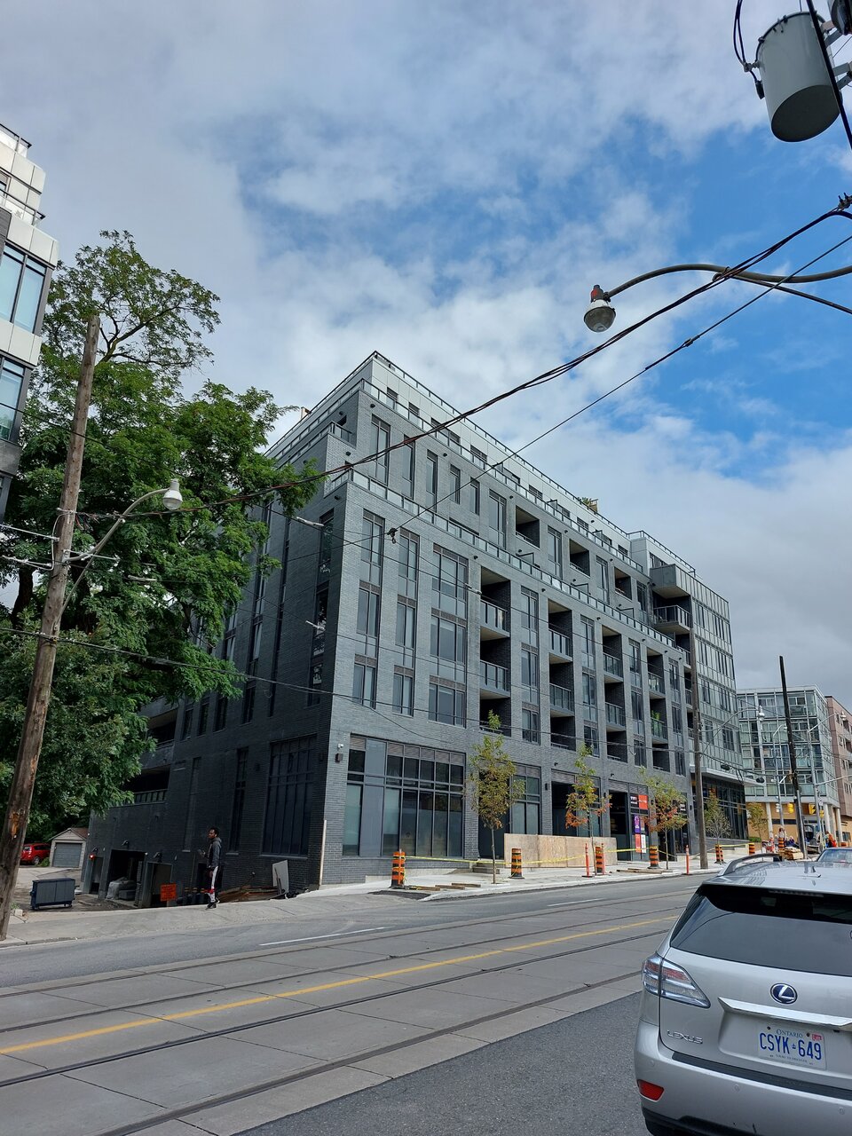
The part facing Kingston is not bad- why did they have to mess up the corner?That corner is like a scab.
AlbertC
Superstar
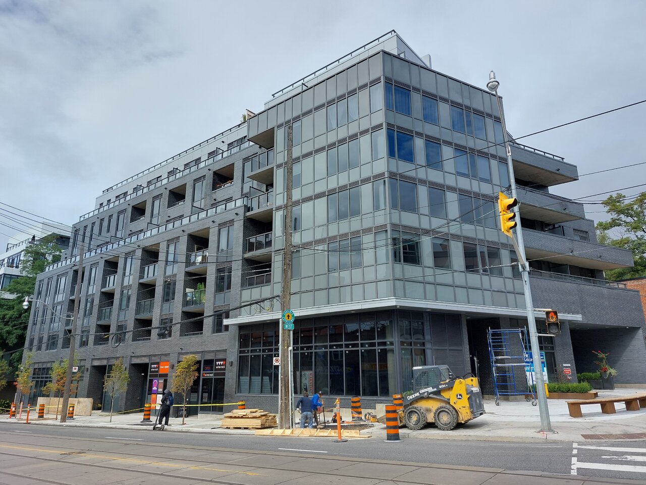
Because Demirov, despite their geothermal initiatives with the building's internal function, has chosen to cheapen out on the corner cladding. And the result is this spandrel dominant trainwreck. Frankly, if they just ditched the change in design motif at the corner, and just stuck with a continuation of brick with regular window wall all the way throughout the building, this would've been perhaps 50% less offensive overall.
VoicesCarry
Active Member
Looks like Darth Vader.
UtakataNoAnnex
Superstar
Vader wouldn't do spandrel though. >.<Looks like Darth Vader.
C
christiesplits
Guest
Wow, this is terrible. A shame we don't have the Pugly Awards anymore, this would be a first ballot winner.
AlbertC
Superstar
Northern Light
Superstar
Are they ever taking their time getting this one wrapped up.
If only they'd put that much time into a thoughtful design.........
AlbertC
Superstar
innsertnamehere
Superstar
I admit this has become better as it finishes up. That spandrel on the corner is terrible but the rest of it looks decent.
AlbertC
Superstar
The Wine Rack has moved in as one of the retail tenants here:
