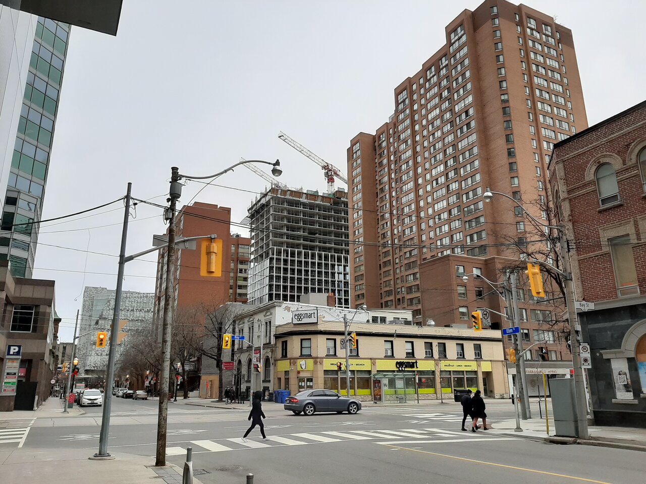
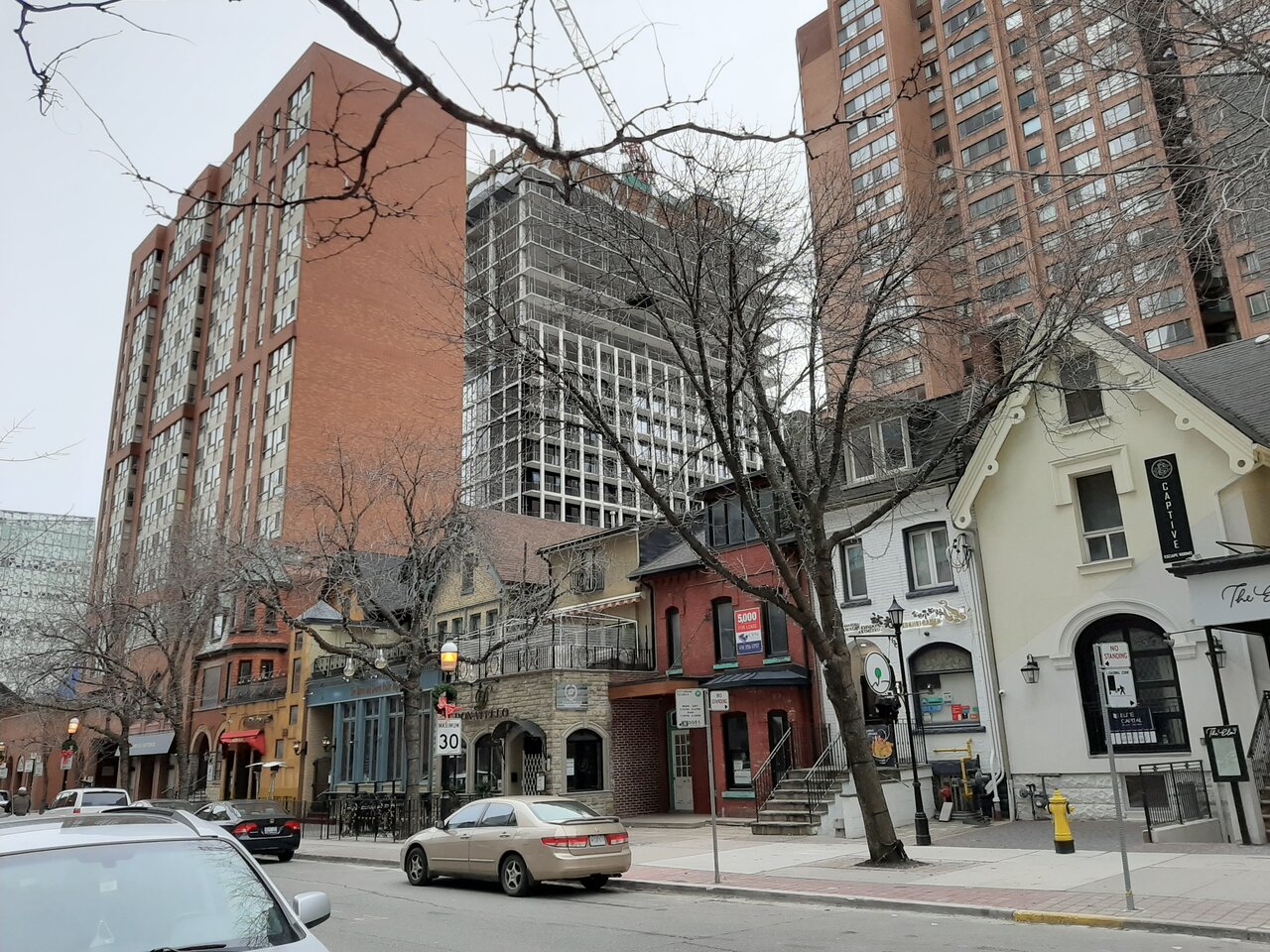
Jan 1, 2021

20210101_135651.jpg
20210101_135804.jpg
20210101_140050.jpg
20210101_140107.jpg
20210101_140130.jpg
20210101_140145.jpg
20210101_140151.jpg
20210101_140214.jpg
20210101_140227.jpg
20210101_140231.jpg
 
Interesting.
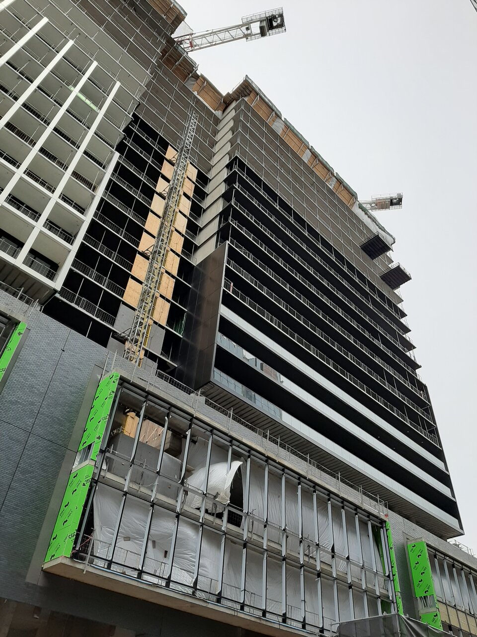
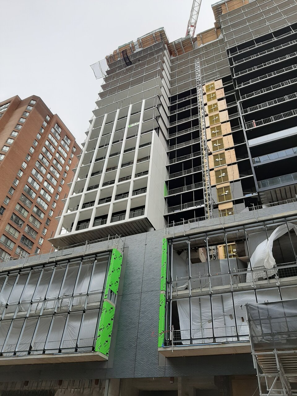
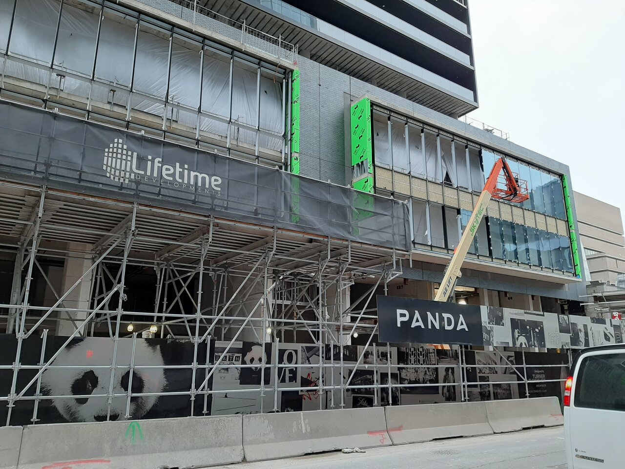
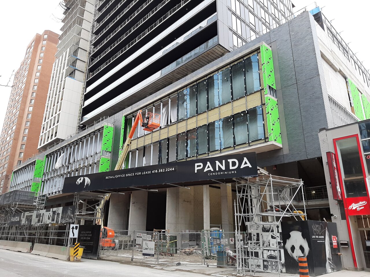
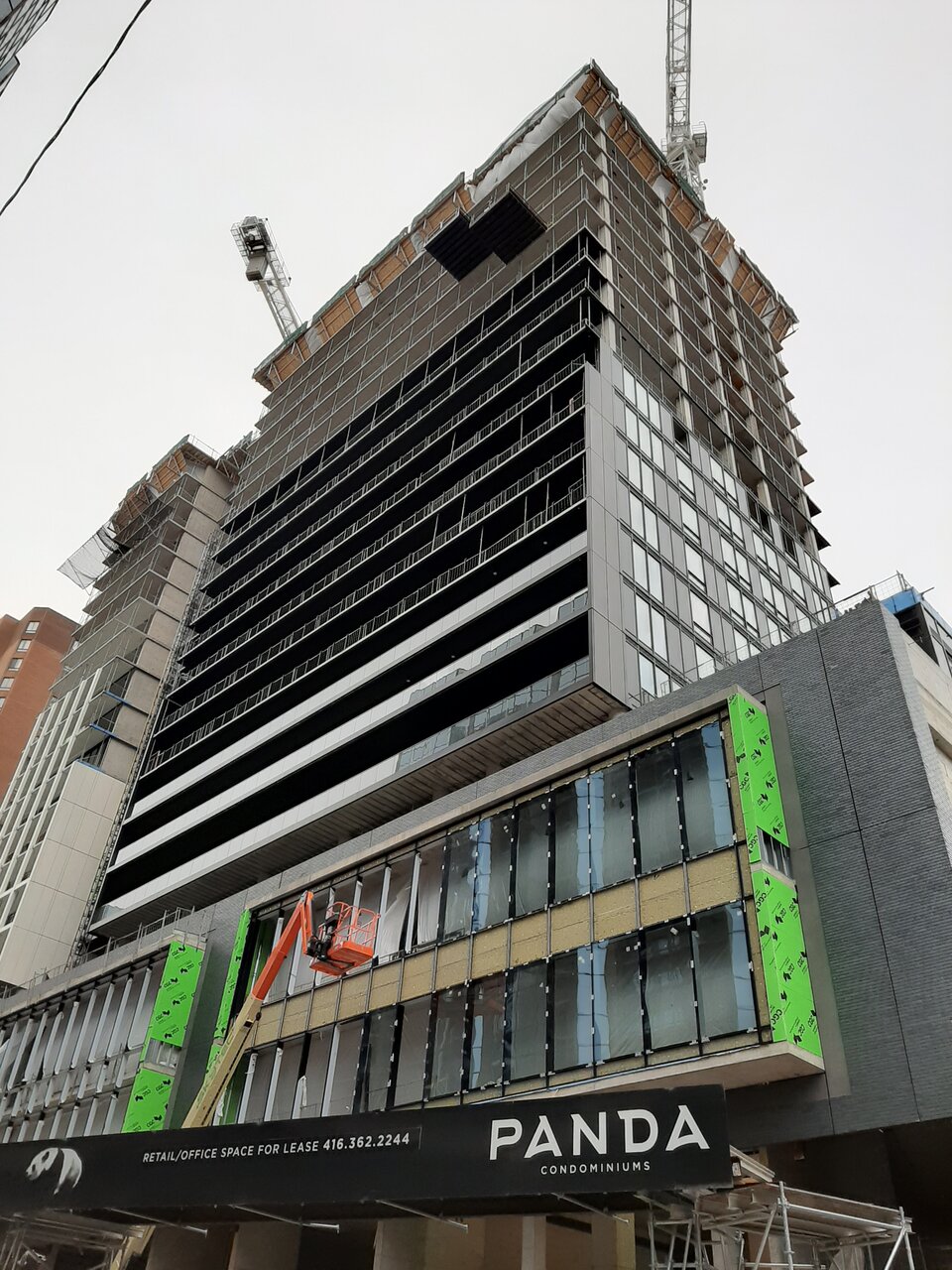
Not anything I'd write home about per se, but definitely much nicer than I originally expected :)
 
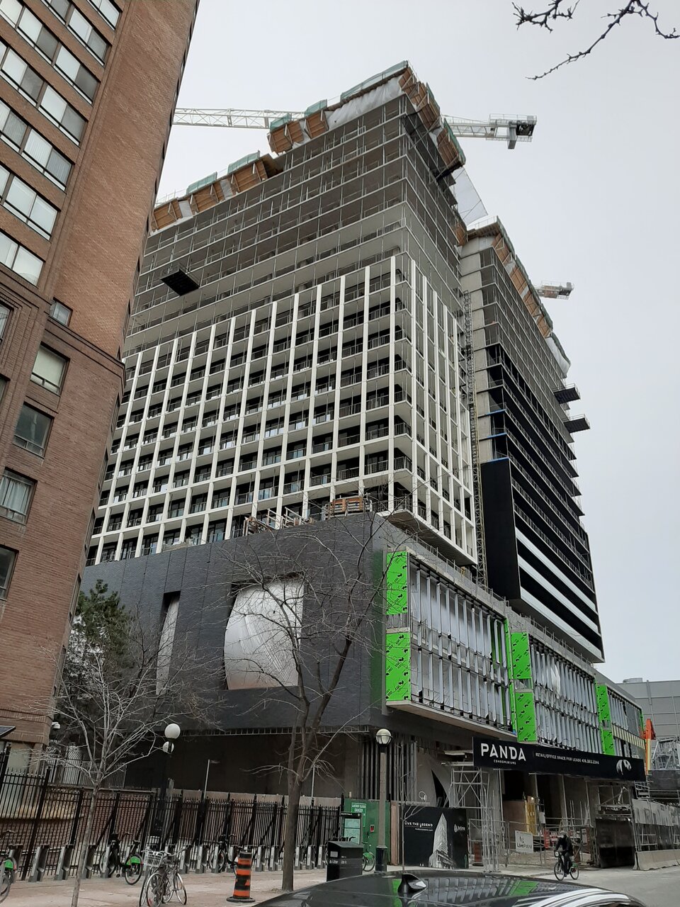
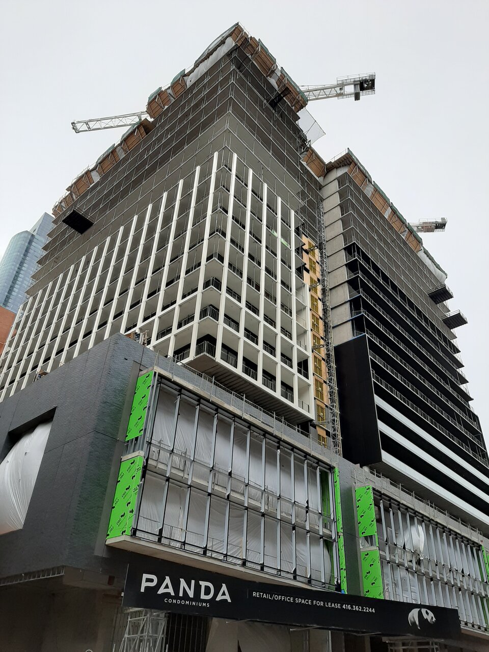
I really like the white grid pattern. This saves the building aesthetically. It seems to have two personalities Overall I'm happy abut this.
 
The whole building should have been designed that way.

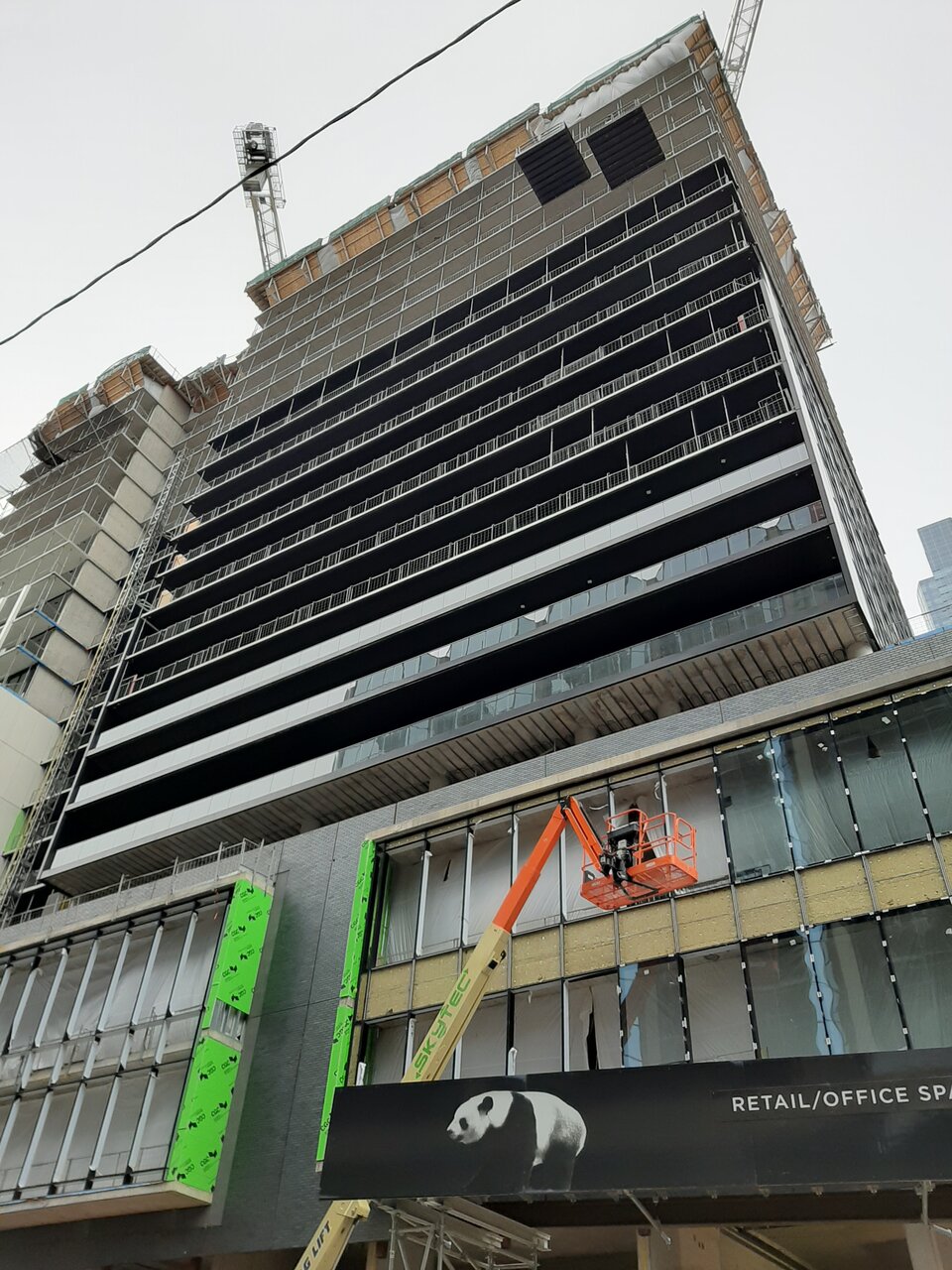
Yeah, it's really just the east frontage -- with its unfortunate paneling -- that's holding this back. It's turning out pretty well in absence of that.
 
Yeah, it's really just the east frontage -- with its unfortunate paneling -- that's holding this back. It's turning out pretty well in absence of that.

You mean the side that is the most visible? Should have gone with the white look across the entire project.
 

Back
Top