I like minimalism as well (quite a lot) -- but again -- that pretty much sums up the entire City of Toronto's catalog of buildings over the past 50 years. It's time we move on from our fetish with modernism and try something different. Ever since the TD Centre went up, it seems our collective driving force behind architectural design of our buildings has been linked to Mies. It's 2015, not 1967 anymore. It would be nice to see more buildings be a bit more striking and fluid in form. Less is more isn't always necessary. Even just simple gestures like rounded corners (as were common in the Deco era) on more buildings would help break up all the straight lines that are present in basically every condo and office tower in Toronto. Simple details like that could still be in line with minimalist designs (the Sisters of St. Joseph building by Shim-Sutcliffe incorporated this idea and it looks fantastic). It would be great if towers and low rise condos would implement this sort of aesthetic. This building on St. Clair W comes to mind:
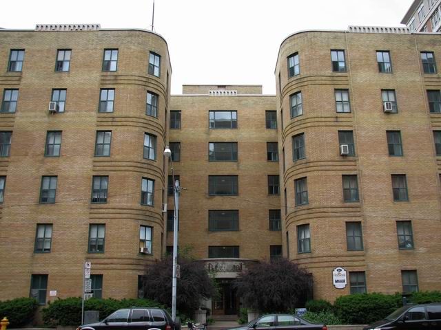
jun1606StClairAveFleetwoodi.jpg~original

Photo: http://i82.photobucket.com/albums/j251/dawnd_01/Autumn 2007/SUMMER 2012/jun1606StClairAveFleetwoodi.jpg~original

Can't expect character from a city that doesn't care for it.
 
I've always thought that that stretch of St. Clair between Spadina and Avenue (and a bit to the east of Avenue), and that stretch of Avenue just south of St. Clair is the closest we have to the Upper West Side in NYC. It's an interesting little pocket of Toronto.
 
Earlier this evening:

DSC02321.jpg


42
 

Attachments

  • DSC02321.jpg
    DSC02321.jpg
    528.8 KB · Views: 934
From Duncan Street a few hours ago:

DSC02588.jpg
DSC02594.jpg


42
 

Attachments

  • DSC02588.jpg
    DSC02588.jpg
    468.6 KB · Views: 743
  • DSC02594.jpg
    DSC02594.jpg
    604.5 KB · Views: 748
That's an especially nice shot of Picasso and the top of Scotiabank Theatre, with the red cube echoing the design behind it.
 
Thanks for the big photo dump today. They all look great. This last pic in particular shows how badly that lot on the s/e corner of John and Richmond needs to be developed. Trash the dump that's currently there and build something special in its place extending to the lot directly beside it.
 
The businesses on the south east side are all actually pretty nice, and look good from John. It's from the back that they look bad. That parking lot just to the east needs something (iconic) and then it will hide the back of those buildings
 

Back
Top