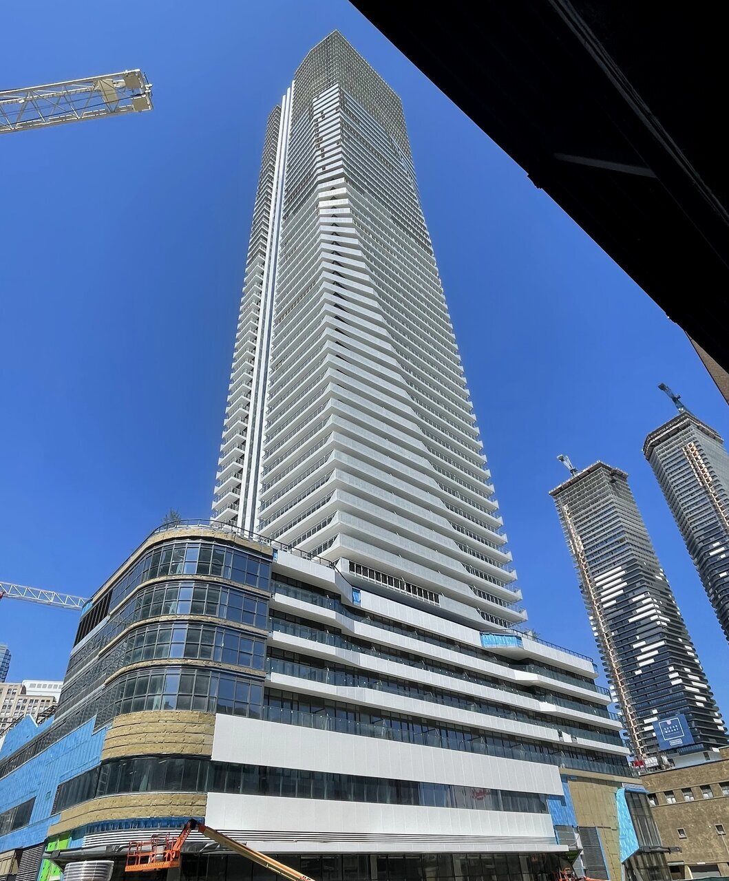
The redesign has already been approved a long time ago. Whats under construction right now is the new design, I believe the height increase would just be adding some extra floors in the middle.
Sorry, yes you're right. The current design appears to date back to Nov 12, 2021.
The-approved version that is still posted on the developers website, with faux bracing: https://oneyongecondo.ca/

To me, the only thing better about the latest design is the improved podium. The rest is a forgettable tower in a sea of mediocrity. But hey, it's tall!
6918-100990.jpeg
thumb_ho-ex-hes-not-hot-hes-just-tall-no-stan-66777474.png
 
I’ve come around to the design. If there’s one thing about flagship projects like this, the material execution usually compensates for questionable design. After seeing phase 1, I’m hopeful for phase 2. It’s not as ambitious as prior designs, but I don’t think those were particularly great or realistic anymore. This building has a unique silhouette, and as we have seen with phase 1 and the adjacent Sugar Wharf, the execution around the newer waterfront is exemplary. I think the extra floors now capitalizes on the new design and makes it look a little closer to the last version, and for the better.
 
I’ve come around to the design. If there’s one thing about flagship projects like this, the material execution usually compensates for questionable design. After seeing phase 1, I’m hopeful for phase 2. It’s not as ambitious as prior designs, but I don’t think those were particularly great or realistic anymore. This building has a unique silhouette, and as we have seen with phase 1 and the adjacent Sugar Wharf, the execution around the newer waterfront is exemplary. I think the extra floors now capitalizes on the new design and makes it look a little closer to the last version, and for the better.
Absolutely. Good execution changes my mind about a project. I think 19 Duncan looked like a mess in the renders, but it's shaping up quite nicely.

Pinnacle is still just too forgettable for my tastes. The 200m+ height balconies are ridiculous and show a lack of maturity (yes I know owner-occupiers still want them until they set foot on one and many investors consider them essential), but the same can be said of so many projects in the city.
 
I am going to least agree that I liked the previous design a lot better...and with the new height, that would of really been the cat's meow.

...beyond that, I'd like to see what it looks like with the current design when they've built before I pass further judgement.
 
I’ve come around to the design. If there’s one thing about flagship projects like this, the material execution usually compensates for questionable design. After seeing phase 1, I’m hopeful for phase 2. It’s not as ambitious as prior designs, but I don’t think those were particularly great or realistic anymore. This building has a unique silhouette, and as we have seen with phase 1 and the adjacent Sugar Wharf, the execution around the newer waterfront is exemplary. I think the extra floors now capitalizes on the new design and makes it look a little closer to the last version, and for the better.

I agree. To add to that:

Though I too certainly miss the triangular almost “filgree” brace motif of the previous, more elegant version, that was a purely cosmetic conceit not structural like The One’s angled hangers... so on balance (with a 105 storey carrot🥕) I'm ready to move on.

Given how well the fritted balcony glass turned out for Phase 1 after that very tall hiccup (all the glass replaced due to defect ;-), I think the combination of curtain-wall and the fritted+transparent glass shapes of balconies for SkyTower will also turn out very nicely.

Bettin' this tower will look far better as constructed versus the rather lame renderings. As most here know, many times actual builds (materials etc.) fail to remotely live up to eye-candy renderings but... on occasion ... the built result is better than “artist's impression”.

Remember how terrified 😱we were of the "Pinnacle Effect" as Phase 1 began to rise? And then shocked (thrilled beyond belief in my case ;-) when the first twisting aluminum panels and glazing, followed by the fritted curves of balcony glass unfolded? From Pinnacle?!

I’m betting this SkyTower (despite pretty underwhelming renders) will be one of those pleasant suprises too (fingers crossed). And the podium does look improved.

PHASE 1 - the swooping fritted balcony glass being replaced on Phase 1.
XxheKfcFHs.jpeg

skycandy
 
I am going to least agree that I liked the previous design a lot better...and with the new height, that would of really been the cat's meow.

...beyond that, I'd like to see what it looks like with the current design when they've built before I pass further judgement.

Im in the same boat. First design was modern, sexy and would have been a real head turner. Felt like something out of the middle east. Unlike anything currently in Canada. The current design is above average, but loses the pizazz for me. It went from a modern Asian showstopper to a refined Miami Beach tower. I am all for the added height, but wish it was added onto the first renderings.

I will reserve judgement until I start seeing some materials in real life. Sometimes an average render can really surprise in a positive way. Here's hoping.
 
I agree. To add to that:

Though I too certainly miss the triangular almost “filgree” brace motif of the previous, more elegant version, that was a purely cosmetic conceit not structural like The One’s angled hangers... so on balance (with a 105 storey carrot🥕) I'm ready to move on.

Given how well the fritted balcony glass turned out for Phase 1 after that very tall hiccup (all the glass replaced due to defect ;-), I think the combination of curtain-wall and the fritted+transparent glass shapes of balconies for SkyTower will also turn out very nicely.

Bettin' this tower will look far better as constructed versus the rather lame renderings. As most here know, many times actual builds (materials etc.) fail to remotely live up to eye-candy renderings but... on occasion ... the built result is better than “artist's impression”.

Remember how terrified 😱we were of the "Pinnacle Effect" as Phase 1 began to rise? And then shocked (thrilled beyond belief in my case ;-) when the first twisting aluminum panels and glazing, followed by the fritted curves of balcony glass unfolded? From Pinnacle?!

I’m betting this SkyTower (despite pretty underwhelming renders) will be one of those pleasant suprises too (fingers crossed). And the podium does look improved.

PHASE 1 - the swooping fritted balcony glass being replaced on Phase 1.
XxheKfcFHs.jpeg

skycandy
Just out of my own curiosity, did Phase 1 use curtain-wall? I wont lie, sometimes I have trouble distinguishing the cladding system used.
 
Last edited:
Sorry, yes you're right. The current design appears to date back to Nov 12, 2021.
The-approved version that is still posted on the developers website, with faux bracing: https://oneyongecondo.ca/

To me, the only thing better about the latest design is the improved podium. The rest is a forgettable tower in a sea of mediocrity. But hey, it's tall!
I’ve come around to the design. If there’s one thing about flagship projects like this, the material execution usually compensates for questionable design. After seeing phase 1, I’m hopeful for phase 2. It’s not as ambitious as prior designs, but I don’t think those were particularly great or realistic anymore. This building has a unique silhouette, and as we have seen with phase 1 and the adjacent Sugar Wharf, the execution around the newer waterfront is exemplary. I think the extra floors now capitalizes on the new design and makes it look a little closer to the last version, and for the better.
Absolutely. Good execution changes my mind about a project. I think 19 Duncan looked like a mess in the renders, but it's shaping up quite nicely.

Pinnacle is still just too forgettable for my tastes. The 200m+ height balconies are ridiculous and show a lack of maturity (yes I know owner-occupiers still want them until they set foot on one and many investors consider them essential), but the same can be said of so many projects in the city.
Im in the same boat. First design was modern, sexy and would have been a real head turner. Felt like something out of the middle east. Unlike anything currently in Canada. The current design is above average, but loses the pizazz for me. It went from a modern Asian showstopper to a refined Miami Beach tower. I am all for the added height, but wish it was added onto the first renderings.

I will reserve judgement until I start seeing some materials in real life. Sometimes an average render can really surprise in a positive way. Here's hoping.

There are pros and cons to both designs. I actually think the faux-bracing of the original shows more design immaturity than 200m+ balconies—at least those balconies have external factors for existing.

My biggest issue with the new design, apart from lack of pizazz, is it looks a bit like a Zaha Hadid knockoff with the organically curved white trim. Materials will definitely make or break this project but I'm hopeful after seeing Phase 1.

Also on the topic of design maturity/evolution, Phase 3 is definitely a cleaner, more refined expression of Hariri Pontarini's Shangri-La.

And last little design note, the redesigned Phase 2 and 3 share the same balcony pattern as Phase 1 and I’m a fan of the cohesiveness.
 
Last edited:
I agree. To add to that:

Though I too certainly miss the triangular almost “filgree” brace motif of the previous, more elegant version, that was a purely cosmetic conceit not structural like The One’s angled hangers... so on balance (with a 105 storey carrot🥕) I'm ready to move on.

Given how well the fritted balcony glass turned out for Phase 1 after that very tall hiccup (all the glass replaced due to defect ;-), I think the combination of curtain-wall and the fritted+transparent glass shapes of balconies for SkyTower will also turn out very nicely.

Bettin' this tower will look far better as constructed versus the rather lame renderings. As most here know, many times actual builds (materials etc.) fail to remotely live up to eye-candy renderings but... on occasion ... the built result is better than “artist's impression”.

Remember how terrified 😱we were of the "Pinnacle Effect" as Phase 1 began to rise? And then shocked (thrilled beyond belief in my case ;-) when the first twisting aluminum panels and glazing, followed by the fritted curves of balcony glass unfolded? From Pinnacle?!

I’m betting this SkyTower (despite pretty underwhelming renders) will be one of those pleasant suprises too (fingers crossed). And the podium does look improved.

PHASE 1 - the swooping fritted balcony glass being replaced on Phase 1.
XxheKfcFHs.jpeg

skycandy
Agree with your points as well. There are a lot of subtleties that do not come through in renderings. In this case, the tower portion of phase 1 has a lot of twists and colour motifs that make it visually interesting. It's like Sugar Wharf in this way, and I think it's a perfectly fine way to go architecturally. Residential buildings of this scope/scale have limited options to be creative when it's time to actually build something. Clean execution that is subtle but interesting is a good way to add some nuance to design.

My only gripe thus far is that the sleek curves on the podium feel cheapened by the decision to not use curved (tempered?) glass on the corners. It's not a huge deal but would've helped sell the sleekness of the whole scheme.

I think if there's a debate to be had about the quality of these projects, it's their ability to be vibrant and desirable communities 20 years from now. Where else in the world is the density this high on a block-by-block basis?
 
Last edited by a moderator:
My only gripe thus far is that the sleek curves on the podium feel cheapened by the decision to not use curved (tempered?) glass on the corners. It's not a huge deal but would've helped sell the sleekness of the whole scheme.
As we know HPA is the king of (gorgeous) curves... The Well, 19 Duncan (hopefully Artists Alley) etc. but got pinnacled on this Phase 1 podium.

As mentioned, considering what could have happened to One Yonge so far... I'll swallow this pill if the tower materials continue to be delivered as promised.

Plus the HPA canopy (The Well redux?) is still to come which will hopefully mitigate the phase 1 V-E-ing on podium glass.
 
There are pros and cons to both designs. I actually think the faux-bracing of the original shows more design immaturity than 200m+ balconies—at least those balconies have external factors for existing.

And last little design note, the redesigned Phase 2 and 3 share the same balcony pattern as Phase 1 and I’m a fan of the cohesiveness.
Ah I see you've never been on a high-floor balcony before! 😁
I kid, but above a fairly low height they are useless, and they go almost unused. You can't even safely store a potted plant on one, and most condo bylaws prohibit them anyway.
They're windy as hell, shoddy-looking and let's not forget those 10cm gaps between the glass and the end of the balcony, a cheap but frankly terrifying drainage solution.
To cap it off, in Toronto even on nicer building we nearly always use low-quality rectangular clamps that eventually start to twist out of position, instead of the nicer looking integrated mounts.

These balconies are there to convince people they'll have outdoor space. Then they're used once when the resident moves in, and never again, unless a new guest is visiting and curious about how awful it really is.
It would be better to just start abandoning the expectation of having them altogether.

18664785_32_lg.jpeg

488 University. This is bad.


0e5ddccb511c25dcfea0913c3b2d1fb815184234.jpeg

Queen's Place Tower 1, Melbourne. This makes more sense.
 
These balconies are there to convince people they'll have outdoor space.

This balcony debate has been done to death in numerous threads. We use our balcony at least 7 months of the year, and we are on a high(ish) floor (30+). I have friends who regularly use their balconies on 50+ and 60+ floors.

I can't even imagine living in a condo without a balcony.
 

Back
Top