ChesterCopperpot
Senior Member
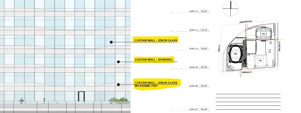
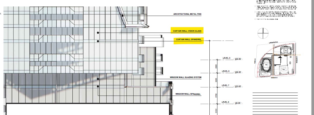
Phases 2 and 3 will have curtain wall


Agreed! The original render was definitely a showstopper.I think the original rendering would have made it somewhat unique
And I think you're reading too much into what I said. As I stated, the curtain wall was similar...I did not claim it was the exactly the same.I think you read too much into the old renders, if you look closely it doesn't appear like the glass is angled at where the diagrids meet except maybe at the crown. Aside from that they were quite different in that they weren't extruding outward like CIBC's does so I don't think that was an apt comparison. Personally I think diagrid lines are a bit overrated but I understand why people in Toronto want some kind sort of architectural flair since the city's architecture is generally so muted. What was gained however is a more slender profile(even before the height increase). In terms of height to width ratio is seems like it's approaching 432 Park territory, though obviously not quite there since 432 Park is 200 feet taller. And there is no indication that they won't be using curtain wall for the non-balcony sections which covers much more of the exterior in phases 2 and 3.
He's a huge fan of Chicago: Tall and sprawl is their primary design philosophy.Seems like Doug wants his cake (tall) and eat it too (sprawl). I guess the silver lining here is that we may benefit from the former. Hopefully...
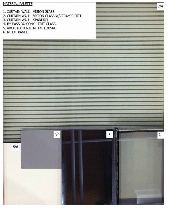
I'm not sure that's as unpopular as you think. As this still may look all good in the end...rending the conversation about the changes to rather moot. And the materials slated to be used looks promising. So there's also that.Unpopular opinion here, but while the original design renders were better than the current design renders; I think in practice, the new version will look better built.
I was very skeptical the original diamond pattern would actually be super visible, esp after CIBC square finished. Most shots you don't see the metal braces on the tower, I think the same thing would've happened here and it would've become a big glass heap. This new design gives shape and colour that will be visible both up close and afar.
The redesign actually has improved the podium. The previous one looked like an added block the tower was resting on, kind of like the World Trade Center which I find distasteful. While the original diamond pattern was striking, the current design ties in with phase 1 and especially phase 3 much better and it's not necessarily inferior. It reminds me a little bit of the Zaha Hadid tower in Miami (One Thousand Museum) which obviously has more dramatic design/structural elements. But I'd say Sky Tower is more elegant.Unpopular opinion here, but while the original design renders were better than the current design renders; I think in practice, the new version will look better built.
I was very skeptical the original diamond pattern would actually be super visible, esp after CIBC square finished. Most shots you don't see the metal braces on the tower, I think the same thing would've happened here and it would've become a big glass heap. This new design gives shape and colour that will be visible both up close and afar.
Now you've got me thinking about how impactful a Zaha Hadid tower would be in Toronto.The redesign actually has improved the podium. The previous one looked like an added block the tower was resting on, kind of like the World Trade Center which I find distasteful. While the original diamond pattern was striking, the current design ties in with phase 1 and especially phase 3 much better and it's not necessarily inferior. It reminds me a little bit of the Zaha Hadid tower in Miami (One Thousand Museum) which obviously has more dramatic design/structural elements. But I'd say Sky Tower is more elegant.
There are many projects in Toronto that end up being ordinary, bland. I read the comments about new proposals, and it seems the opinions are usually "it's lame", "the design is meh" etc. If you want to see how impactful a Zaha Hadid would be, do a search in google image for "new architecture in new cairo"! And yes I realize they are beginning with an empty slate, but I swoon about the new architecture. Can we not have a few of these jewels in TorontoNow you've got me thinking about how impactful a Zaha Hadid tower would be in Toronto.
Agreed, looked so much better before. Now is more of the same. Bit difficult to create something for real unique in this city.I think the original rendering would have made it somewhat unique
That's a beautiful picture. Thanks for sharing this, Tstormers!