I think, this current design is very refined and mature and is not gimmicky like Dubai or Vegas. Cities like Chicago and Sanfrancisco build buildings like these. Plus previous designs had too many balconies for buildings that tall, that's a turn off. I'm happy that HPA took such a matured approach to design.
I tend to agree. Much design refinement and effort has gone into this trio over the last few years nearly all of it favourable which is a good thing considering the size of the project. This will be prominently visible on the waterfront for many decades. Let's hope for quality materials that will make these three positively stand out.
 
Often we end up with a significant downgrade in terms of design and quality. This isn't one of those. This is better than the previous designs and some of these early peeks are encouraging.
Yep. This certainly doesn't seemed to be squared off in the final design. Rather it's almost if they kept pushing the boundaries until it was approved.
 
Great light and shadow
E659C3E1-F952-41AB-94FB-CA224D879C23.jpeg
36FACE60-8394-4DD9-B839-E9C3AAD2296A.jpeg
A8B493EC-6022-4952-BDE4-A0E6A7EAE044.jpeg
 
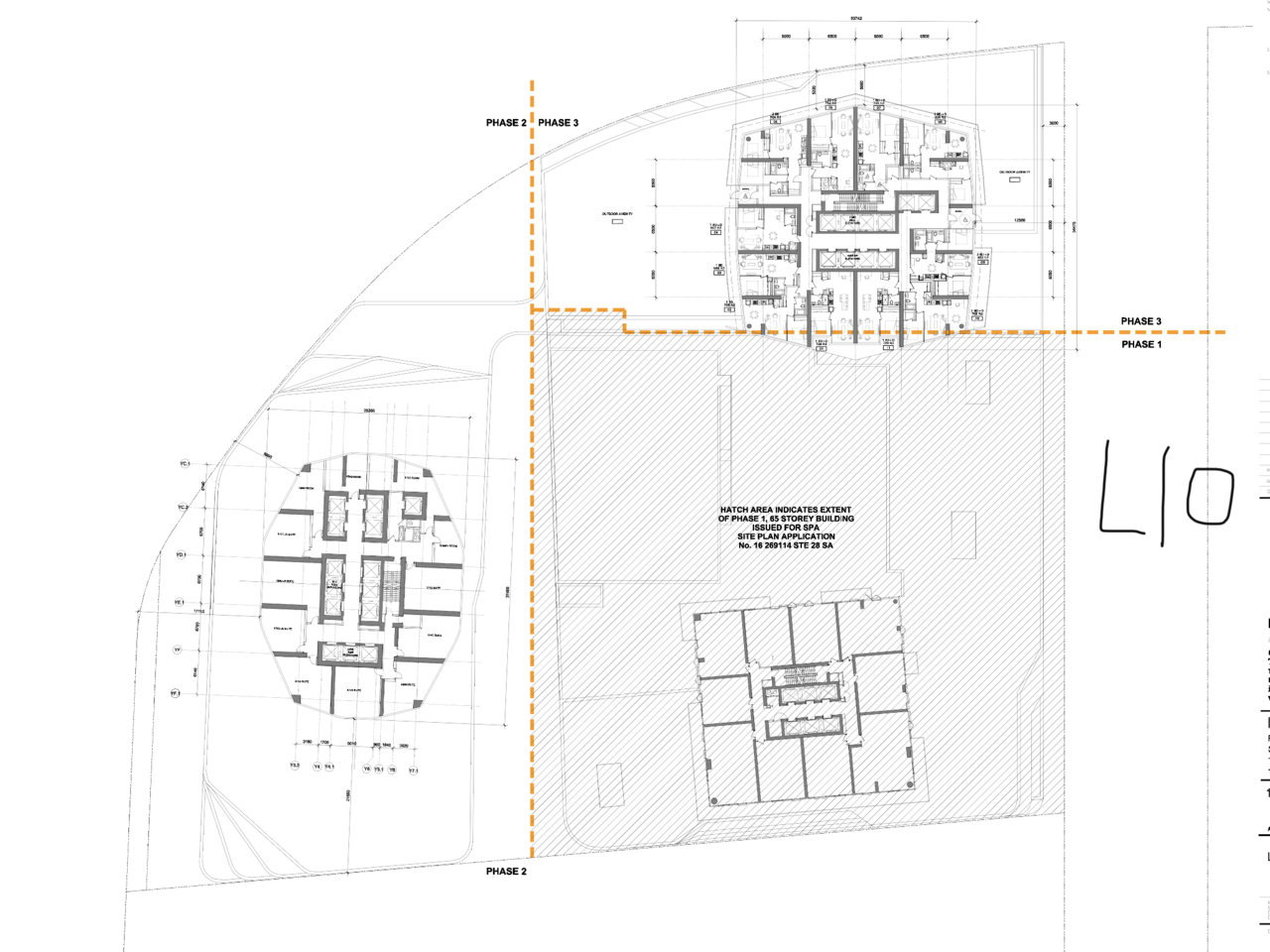
First phase has the community centre in the podium so it's larger in footprint.

Tbh, I'm excited for Phase 3 as well, even if it's not as exciting as the Sky Tower. I was walking down Bremner the other day and it should be the main thing we see behind the ACC when finished. Which will certainly be an improvement over the Daniels building that is in clear view right now (thankfully Sugar Wharf will help hide that as well).
 

Back
Top