You are using an out of date browser. It may not display this or other websites correctly.
You should upgrade or use an alternative browser.
You should upgrade or use an alternative browser.
- Thread starter lkov.rc
- Start date
Maria Greer
New Member
As a tenant who lives here, the pictures we received based on what the exterior will look like barely look any different than they currently do. The only difference depicted in the pictures are the balconies and front entrance. Regardless of all that, my balcony faces into the courtyard where the new building is meant to be built. The last thing I want to see is into someone's living room 12 feet away from my balcony. Not mention it will block any sun I normally get on my balcony. You can forget sitting out on your balcony, as there will be no privacy. This will also block what little view I already have. As mentioned before I support the building being build on Seaton St, even though it will be a nightmare to have to listen to construction everyday for the next couple of years. At the end of the day there's no reason for them to be building so close together and cramming a bunch of people side by side. This second building is purely about profit and won't change the fact that the homeless and drugs in the area are here to stay.The proposal includes a total re-clad of the older buildings. So a new exterior appearance, not just balconies.
HousingNowTO
Senior Member
Virtual Community Consultation Meeting
Wednesday, May 26, 2021 7:00 pm
REGISTER - https://toronto.webex.com/toronto/onstage/g.php?MTID=ebb25204cec09c58f82c742b2735b3d4f
Wednesday, May 26, 2021 7:00 pm
REGISTER - https://toronto.webex.com/toronto/onstage/g.php?MTID=ebb25204cec09c58f82c742b2735b3d4f
DavidCapizzano
Senior Member
Wasn’t able to snap photos as I was on the bus but the older buildings look like they're being painted white, with new glass railings / slab restoration happening. Might be new windows going in as well.
Northern Light
Superstar
Wasn’t able to snap photos as I was on the bus but the older buildings look like they're being painted white, with new glass railings / slab restoration happening. Might be new windows going in as well.
The following permit has been issued: (2 accompanying permits for mechanical and plumbing)
Painting does not require a permit; I though I recalled that balcony railing replacement did require a permit.........perhaps I'm misremembering.
DavidCapizzano
Senior Member
Stopped by on my way home and grabbed some pics for context
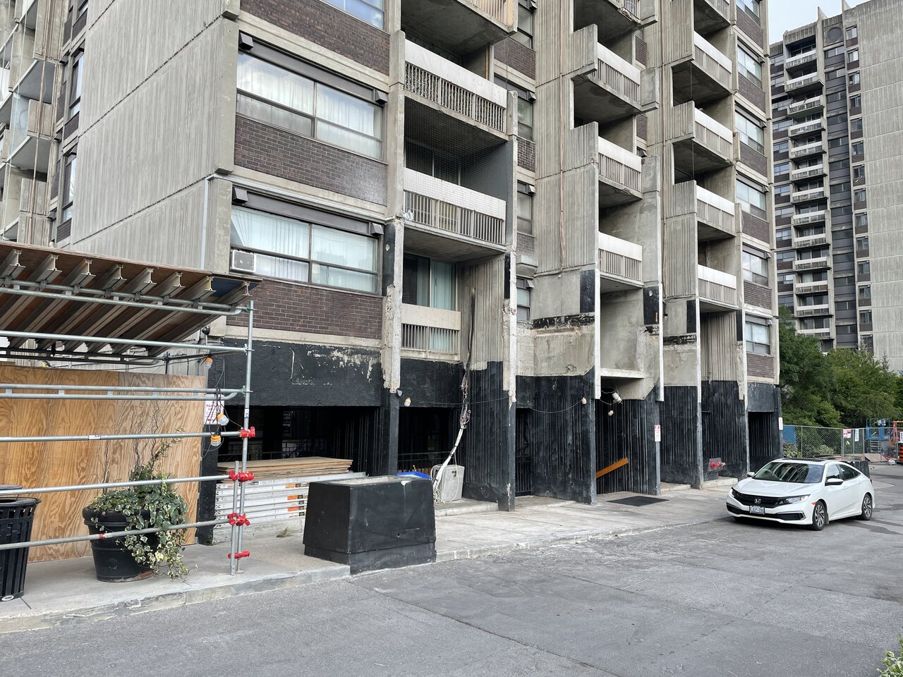
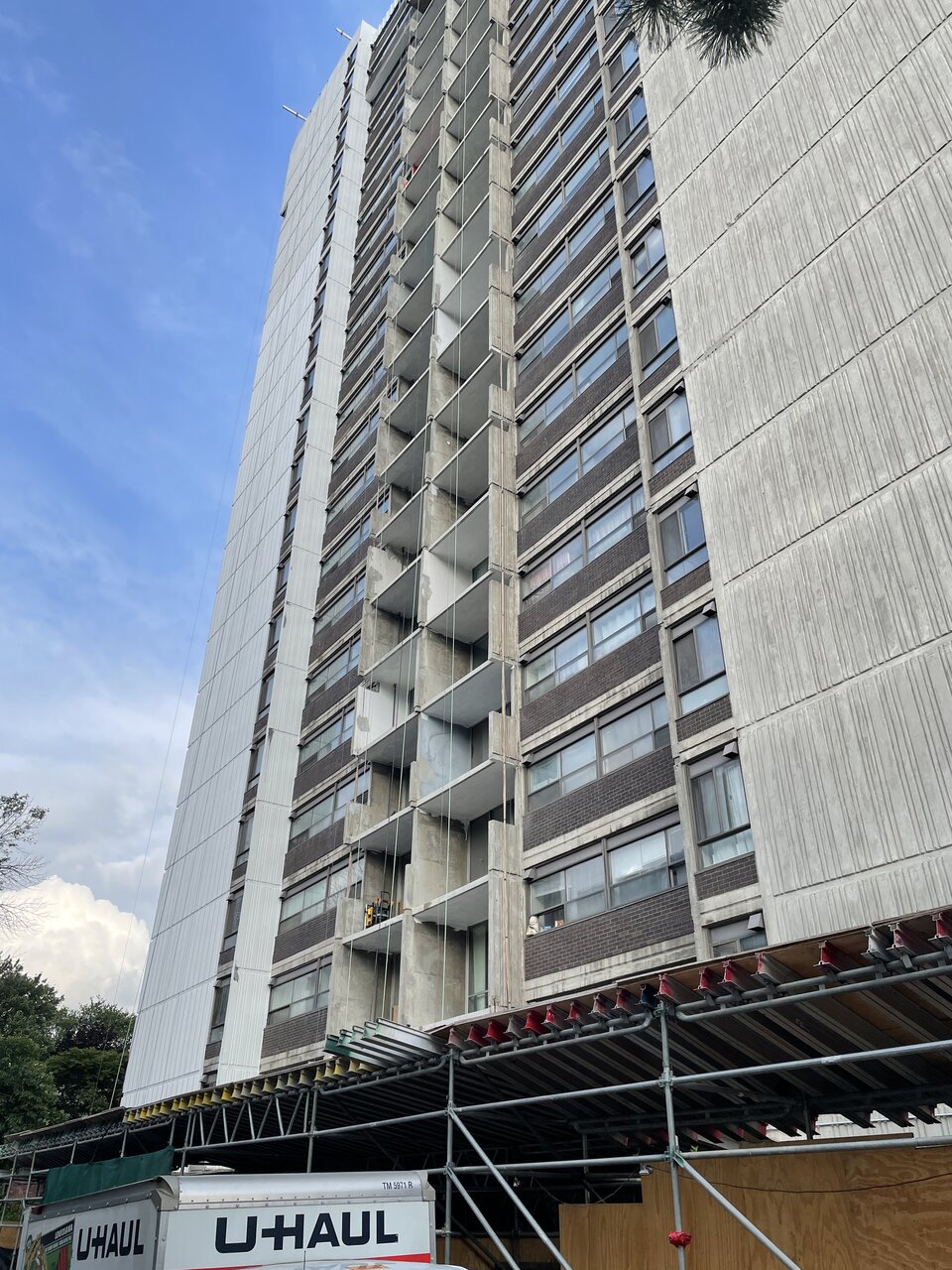
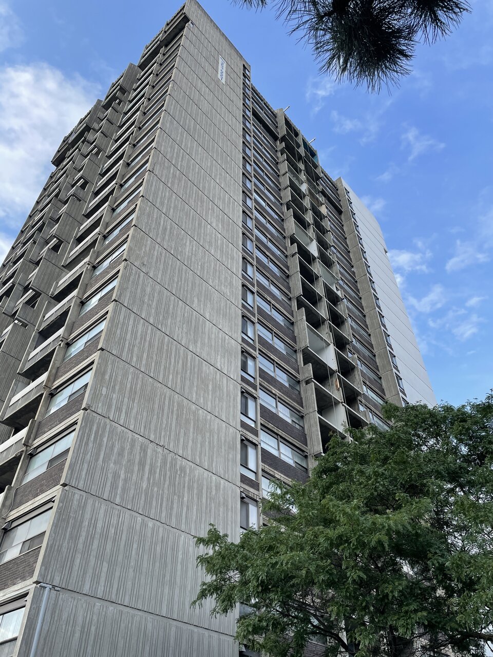

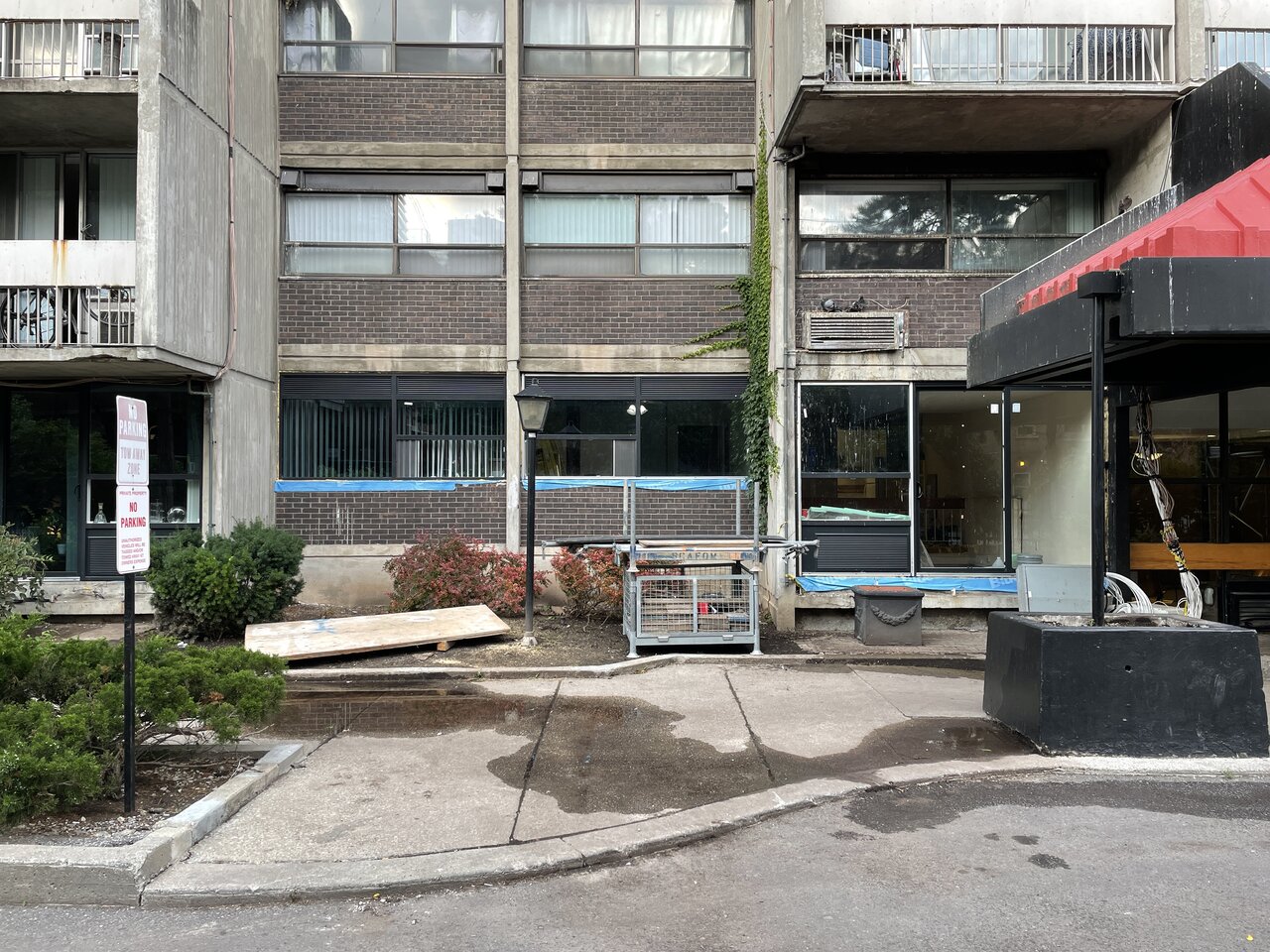
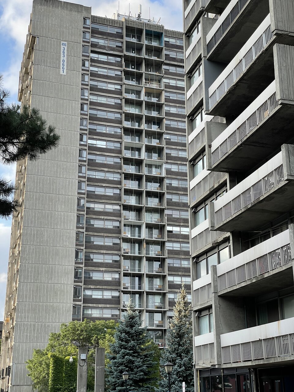
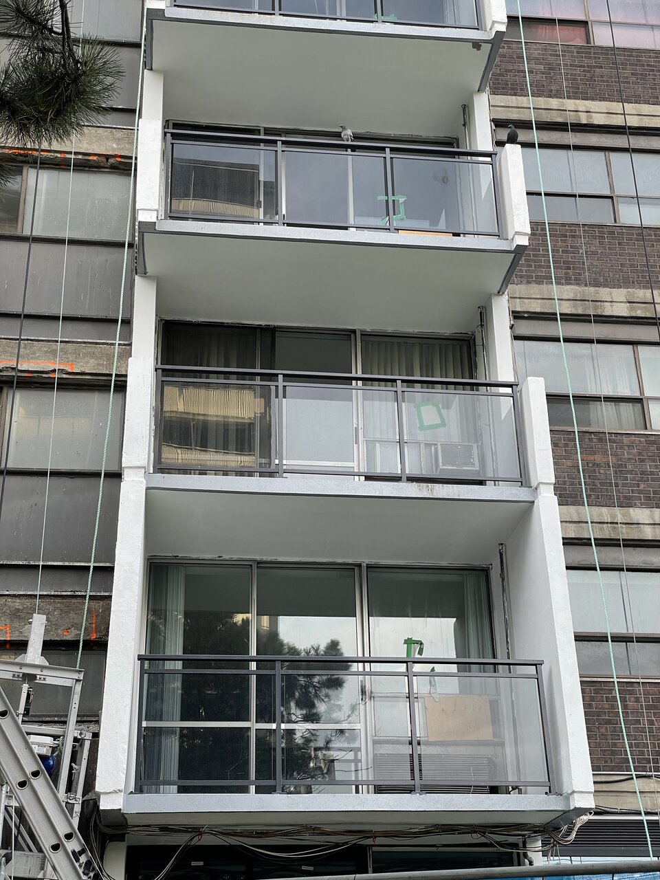
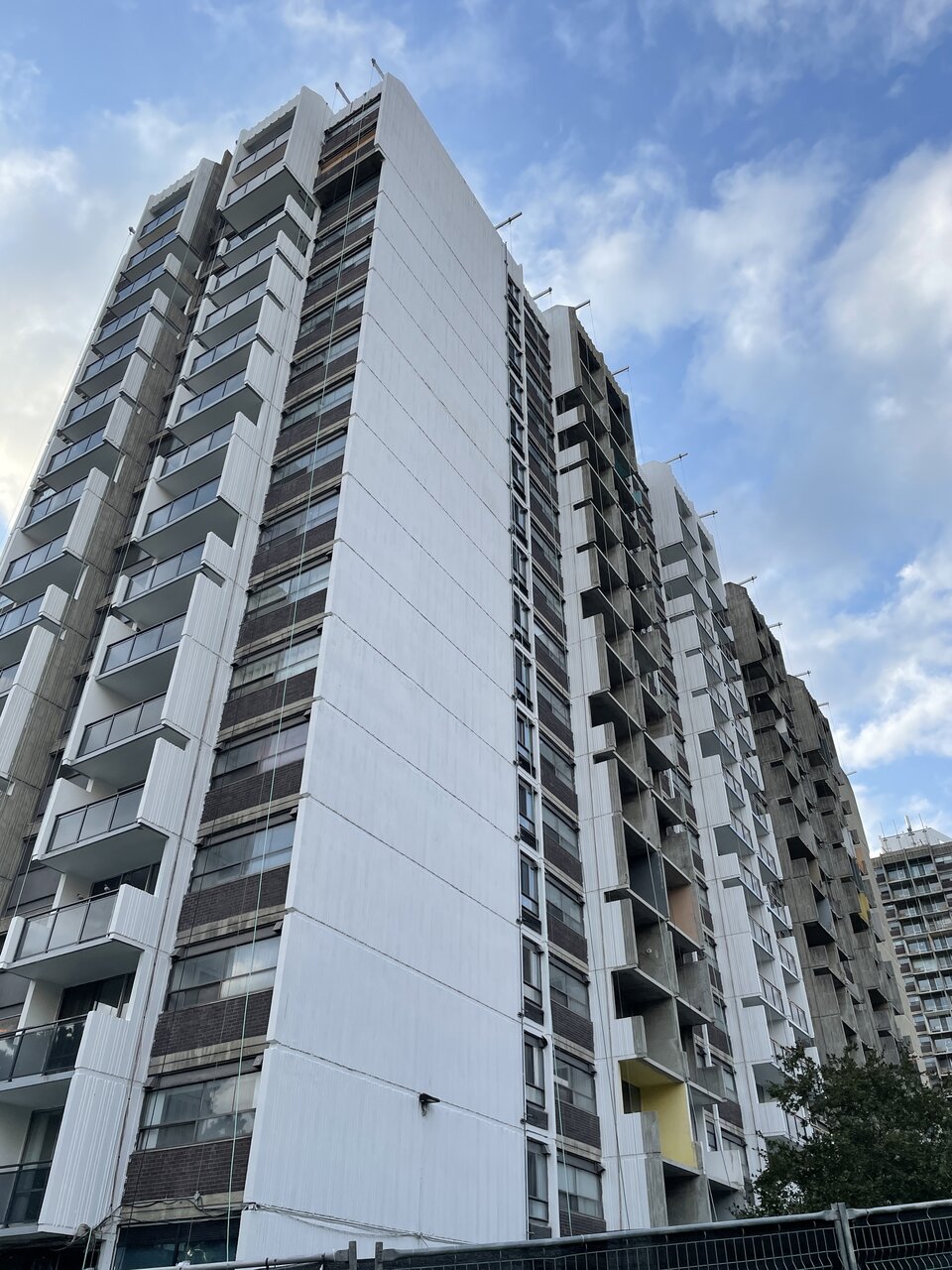
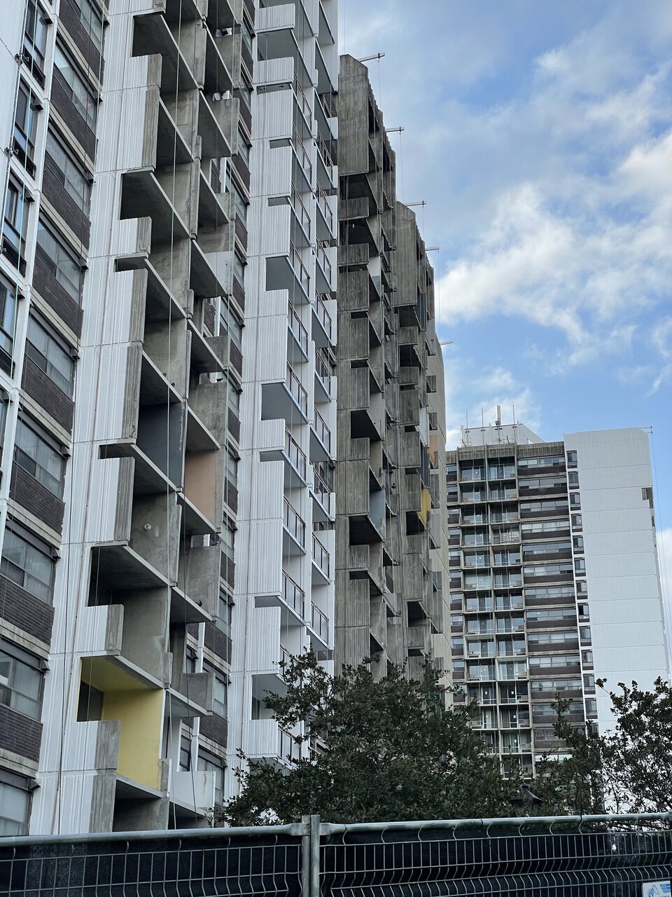
Northern Light
Superstar
Stopped by on my way home and grabbed some pics for context
View attachment 338545View attachment 338546View attachment 338547View attachment 338548View attachment 338549View attachment 338550View attachment 338551View attachment 338552View attachment 338553
Hmmm.........
I see there are fees for permits for balcony repairs and railing replacements.
Yet no permit for same has been pulled............

Building Permit Fees
Calculated based on the work you propose in your application, the fee schedule lists the fee rate charged for each type of work proposed, and explains your payment options.
DavidCapizzano
Senior Member
DavidCapizzano
Senior Member
Undead
Senior Member
So satisfying when a 60s slab tower gets a thoughtful facelift.
Last edited:
egotrippin
Senior Member
Thoughtful? They're replacing the brick with, you guessed it, grey glass; just what Toronto needs more of. Thoughtful would've been a simple cleaning and repairs where needed.
Undead
Senior Member
Thoughtful compared to the last slab tower I lived where the management installed bright yellow balcony railings that clashed with the building's 60s brown theme. Or those completely see through railings that make the building look like it's still under construction. At least the new pieces here blend in well with the existing colours.Thoughtful? They're replacing the brick with, you guessed it, grey glass; just what Toronto needs more of. Thoughtful would've been a simple cleaning and repairs where needed.
egotrippin
Senior Member
I will give you that, the overall colour scheme is more complementary than some renewals. It's just disappointing that once again we lose masonry details and the texture of metal balconies for more plain old glass.Thoughtful compared to the last slab tower I lived where the management installed bright yellow balcony railings that clashed with the building's 60s brown theme. Or those completely see through railings that make the building look like it's still under construction. At least the new pieces here blend in well with the existing colours.
condovo
Senior Member
I'm very ambivalent about this reno. It looks better but it's not in keeping with the buildings' Brutalism, which is too bad, especially the glass balcony railings and the spandrel covering the brick. I'm okay with the coat of white on the concrete though. I dunno. I'm on the fence.
isaidso
Senior Member
I will give you that, the overall colour scheme is more complementary than some renewals. It's just disappointing that once again we lose masonry details and the texture of metal balconies for more plain old glass.
Agree 100%. My family own 4 condos in a 70s building. I imagine we'd sell all of them if they try and replace the solid balcony walls with glass. It largely negates one's fear of heights, one can line the balcony with substantial flower boxes, and it allows for more privacy. Glass would destroy the architectural integrity of the building so there's that too.


