1655883200956.png

Was trying to figure out why this nightmare of a podium felt so familiar and realized it's a squat version of Tableau's podiumalso by Wallman (of Time and Space fame). If they wanted to copy and paste themselves at least choose something like Ten York.
153-2270.jpg
 
Tableau is a pretty great project though. It's unfortunate the retail has struggled (I just noticed yesterday that the Queen Anne has closed), but the idea is a very good one.

I'm quite sour at their approach to preserving/recreating the original building facade some of the worst attempts at integrating I've seen. The retail is another aspect I'm not a fan of, instead of continuing the street wall and creating a visually interesting bend that follows the curve of Richmond they added this gigantic portico/canopy/tabletop (?) that adds nothing.

Looking at the Q Tower's podium, it seems like it'll suffer from much of the same retail mistakes. I guess, at least that stretch of Harbour has always seemed like a thoroughfare compared to Richmond and Peter.
 
  • Like
Reactions: xy3
I think you've hit on it, at least partially. Richmond and Peter is a high-speed, car sewer. Unless the westbound light is red, cars absolutely fly through there. What I appreciate about the Tableau forecourt is that it provides some separation from that hellscape, along with the enclosure from the columns and canopy (and complimentary Shayne Dark!). Again, I'm not saying it's perfect, but I don't think pushing things out so that they're closer to the right of way would have done anyone any favours. Recall the initial concepts for the site (pre Urban Capital) from Core did this.
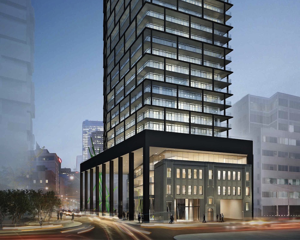
 
So much of Wallmans work, such as the Tableau podium (although Ill give them credit for preserving the heritage) is grubby and heavy handed and this proposal is no exception to say the least.
 
Tableau is a pretty great project though. It's unfortunate the retail has struggled (I just noticed yesterday that the Queen Anne has closed), but the idea is a very good one.
I agree I think Tableau‘a design is superior to this last design iteration, bu considering this prominent location and the fact we are in 2023, this design should be much more superior to Tableau. this looks like another entertainment district condo which sucks for Toronto’s main skyline view.
 
I agree I think Tableau‘a design is superior to this last design iteration, bu considering this prominent location and the fact we are in 2023, this design should be much more superior to Tableau. this looks like another entertainment district condo which sucks for Toronto’s main skyline view.
100% agreed. The proponent here has much to do with your complaint...
 
Great video by Oh The Urbanity Youtube channel that focuses on the change from 2 towers to 1 for this proposal:
The "Oh The Urbanity" folks have been great to work with on these EXPLAINER videos... 💚
 
Of course they try to make it look about 30 meters taller than it actually is :rolleyes:
Yup that tower next door is over 230m tall, and the rendering makes Q look as tall or even slightly taller. Surprised they didn't make it taller than the CN Tower while they were at it ...
 

Back
Top