This thread will be used for Buildings 4B + 4C within the Regent Park master plan, more details in our front page story here: https://urbantoronto.ca/news/2024/10/19-and-39-storey-towers-proposed-part-regent-park-phase-4.57083


You are using an out of date browser. It may not display this or other websites correctly.
You should upgrade or use an alternative browser.
You should upgrade or use an alternative browser.
- Thread starter Paclo
- Start date
hawc
Senior Member
Okay, this is the block relevant to me. I'm excited to see it get completed.
We live on Spruce street which is one block north of Gerrard. Down towards the east end (River).
So buidlings 5E, 5F, 5G, 5H are the ones that interest me the most.
Are there any 'shadow maps' or ways to see where the building's shadow will fall? I would hate to think any of these buildings would be so tall or big that they would cast long shadow 3 blocks north across our house so we don't get sun from south. But who knows.
When will final block of buildings get demolished? Is that still a year or so away? Folks definitely still living there.
Can anyone post renderings of the buildings in this specific thread. I know they are scattered around elsewhere.
Last edited:
Are there any 'shadow maps' or ways to see where the building's shadow will fall? I would hate to think any of these buildings would be so tall or big that they would cast long shadow 3 blocks north across our house so we don't get sun from south. But who knows.
You can find the shadow studies and architectural plans in the AIC page here: https://www.toronto.ca/city-governm...nt/application-details/?id=5485393&pid=233137
hawc
Senior Member
Thank you for that link. Lots of fun documents to look at.
Here's what the longest shadows of the day/year will look like. Folks on Sword street are suddenly going to be under a lot of shadow for a good part of the day, but doesn't look like it will stretch as far north as Spruce.
Purple is new shadow.

Here's what the longest shadows of the day/year will look like. Folks on Sword street are suddenly going to be under a lot of shadow for a good part of the day, but doesn't look like it will stretch as far north as Spruce.
Purple is new shadow.
artemperederii
Active Member
I like what comes to design, but I don’t like the layout which looks awkward and gives the feeling that it’s 3 different buildings by 3 different developers who somehow agreed about design and height. The part of building in the middle looks like it doesn’t belong here, why did they decide to make it 1 foot taller than left part? Anyway potentially design looks great, can definitely see an inspiration from Southern block (Canary), and it’s wonderful that we get more good architecture, but something needs to be done with layout 
HousingNowTO
Senior Member
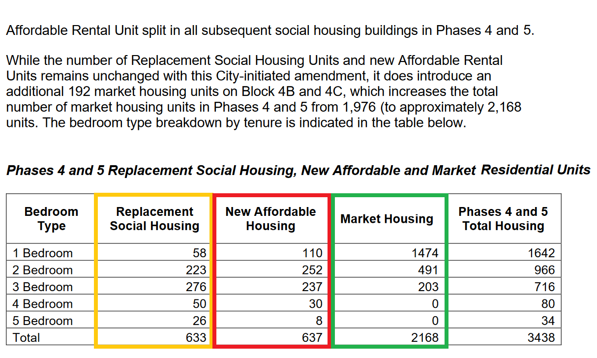
Is the unit-split of the TCHC / Social Housing, Affordable Rental & Market-Rate across these ~819 units doesn't appear to be broken-out, but here is the mix across both PHASE 4 & 5...
"While the number of Replacement Social Housing Units and new Affordable Rental Units remains unchanged with this City-initiated amendment, it does introduce an additional 192 market housing units on Block 4B and 4C, which increases the total number of market housing units in Phases 4 and 5 from 1,976 (to approximately 2,168 units)."

"While the number of Replacement Social Housing Units and new Affordable Rental Units remains unchanged with this City-initiated amendment, it does introduce an additional 192 market housing units on Block 4B and 4C, which increases the total number of market housing units in Phases 4 and 5 from 1,976 (to approximately 2,168 units)."
Last edited:
UtakataNoAnnex
Senior Member
The first column above likely includes RGI programs. Not sure the second column includes such...although in a marginally just society it should, IMO.
HousingNowTO
Senior Member
Rent-Geared-to-Income "RGI" is always the SOCIAL HOUSING in the City Reports, average RGI rents (2023) are below $500 / Month, hence the huge waiting-lists.The first column above likely includes RGI programs. Not sure the second column includes such...although in a marginally just society it should, IMO.
"Workforce Housing" is AFFORDABLE HOUSING in the City Reports, at rents and incomes equivalent to the current (2024) "Housing Lottery" bands...