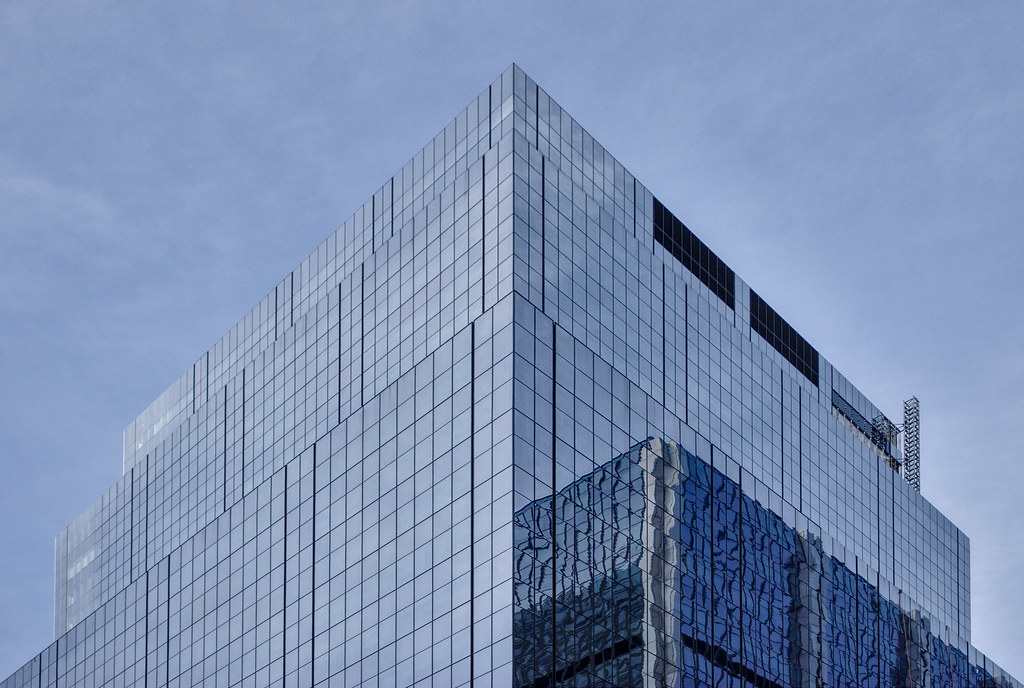
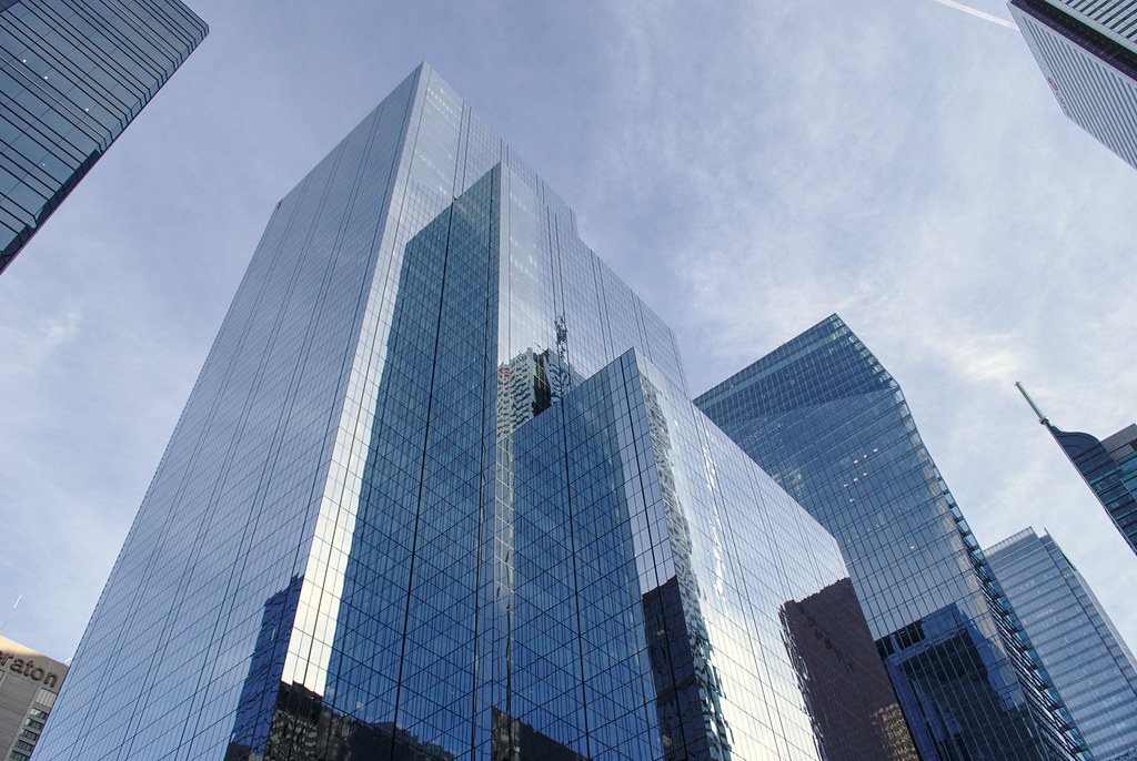
The glass is good quality but it just blends into the sky and other buildings. The dark cladding was much easier on the eyes and helped highlight the attractive stacked structure with solid colour panel edges and thin silver bands. It used to be a classy building.
 
IMG_2369.jpg
 
The entire area is basically one big indistinguishable mush of blue-green glass now, and the EY Tower has less of an impact being sandwiched between three buildings of the same colour and materiality.

They should have at least differentiated by glass colour if they were going for the all-glass approach.


Funny, isn't it? It's like color got banned. Wish we had more bold colors in this sea of blue/green glass. I don't get it.
 
Although it must be a really nice improvement for those who work inside as well as for energy efficiency (I hope).
 
agree with all the other comments... too much of the same coloured glass in a row there. as for buildings that are the topic of this thread, on their own they look a thousand times better than they used to - really sharp looking glass! the photos above from Rascacielo show some amazing opportunities for abstract photos with the repeating reflections!
 

Back
Top