May 25, 2013:

XUepg1M.jpg


j9c8BNg.jpg
 
To quote Neil Young on that last photo: "out of the blue, into the black"
 
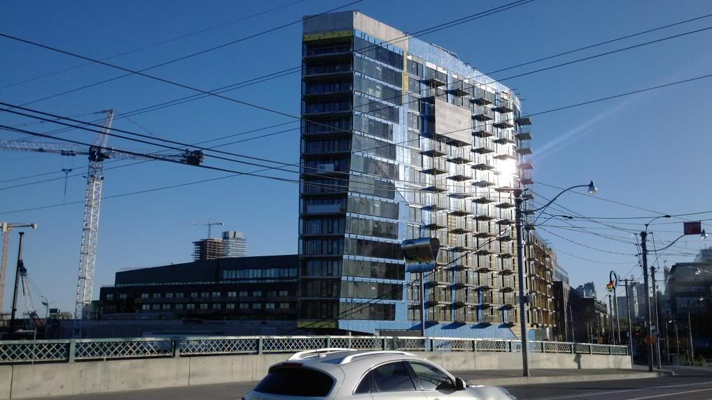
Right?! The Perimeter Institute is really a sight to behold... S+P at their best.
 
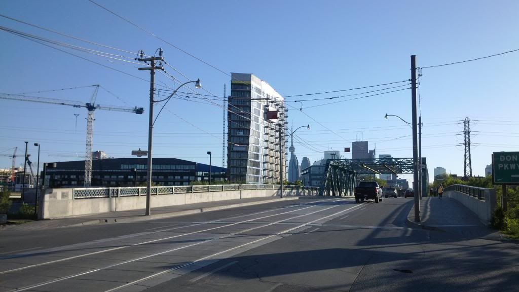
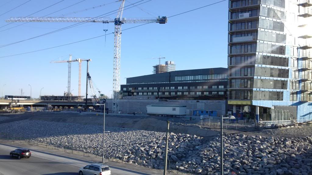
May 26th. Sorry about the cellphone pics.

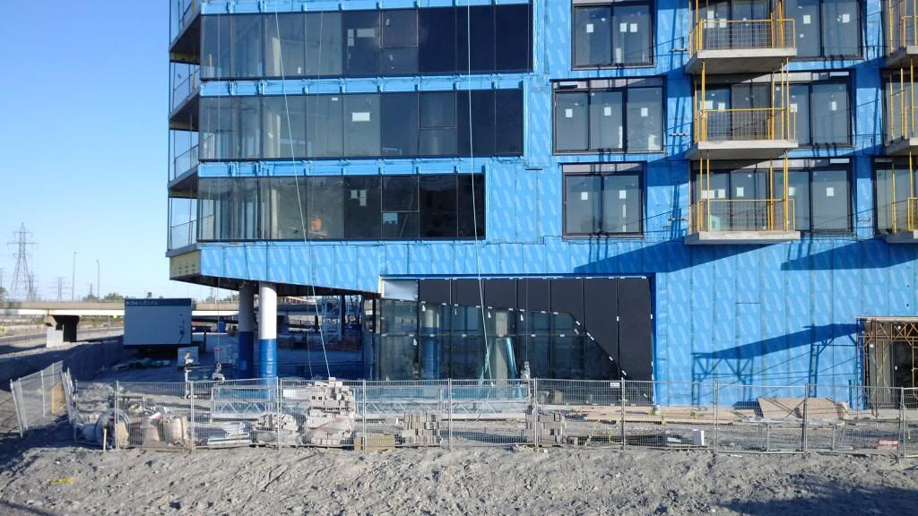
Looking westward o'er the Don.
IMG_20130526_192100_zps82d29823.jpg


IMG_20130526_192242_zpsf4916f3c.jpg


IMG_20130526_192319_zps59013f08.jpg


IMG_20130526_192346_zpse4e00868.jpg


IMG_20130526_192510_zps0d0434a2.jpg


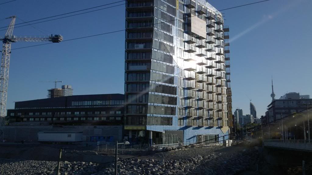
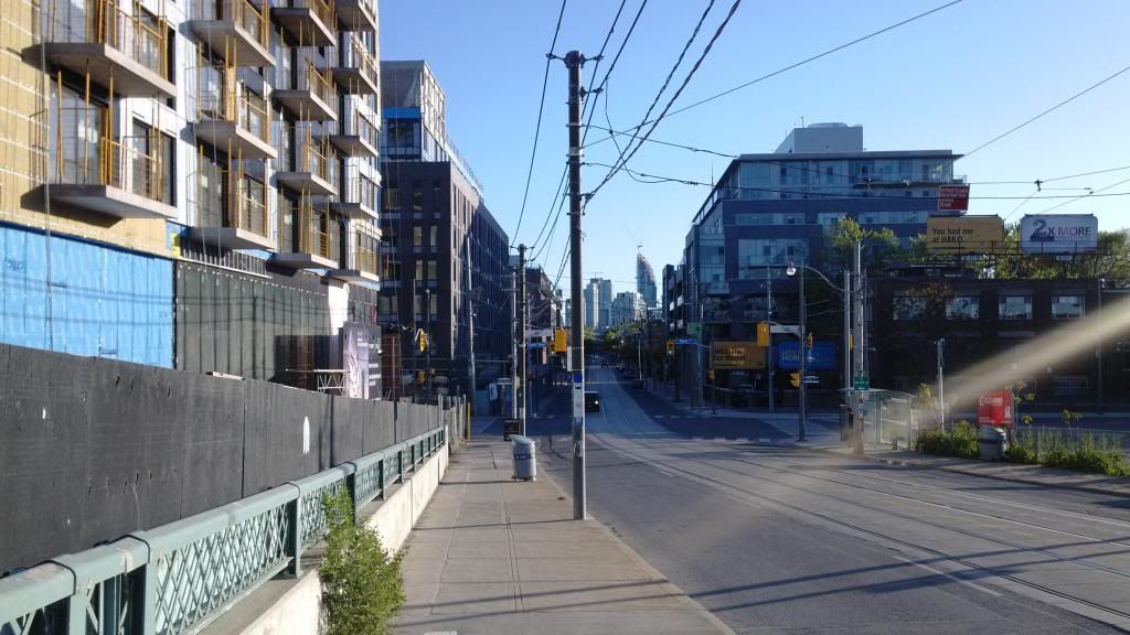
This looks more impressive in person. The L-Tower forms a wonderful terminus to the view.
IMG_20130526_192543_zps017459da.jpg


IMG_20130526_192606_zps98e45eb6.jpg


IMG_20130526_192721_zpscf32a116.jpg


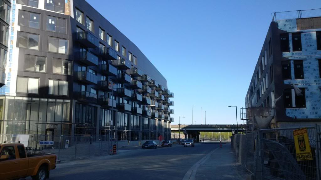
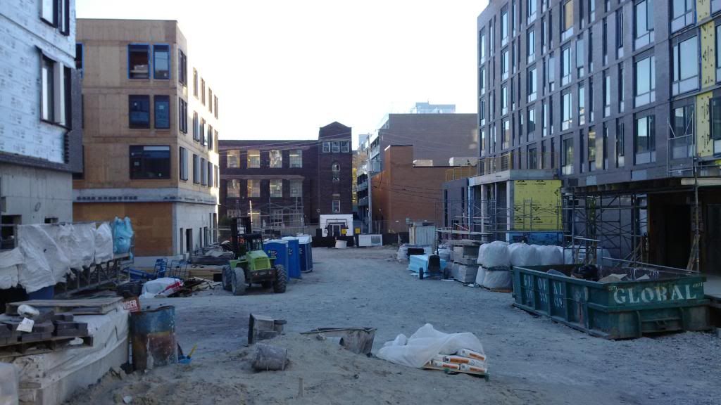
Just across the street, the peculiar sight of wood construction for TCHC. Erm.
IMG_20130526_192803_zps0febbb60.jpg


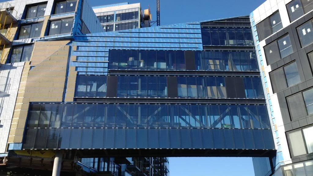
The bridge between buildings, getting sculptural.
IMG_20130526_192817_zps95cf974e.jpg
 
Awesome update! And so cool to see the inside of the townhouse unit. I love the exposed concrete ceiling, the exposed duct, and the kitchen looks great too.
 
I love this project ... the only negative so far, the patio pavings are rather dull, the square tile things, but I guess what else would you use !
 
Just moved in here! Can't wait to see the area develop around me, also for the other tower to finish up!
 
Though I like the exterior of RC very much and most of the interior shots look good too I must say I was not impressed by the view INTO the show-loft bedroom from Lower River Street. Because of the full glass wall, one sees the side of the bed and it will not look too great when people actually live there (and don't make it up every morning.) Of course, one would have blinds but ....
 

Back
Top