bgobgo
Active Member
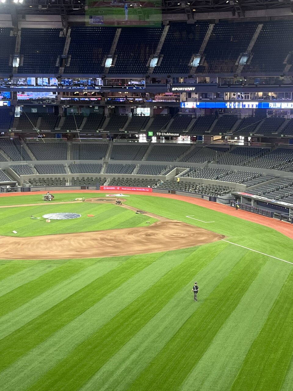
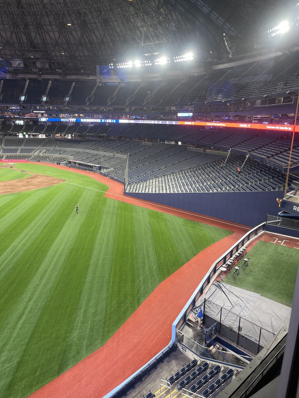
Some new pics of the lower bowl. Loving it.
Source: Tyler Procyk on X.


Source: Tyler Procyk on X.
A pole would interfere with views no?Sadly, “net” foul poles remain…
Otherwise, I agree, it looks great!
A pole would interfere with views no?
kudos to the team. Almost looks like a modern ballpark in the interior.
Is the symmetry going to even be noticeable with people in the stands though? Does it change the experience of the game?From a purely aesthetic perspective, the new seating arrangement and field layout don't look good. I've never liked asymmetrical field shapes, a la Fenway Park. The Dome had near perfect symmetry before with respect to the shape of the field and the seating sections.
Focusing on the latter: the execution of the new seating sections behind home plate looks terrible. The aisles are all disjointed and don't line up well with those in the 200 Level. The concrete walls that demarcate the 100 Level into three different tiers is not only utilitarian in appearance, but it exacerbates the messiness of the overall plan. It looked so much better when the 100 Level mirrored the clean, elongated lines of the 500 Level.
Also, was it really necessary to incorporate the VIP seating behind the backstop in such a way that it had to be separated with those walls? I don't like how truncated this all looks. There some other issues that I also dislike, such as the diagonal Blue Monster foul territory wall in left field. I feel like this could have been handled better with more careful attention to details.
From a purely aesthetic perspective, the new seating arrangement and field layout don't look good. I've never liked asymmetrical field shapes, a la Fenway Park. The Dome had near perfect symmetry before with respect to the shape of the field and the seating sections.
Focusing on the latter: the execution of the new seating sections behind home plate looks terrible. The aisles are all disjointed and don't line up well with those in the 200 Level. The concrete walls that demarcate the 100 Level into three different tiers is not only utilitarian in appearance, but it exacerbates the messiness of the overall plan. It looked so much better when the 100 Level mirrored the clean, elongated lines of the 500 Level.
Also, was it really necessary to incorporate the VIP seating behind the backstop in such a way that it had to be separated with those walls? I don't like how truncated this all looks.
I think it has more to do with the height of them more then being able to be removed although was a factor in the design of them. Putting in a permanent foul pole the height it would be needed in the Rogers centre would be a massive undertaking and would probably need it's own footing.Sadly, “net” foul poles remain…
Otherwise, I agree, it looks great!
Good point. I’m a picture guy not a word guy.What about it?
I'll say this, having gone to games for 25+ years, the rebuilt 100 level will almost certainly be a massive improvement for the in-game viewing experience compared to the old seating deck. The issue of the 100 level not being completely symmetrical or aligned with the 200 and 500 level sections is a pretty minor qualm IMO considering the net benefit of a much improved 100 level. I don't think the minor misalignment is by choice either; you can blame the round/oval design of the Dome and maybe blame lies directly with the designers/architects who designed the thing almost 40 years ago. In an ideal world, the upper decks wouldn't be circular but would follow the curvature of the 100 level.The reason for that asymmetry in older parks is due to the fact that they were built on constrained sites and shoehorned into tight city blocks. Many of the postwar and contemporary stadiums are built on wide open land, thus, replicating asymmetrical field layouts is contrived, as opposed to being a result of limited space to work with.
In the instances where the aisles don't line up, they're generally centered with corresponding seating sections in other levels. It looks like there is a little bit of asymmetry in the upper deck at the new Yankee Stadium, however, the new 100 Level seats at the SkyDome are much more haphazard in their pattern. Some of the aisles in the new lower seating areas are at such odd, oblique angles when contrasted with their adjacent 200 Level sections. Anyway, these are just some observations that I've had. I wonder if Buck Martinez shares my sentiments.