You are using an out of date browser. It may not display this or other websites correctly.
You should upgrade or use an alternative browser.
You should upgrade or use an alternative browser.
AlvinofDiaspar
Moderator
The final gallery first envisioned in the RenRom project - Early Life - is finally opening:

 www.theglobeandmail.com
AoD

New ROM gallery showcases the weird, wonderful first drafts of animal life on Earth
Rare Canadian specimens of ancient microbes and bizarre sea creatures have a new and permanent home at the Royal Ontario Museum. The Globe took a look
AoD
Marccram
New Member
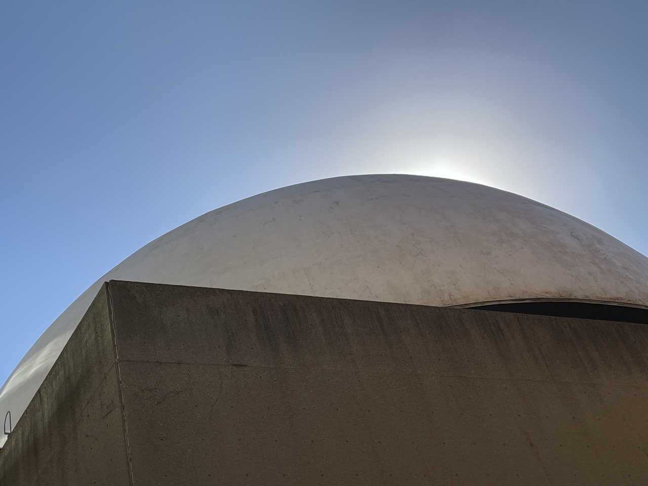
Concrete.
jje1000
Senior Member
Things I noticed from a recent trip:
- The ground floor is free 'til September.
- The new outdoor garden on Bloor is growing in nicely.
- The had live music in the Crystal atrium but the acoustics are not great. That being said, it was nice hearing some music wafting up into the galleries.
- The Crystal still feels cheap like a drywall palace- and due to the choices of materiality, poor detailing (hello handrails with screws in them), and minimalist design inside and out- perpetually scuffy in the atrium/handrail/lower wall/wall corner areas.
- The museum still feels like a maze at times, and connections between the older wings and the Crystal can spit you out into the middle of galleries. Some connections like between the European design gallery and Africa-Oceania galleries are still atrocious.
- The minimalist galleries are somehow aging poorly compared to some of the earlier ones (the Egyptian & European design galleries have grown on me again). Perhaps it’s just me, but I increasingly find visually contextless/narrativeless artifacts in glass cases dry and uninteresting. Modern museum design could really look to draw people into the artifacts' worlds, audiovisually reconnecting them to their contexts- i.e. Yadegar Asisi's historical panoramic recreations- these artifacts used to be part of something.
- Many of the older silver exhibit digital kiosks are no longer working, which contributes to this issue.
- The Spirit Room is still offensively useless as a thematic or functional space. So useless that the T-Rex gift shop is now located in it.
- The Staircase of Wonders still sucks, the old ROM stairs are far superior. No wonder barely anyone seems to use it.
- The elevators and elevator lobbies are very bland and visually cluttered. The elevator in the older wings is strangely in a closet.
- The entire Japanese gallery has been replaced by an event space, and all you get now is a single suit of samurai armor. Sad!
- The Canadian History gallery has been replaced by temporary exhibition space. Also sad, and it highlights the need for a dedicated Toronto history/ethnological museum.
- The third floor is bisected by a temporary exhibit space, and the corridor connecting the Byzantium gallery to the atrium is very narrow and passes through the older curatorial wing.
- The Canadian modern design gallery is where the Crystal's interiors really shine. Too bad it's all the way at the top.
- For some reason (saving money?), some galleries like Asia, First Nations, and Asia-Pacific are dimly lit to the point of detriment. With this reduced lighting, the Asian galleries with their rows of display cases felt very claustrophobic.
- There are some marooned and truncated galleries like the bird exhibit from the 90s and its intruding newer toy soldier exhibit.
- Libeskind’s uncomfortable chairs have been sidelined and shuffled off into the India-Oceania-Africa galleries.
- The new Dawn of Life gallery is great, albeit a bit too bright blue for my tastes (Ripley’s mood). That being said, there was something truly captivating about the old, dimly-lit early life galleries with their enormous dioramas that made them feel truly primordial.
- The bat cave was better without the voiceover dialogue (again it is one of those truncated exhibits that's over before it even starts).
- Some galleries like Oceania-Africa feel undertrafficked, and galleries like India feel like they could be more interesting (again, floating artifacts with minimal context).
- I noticed that in a few instances in some of the older exhibits, literal artifacts are missing from display cases and pedestals without any notes as to their whereabouts (it was a Roman bust and Egyptian Book of the Dead). While I’m sure they’re just being taken away for conservation, it still is disconcerting.
- With advances in ticketing technology, the front desk areas will be minimized in the future. This may present some opportunity to revamp the Bloor Street entrance in the future, and make it more inviting.
- I wonder if it was a missed opportunity to work with U of T to relocate some of the curatorial offices to the new Centre for Civilizations, Cultures, and Cities? The museum felt very short on space, which resulted in some odd exhibit arrangements (especially in world history), and the loss of some exhibits (they need revenue?).
- Overall, the Crystal is something the museum needs to 'deal with' (it has its fundamental design issues, but is too expensive to start over), which may require a larger intervention in the future. For one thing, the huge useless Spirit Room should be target #1 for removal.
Last edited:
hawc
Senior Member
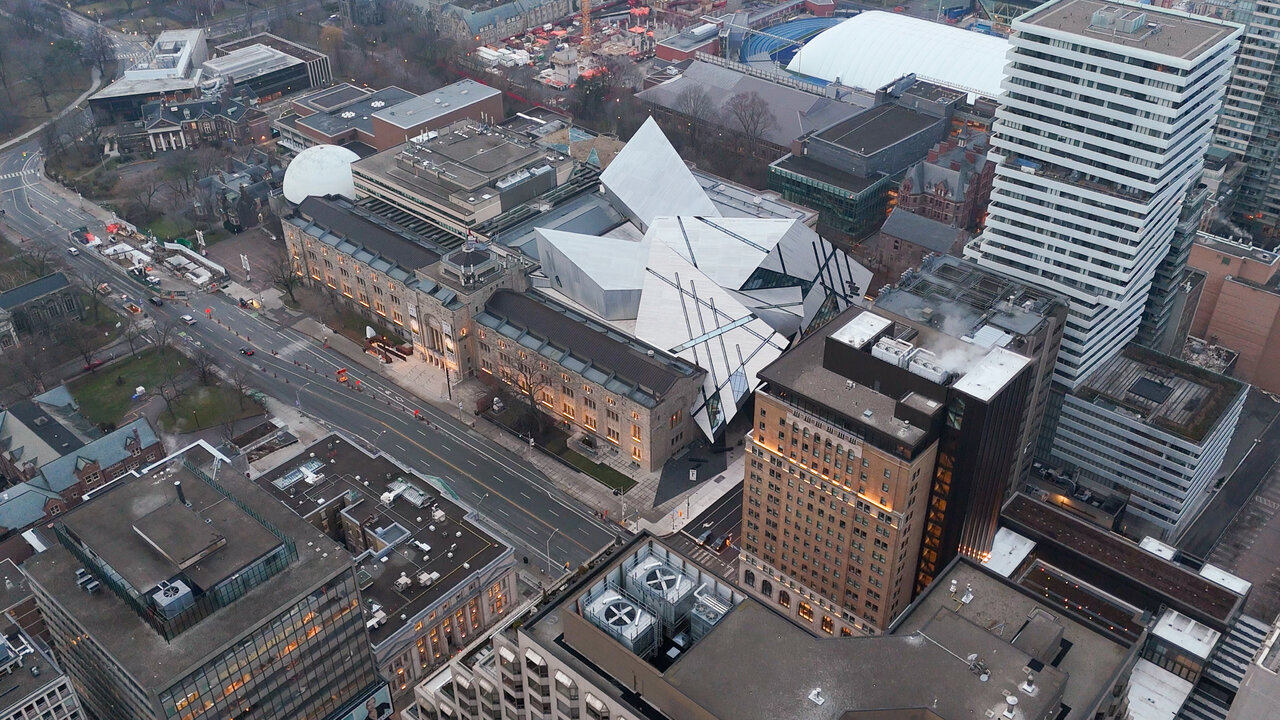
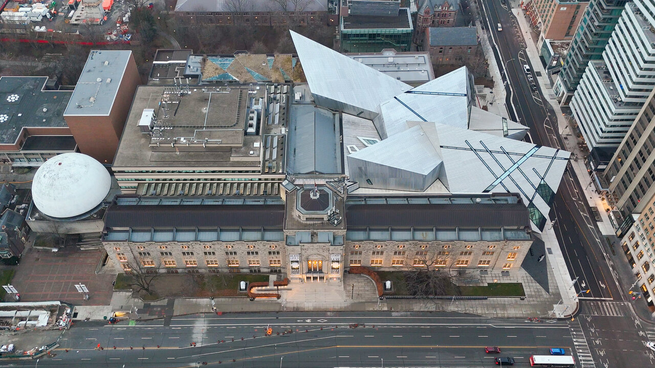
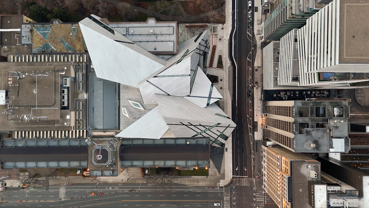
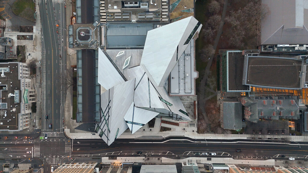
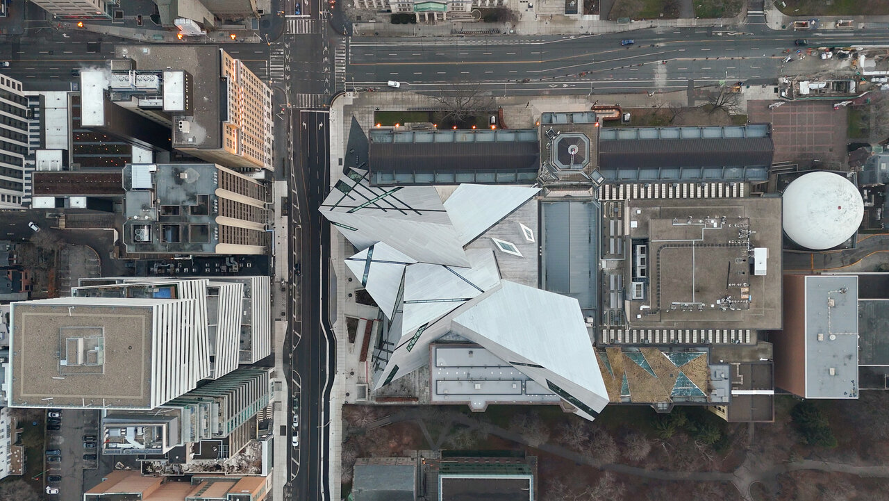
A slightly different perspective.
Freddy
New Member
Really really pops from the vantage!
Student99
Active Member
What exactly is the "spirit room"? Is it that multi-storey space where platforms just run through it?- The Spirit Room is still offensively useless as a thematic or functional space. So useless that the T-Rex gift shop is now located in it.
. For one thing, the huge useless Spirit Room should be target #1 for removal.
AlexBozikovic
Active Member
The Crystal is getting a renovation. My piece on OpenROM:
https://www.theglobeandmail.com/arts/art-and-architecture/article-rom-crystal-renovation-design/
https://www.theglobeandmail.com/arts/art-and-architecture/article-rom-crystal-renovation-design/
TORONTO, FEBRUARY 14, 2024 — Today, the Royal Ontario Museum (ROM) is pleased to announce the launch of OpenROM, a multi-faceted initiative that will dramatically open the Museum up even more to the public, creating a thriving cultural and civic hub in the heart of the city. Grounded in ROM’s overarching vision to further enhance visitor access and engagement, OpenROM includes a sweeping architectural transformation of the Museum’s main floor and a redesigned Bloor Street entrance that will deepen ROM’s connection to the city. Work is set to begin in early 2024, and the Museum will remain open to visitors throughout the three-year construction period.
Funded by private philanthropy, this landmark revitalization project has been catalyzed by a $50-million donation from the Hennick Family Foundation – the single largest cash gift in ROM’s history.
Once construction is completed, OpenROM will introduce ongoing free access to the Museum’s main floor. This builds on the proven success of ROM’s summer-long Free Main Floor pilot program, which was introduced in 2022 and returned in 2023, both with the generous support of the Temerty Foundation. OpenROM’s expansive architectural design, coupled with year-round free admission to the Museum’s entire main floor, as well as unlimited access to special programming, live performances, and hands-on activities, will make ROM an even greater cultural anchor and gathering place for Ontarians.
“OpenROM is more than a physical transformation; it is a major leap forward in the Museum’s ongoing evolution to becoming an even more welcoming and accessible space,” says Josh Basseches, ROM Director & CEO. “This is an opportunity to truly throw the doors of the Museum open, both literally and figuratively, and invite more people in to experience all ROM has to offer. We want people from down the block and around the world to feel like this is a place for them, where they are inspired and belong.”
Siamak Hariri, of the award-winning Toronto-based firm Hariri Pontarini Architects, leads the design. Building on the iconic Daniel Libeskind-designed Michael Lee-Chin Crystal, OpenROM will transform 86,000 square feet on the main floor and create 6,000 square feet of new gallery space on the second and third levels, deepening the visitor experience with the Crystal and providing greater access to ROM’s world-class collection.
“We’re going to re-introduce ROM to Toronto with a design that, in effect, turns the Museum inside out,” says Siamak Hariri. “We’re going to bring daylight and views deep inside and create new connections with Bloor Street, within the ground floor public spaces and the galleries themselves.”
In addition to reimagining the core of the Museum, the project includes enhancements to the exterior spaces. Animating one of the most notable intersections in Toronto, a new showcase water feature will wrap around the heritage façade at the corner of Bloor Street and Queen’s Park. This fountain will evolve with the seasons, changing from burbling water in the summer to cracked ice in the winter, in a nod to frozen Canadian landscapes.
Anchoring the exterior will be a newly designed and fully accessible Bloor Street entrance, sheltered by an expansive bronze canopy. The seamless floor-to-ceiling glass entryway – the future Hennick Entrance – will offer pedestrians direct sightlines into the building, creating a porous connection between the Museum and the neighbourhood.
Inside, visitors will enter a bright, open foyer, featuring artworks and specimens from ROM’s extensive collection, with an unobstructed vista into the Museum. An oculus – a giant, circular portal in the ceiling – will draw visitors’ eyes upwards, bathing the entryway in light and offering a view of the remarkable dinosaur galleries above.
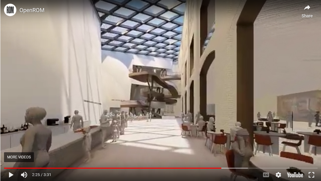
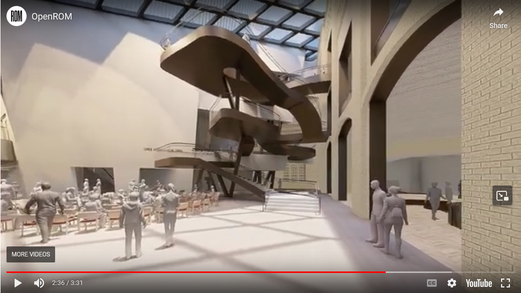
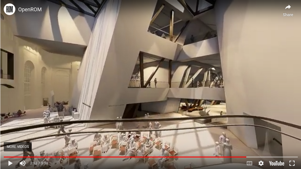
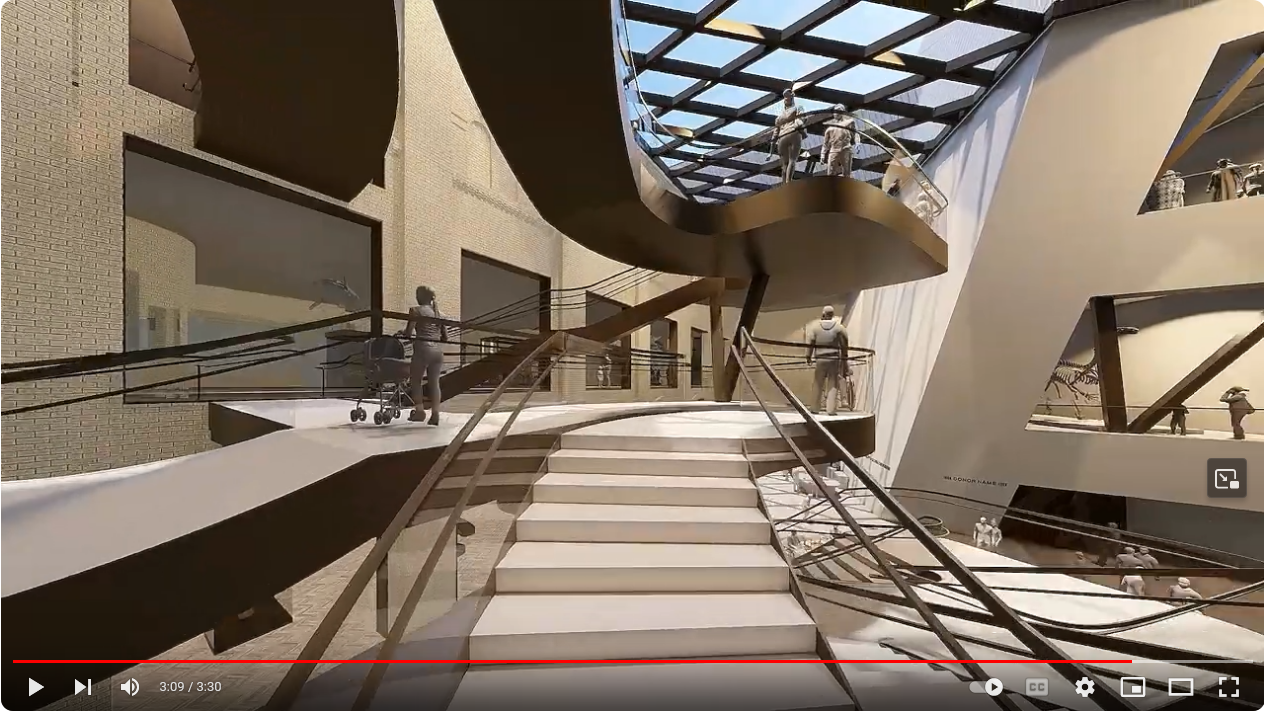
The foyer will lead into the new heart of the Museum: Hennick Commons, a soaring, sunlit four-storey atrium capped with a sweeping, high-performance diagrid glass ceiling. There, visitors will encounter a new, 2,400-square-foot forum, where audiences will enjoy regular performances, programs, and hands-on experiences. Adjacent to the forum will be a grand multi-level, lily pad staircase, which will offer three accessible overlook platforms for surveying the Museum and knit together old and new wings of the building to improve mobility. The Hennick Commons will be a vibrant hub and public plaza; a place for gathering, learning, and exchange.
“We are honoured to serve as catalyst donors for a transformational vision for the Royal Ontario Museum,” say Jay and Barbara Hennick. “OpenROM reimagines the visitor experience and will help to revitalize civic life in our great city. It's finally time for the ROM to take its rightful place among the very best museums in the world”.
“This cherished cultural institution offers exhibits and programming that appeals to all ages and interests," says Neil Lumsden, Minister of Tourism, Culture and Sport. "OpenROM will enable Canada’s largest museum to welcome even more visitors – fostering community, learning and cultural connections. I look forward to the completion of this project and seeing firsthand the many benefits that it will offer the people of Ontario."
ROM’s extensive multi-year renewal plan began with the reopening of the Weston Entrance on Queen’s Park in 2017. In 2019, ROM introduced a new public outdoor space with the unveiling of the Helga and Mike Schmidt Performance Terrace and the Reed Family Plaza on Bloor Street. And in 2021, the Museum opened the Willner Madge Gallery, Dawn of Life – the first major permanent gallery of its kind anywhere in the world.
"The next in a series of bold architectural initiatives, OpenROM will elevate the Museum’s role as a vital Toronto landmark, recognized as Canada’s preeminent museum and one of the world’s great cultural institutions,” says Basseches.
Last edited:
rdaner
Senior Member
Wonderful! Little question: who is doing the fountain?
AlvinofDiaspar
Moderator
The Crystal is getting a renovation. My piece on OpenROM:
https://www.theglobeandmail.com/arts/art-and-architecture/article-rom-crystal-renovation-design/
It reminds me of Lisa Rochon's lament what, 2 decades ago of how the diagids were hidden. Anyways, one thing I do hope they don't change too much is the design philosophy of exhibits/displays - it is one thing that was handled far better than before (and the recent galleries seem to have reverted a bit to the old stoginess).
As to the design - I am not entirely convinced by the "oculus", and I wonder how (if?) the old "Stairs of Wonder" will be purposed, vis-a-vis the new lilypad staircase. I do love the increased focus on high quality materials; and opening up the courtyard with glazing is an no brainer.
AoD
Last edited:
Northern Light
Superstar
The Crystal is getting a renovation. My piece on OpenROM:
https://www.theglobeandmail.com/arts/art-and-architecture/article-rom-crystal-renovation-design/
Excellent piece.
AlvinofDiaspar
Moderator
Also - updated website:
 www.rom.on.ca
AoD
OpenROM
Canada’s Leading Museum, Reimagined. Introducing OpenROM: a landmark initiative that will dramatically open the Museum even more to the public, creating greater access, and a thriving cultural and civic hub in the heart of the city. OpenROM includes a sweeping architectural transformation of the...
AoD
Northern Light
Superstar
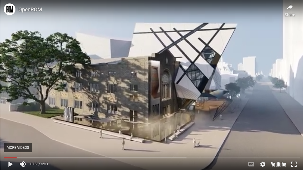
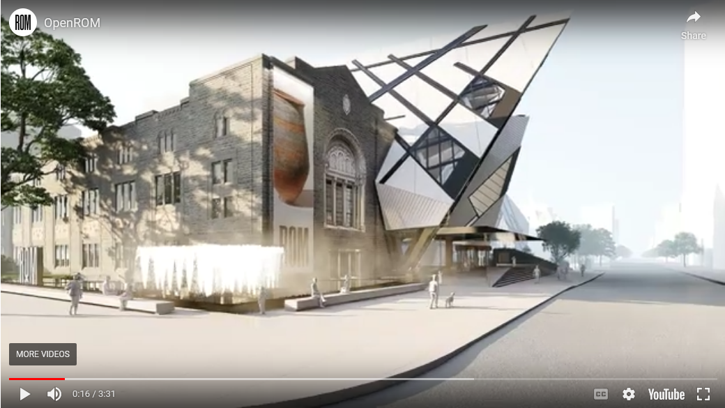
Let me throw up some links/renders
Project Website:
 www.rom.on.ca
Video from front page of same:
A few extractions of images from same:
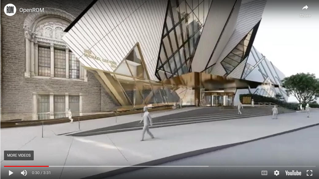
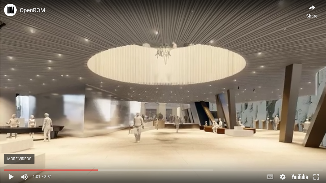
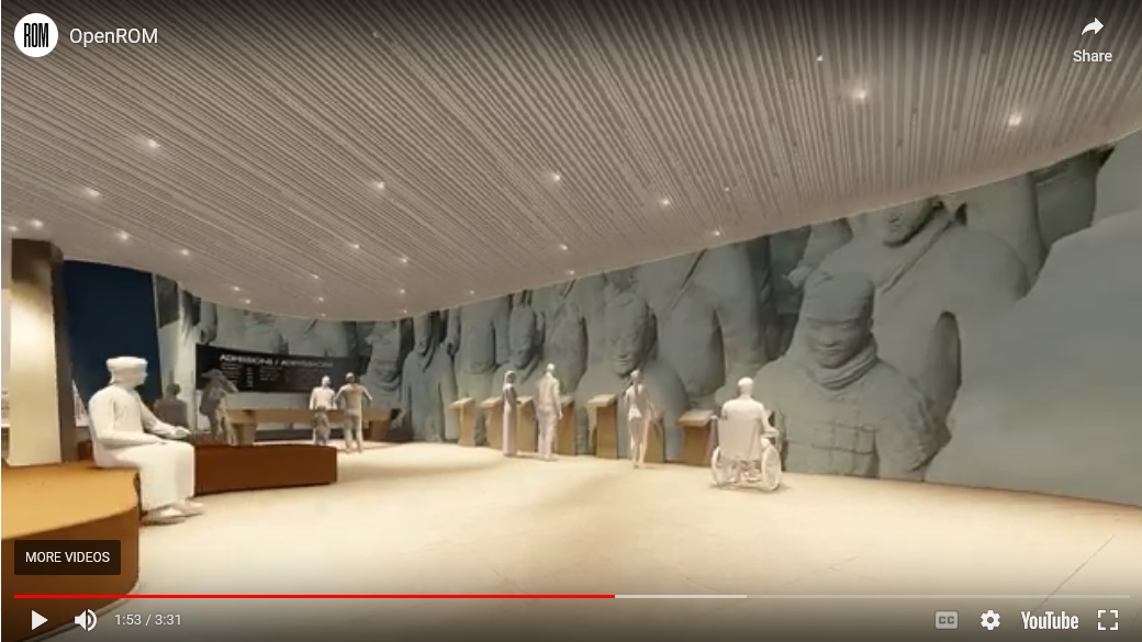
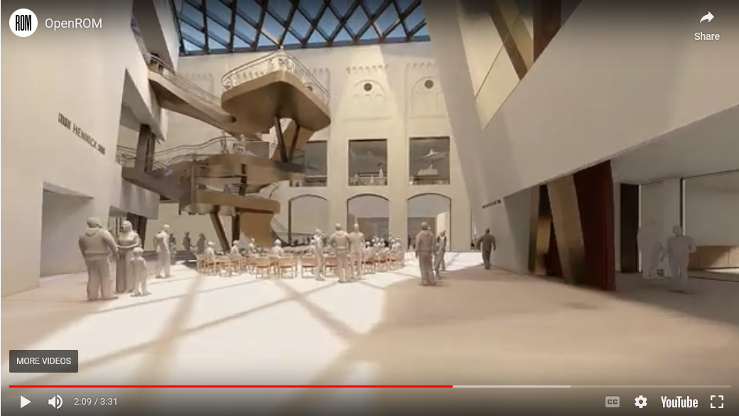
Project Website:
OpenROM
Canada’s Leading Museum, Reimagined. Introducing OpenROM: a landmark initiative that will dramatically open the Museum even more to the public, creating greater access, and a thriving cultural and civic hub in the heart of the city. OpenROM includes a sweeping architectural transformation of the...
Video from front page of same:
A few extractions of images from same:
UtakataNoAnnex
Senior Member
With Gehry squiggle stairs and all, Mr. Hariri went all out... 