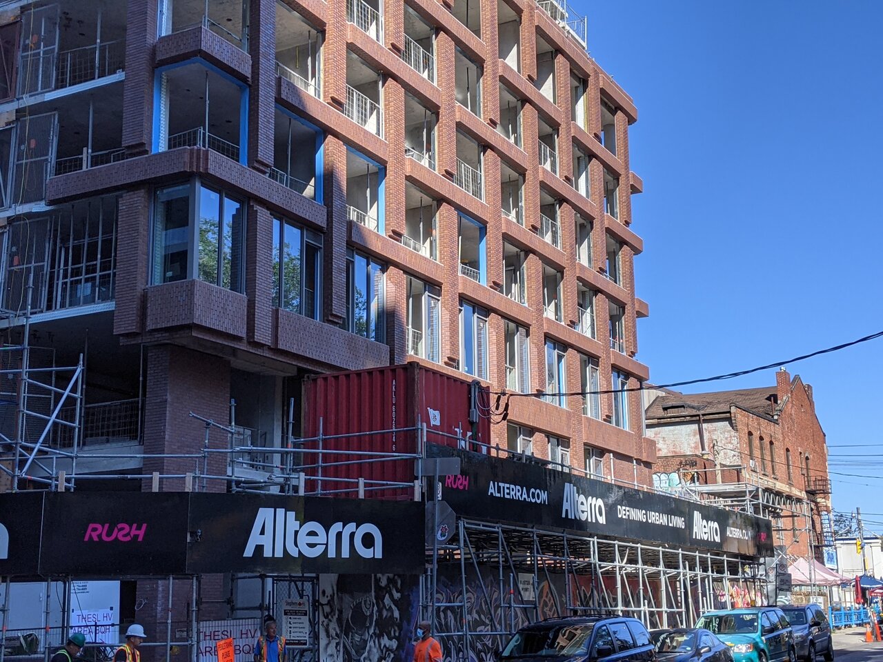
Unsure if anyone here has seen the window wall yet, not enough for me to make a final judgement, and I'm more curious as to how it'll look up top.

Taken moments ago:
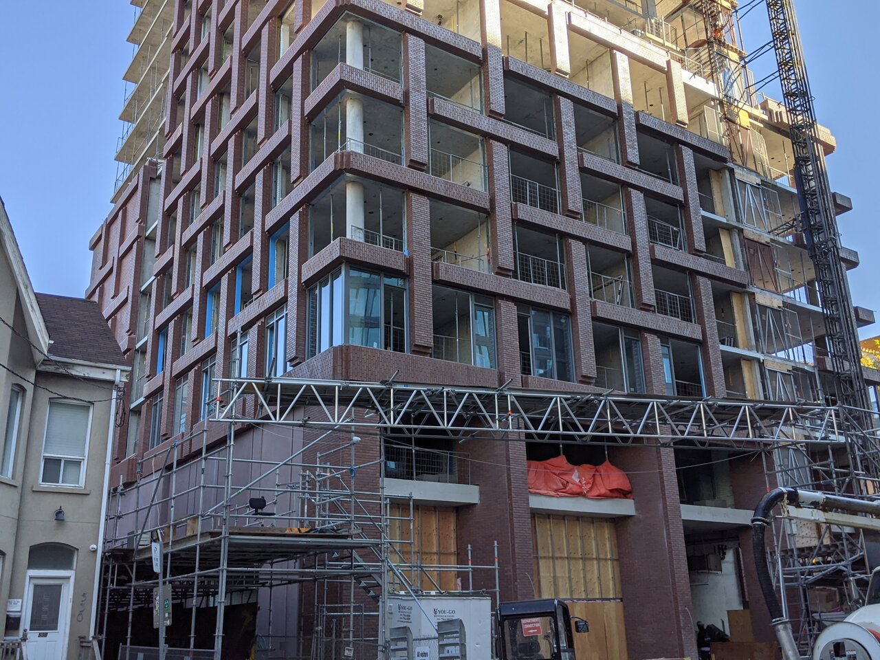
PXL_20210910_143037471.jpg
PXL_20210910_142952121.jpg
 
I think it works. But also still too early.

Might end up being a little over bearing up top but we will see!
 
I like the brick and glass but I'm more worried about the top part. It might end up with grey spandrel. :(
 
I like the brick and glass but I'm more worried about the top part. It might end up with grey spandrel. :(
Window wall they'll be using is pretty much the of same fashion as they're installing now from the renderings I gather, for good or bad.
 
Wow real nice!! Excellent column spandrel for podiums to be used on other condos etc. It's got that 70s vibe and would be great for a skyscraper facade in a light metal cladding look!
 
Looking good so far. I like how the precast brick pattern runs sideways for the horizontal spans which reinforces the basketweave pattern (which wouldn’t be as structurally sound if it was done in real brick).
My concern is that those horizontal ledges would be a perfect perch for pigeons who will create a mess of droppings on the face of that nice precast brick.
 
It's not as bad as I'd feared, but I don't understand why not go black...?
I agree that black would look sleeker and more upscale, and I would have preferred black, though in this case I'm guessing they went grey in order not to take attention away from the lines of the brick pattern (as the grey disappears better in the background)
 
Love the design but have a technical question. Is this building susceptible to water pooling just below those vertical brick sections? If so, are there construction techniques to ensure it doesn't make its way in?
 
Love the design but have a technical question. Is this building susceptible to water pooling just below those vertical brick sections? If so, are there construction techniques to ensure it doesn't make its way in?
Absolutely! this was a very challenging element of the design. In the end, a sloped precast sill was integrated into the panels. This proved to be very complex, especially at the outside corner windows

@ProjectEnd - as for the glass, I agree darker would have been better.

But give the Alterra big time credit for doing laminated glass and thus avoiding the dreaded 'horizontal mullion' - this is just about as good as window wall gets.

Would have preferred perf at the louvers as well but you can't win 'em all
 
Last edited:

Back
Top