You are using an out of date browser. It may not display this or other websites correctly.
You should upgrade or use an alternative browser.
You should upgrade or use an alternative browser.
- Thread starter UrbanAffair
- Start date
Vminkov
Active Member
I love her lack of energy! Go girl give us nothing!
CanadianNational
Senior Member
Seeing this thing's sides straight-on vs. seeing it directly up from the bottom is quite a surprise in what it reveals about the building. Looking up from the base, it's immediately apparent how lovely the and well-done the geometric folding and outlines of the balconies have been done. That's a skilled pour and an urbane and pleasing touch that would have greatly benefitted the tower had the cladding engaged with it properly. Personally, I can't help but think how good it could have looked if they had used the balcony outlines as is to produce a closed volume.
This tower is a cautionary monument to expediency, speculation and ugly choices. If fate smiles on us, perhaps it will be up for a recladding in twenty years. In the meantime, it deserves every insult heaped on it.
This tower is a cautionary monument to expediency, speculation and ugly choices. If fate smiles on us, perhaps it will be up for a recladding in twenty years. In the meantime, it deserves every insult heaped on it.
Last edited:
Justelena
Active Member
leftfieldto
Active Member
Yikes!! Where's the vomit emoji when you need it?
AlvinofDiaspar
Moderator
Yikes!! Where's the vomit emoji when you need it?
It's heartening to see them taking inspirations from the new additions to the Yonge-Dundas Square, or the much-loved 2012 London Olympics logo. Hear me RAW...
AoD
yrt+viva=1system
Senior Member
7.1.2023
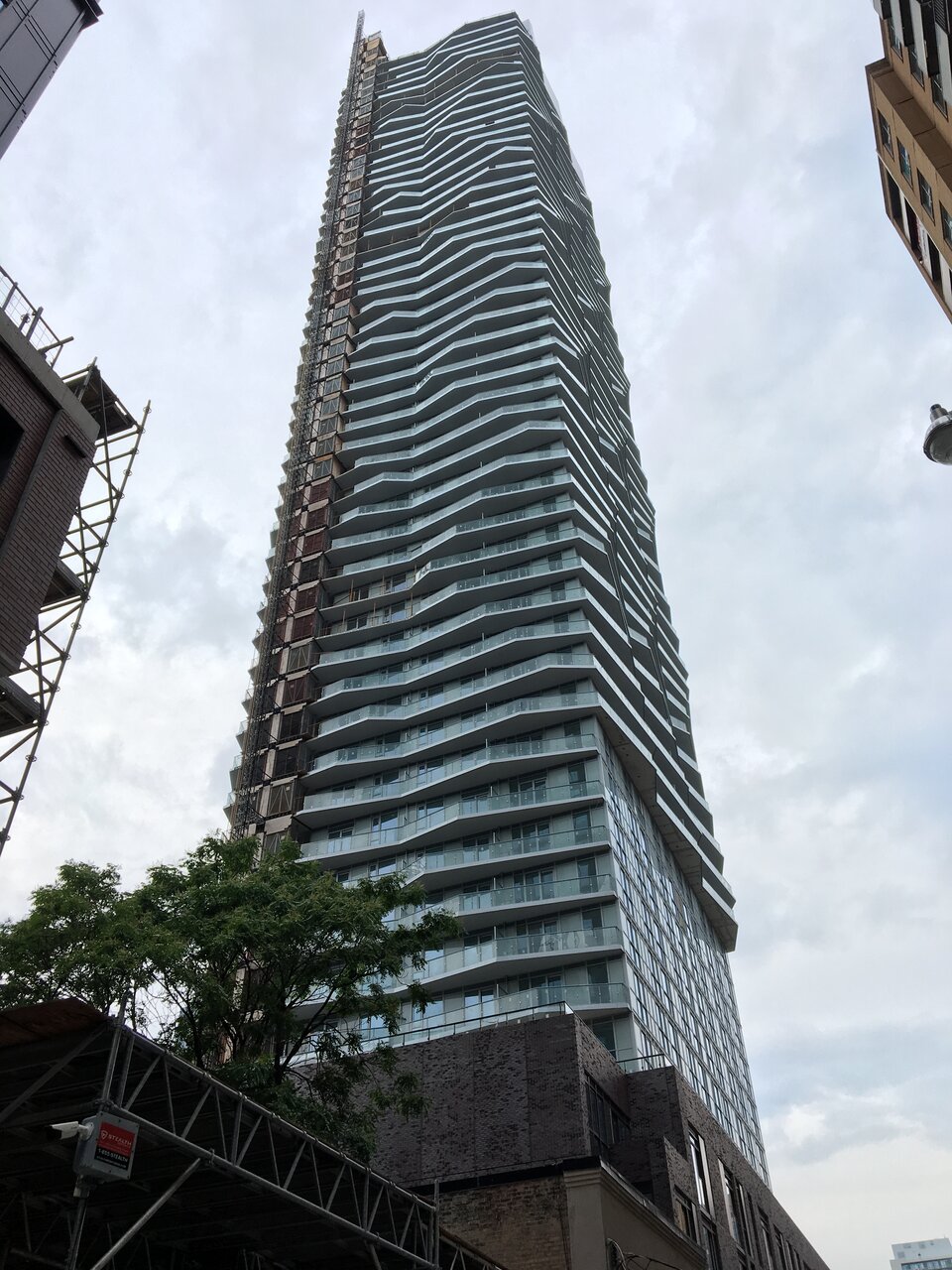
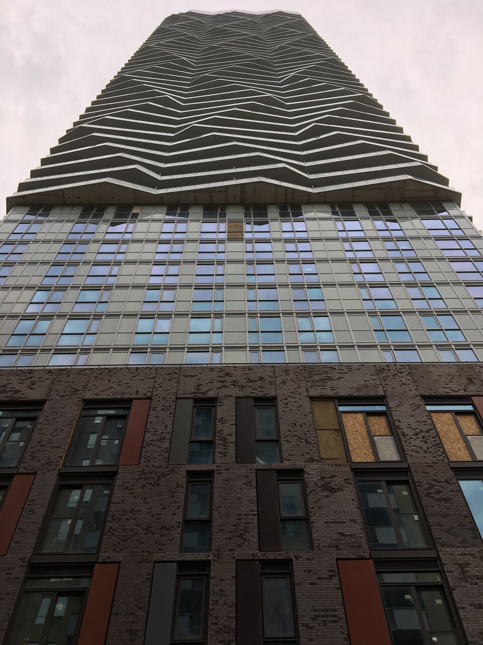
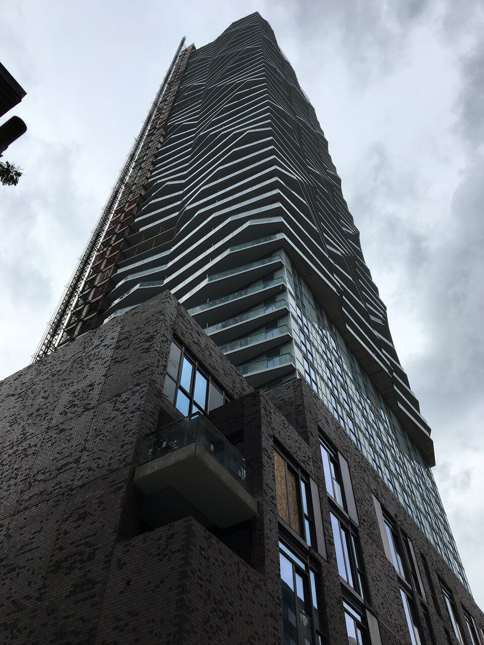
Rascacielo
Senior Member
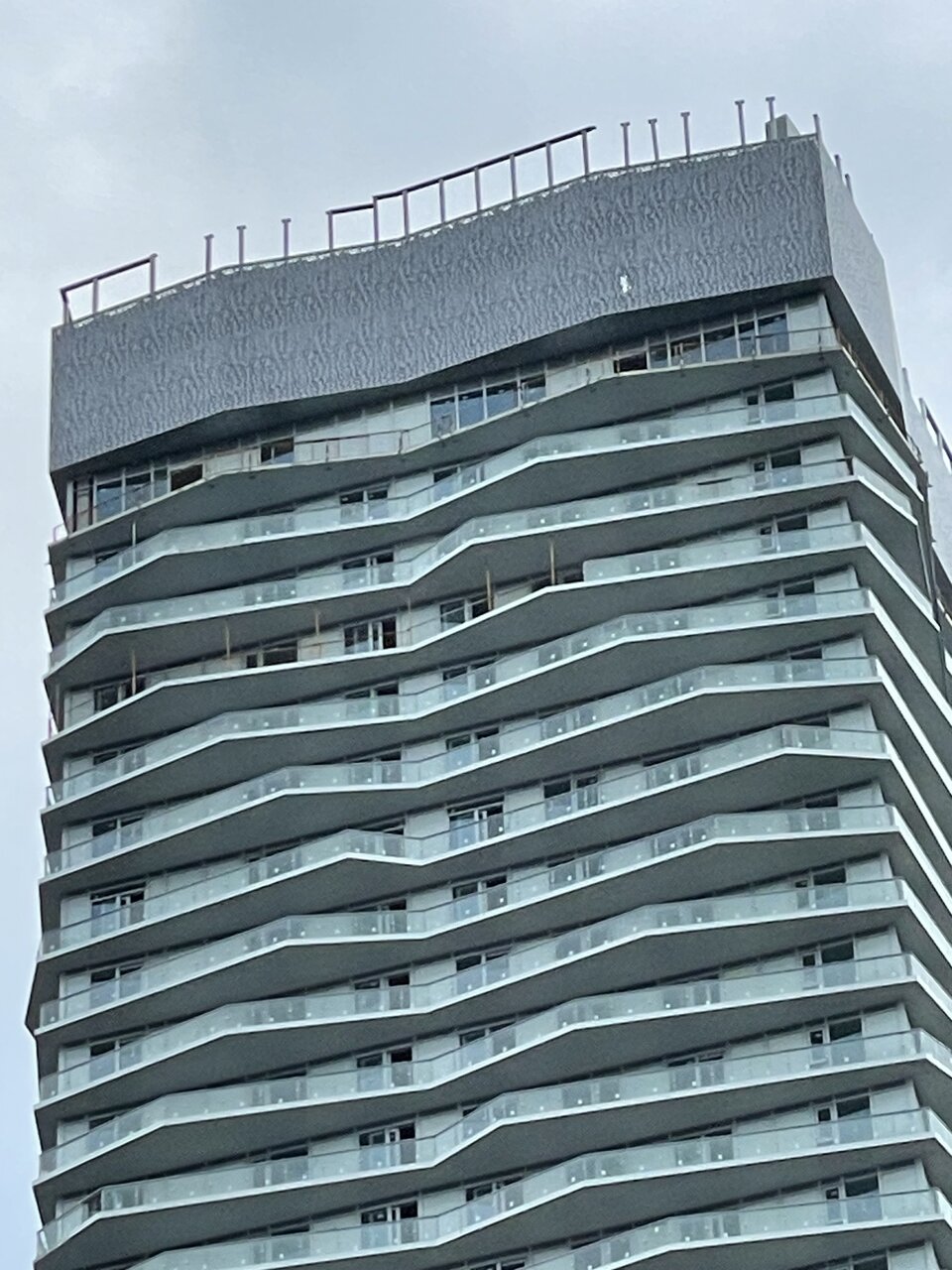
Today. Cladding on the crown has this paisley-ish pattern. Given that the pattern is hardly visible 400-500 m down the street, it seems such a waste of budget - could’ve spent it on better balcony glazing or non-spandrel tower cladding.
paupah
Active Member
Nice. You managed to make this look not horrible
UtakataNoAnnex
Senior Member
Even being generous here...making your building only works at limited angels is really not a good way to design and build it. What so ever. /sigh
Last edited:
lightarchitect
Active Member
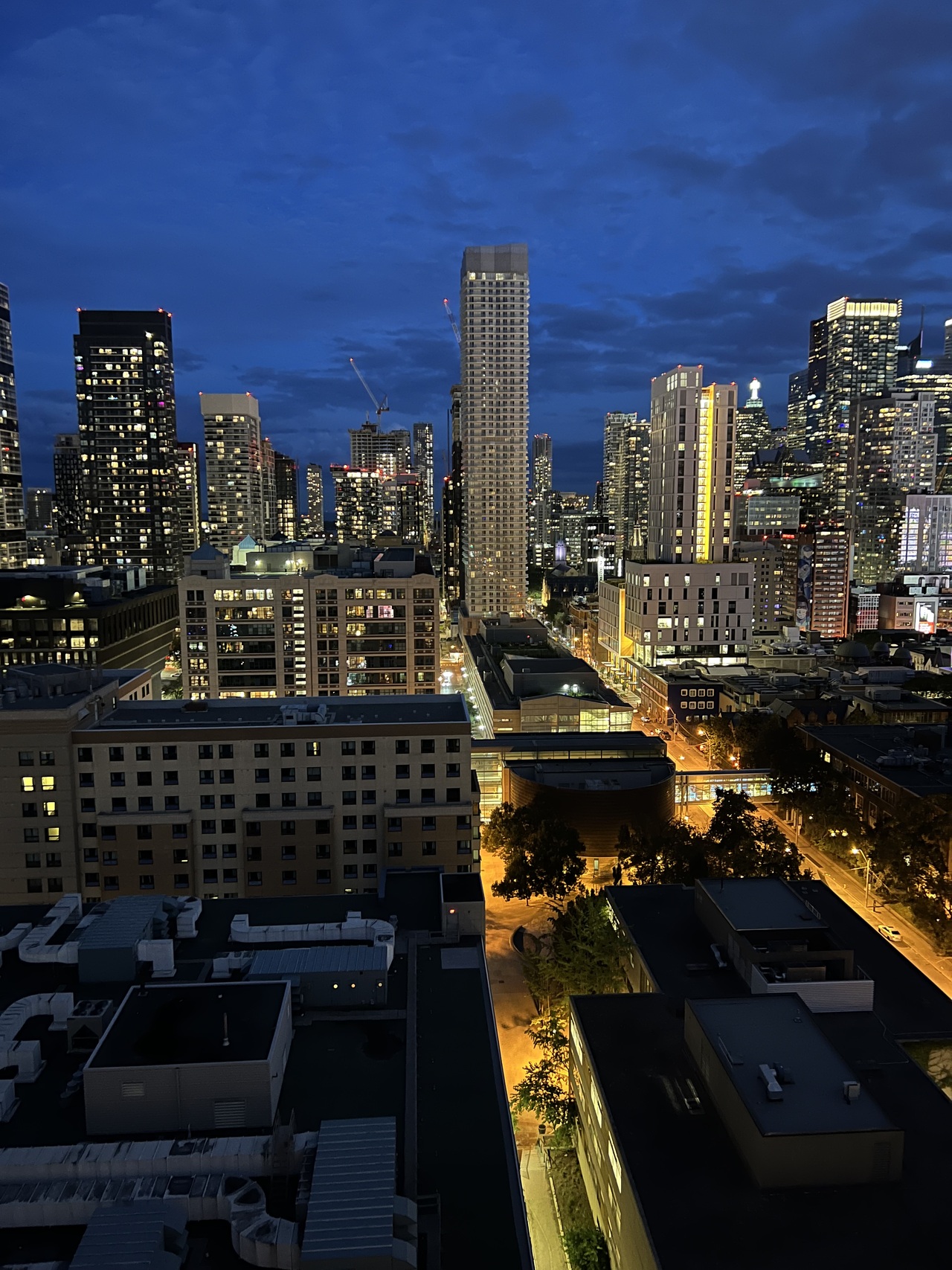
Yellow lit roads to this unfortunate mess.
Rascacielo
Senior Member
No picture, but I passed by the other day and noticed that the patterned cladding had been extended to the parapet above the roofline. Again, all that effort and extra expense that could’ve been spent on better balcony glazing …
officedweller
Senior Member
At least they continued he folds to the top.
Compare to Grosvenor Pacific in Vancouver, where they stopped short:

Compare to Grosvenor Pacific in Vancouver, where they stopped short:

UtakataNoAnnex
Senior Member
What works here is that the balcony glazing is opaque making the balcony shapes pop out at more angles. And the curtain wall is of a higher caliber materials making it far less distracting to the balcony style...At least they continued he folds to the top.
Compare to Grosvenor Pacific in Vancouver, where they stopped short:

...I'm not saying I like this building, but it's much more pleasant to look at than the antiSocial here.
officedweller
Senior Member
Yeah, it's carrera marble at the balcony slab edge which nicely defines the zigzags.What works here is that the balcony glazing is opaque making the balcony shapes pop out at more angles. And the curtain wall is of a higher caliber materials making it far less distracting to the balcony style...
...I'm not saying I like this building, but it's much more pleasant to look at than the antiSocial here.
The dark glazing hides a lot of spandrel on that one too.