It's unfortunate that you lack the intelligence to appreciate my posts. If you lose the attitude, you could learn a lot from much of what I've posted.

We don't need to wait 15 years for anything--they are already a success.

No he was making the counter argument that projects don't necessarily have to be expensive to be well-designed and well-scaled. I could probably extrapolate what your trying to communicate in your original post (assuming you more or less meant that we shouldn't be surprised of the uninspired design given that it is not intended to be an overly affluent area) but you worded it in confusing, presupposing, and provocative way. You are clearly the one with the attitude problem.
 
Waterloo_Guy will be taking a vacation from UT until October 1. Insulting other members is not tolerated.

42
 
Waterloo_Guy has been a problem in various threads; I imagine he had been warned and this was what put him past his three strikes.
 
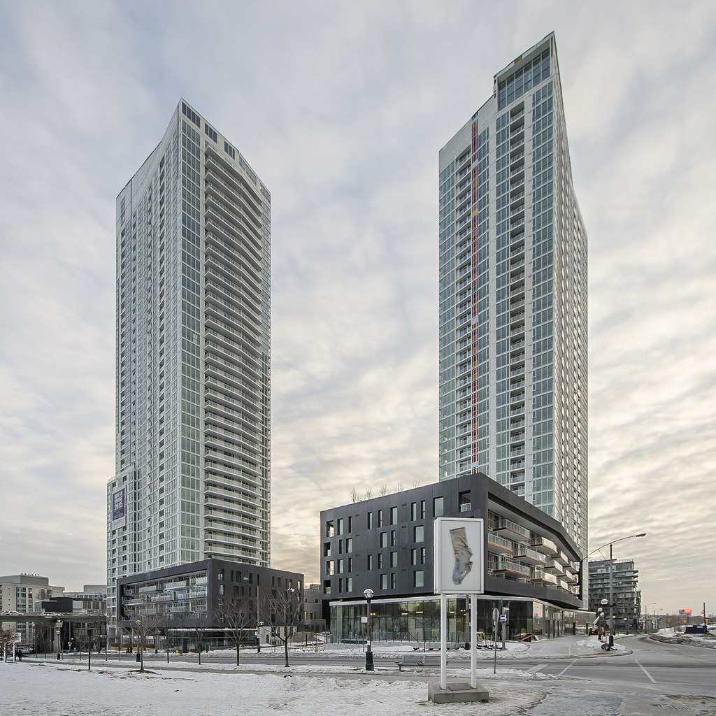
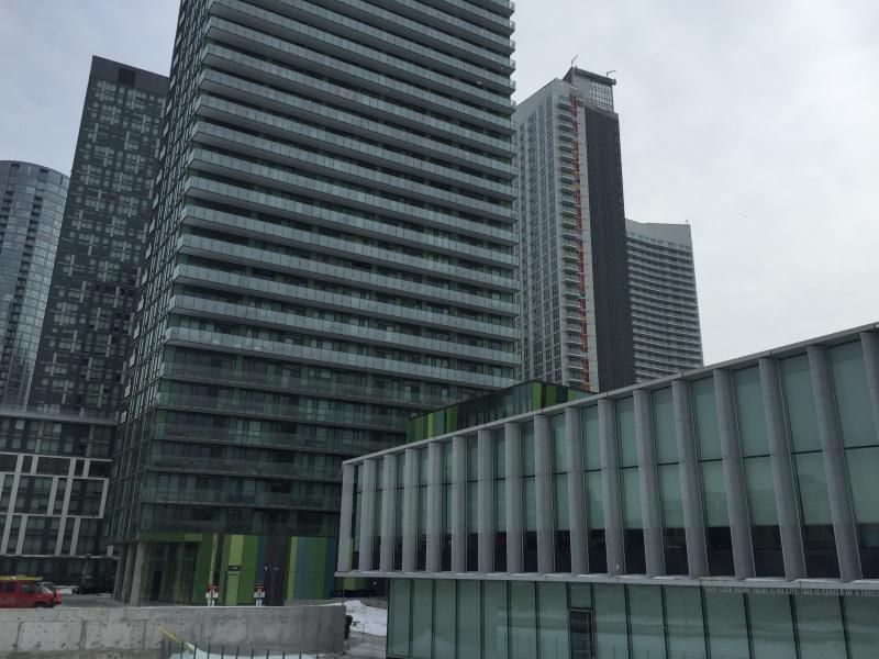
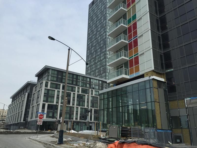
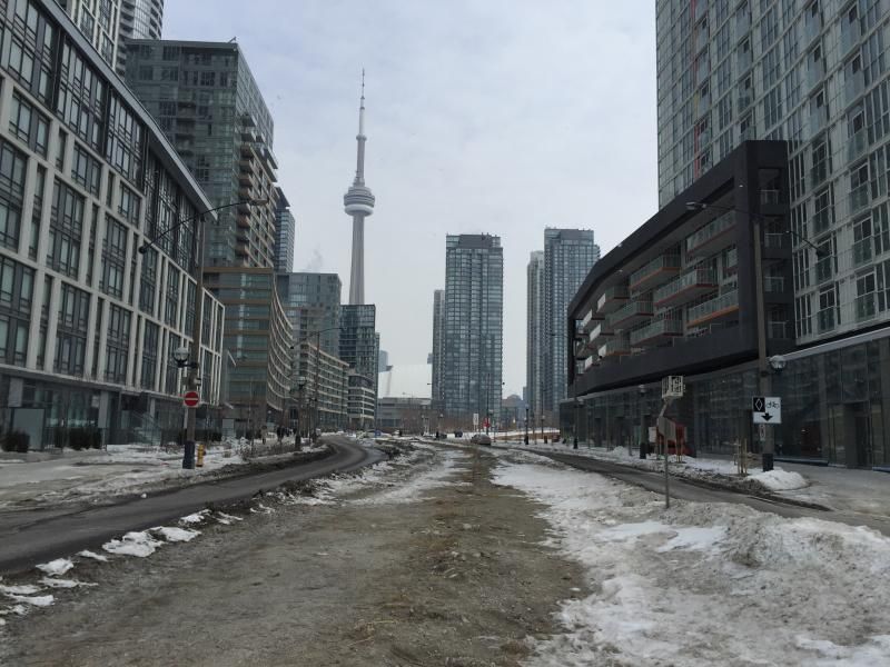
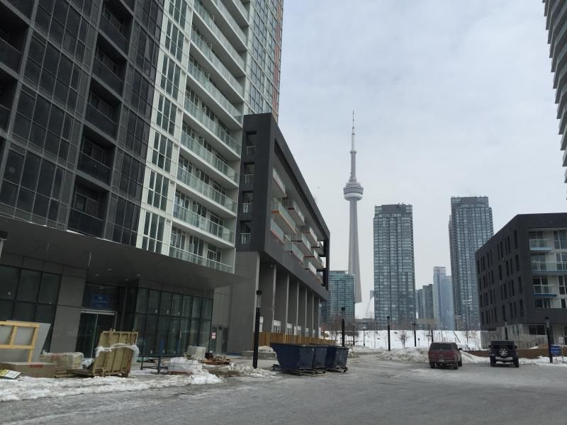
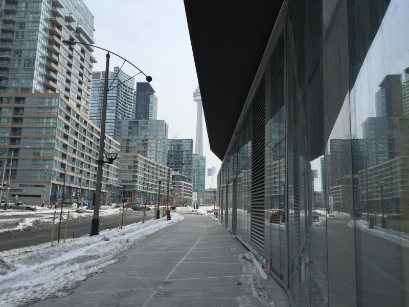
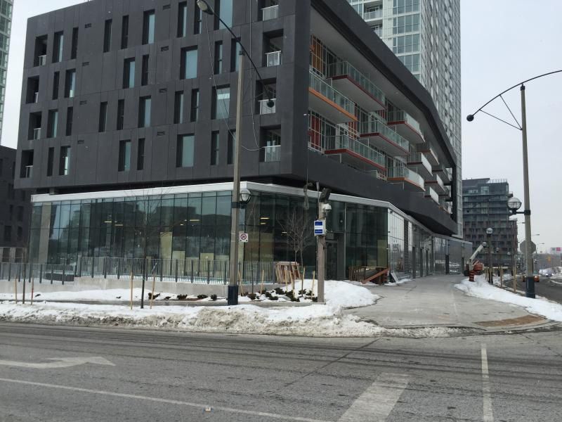
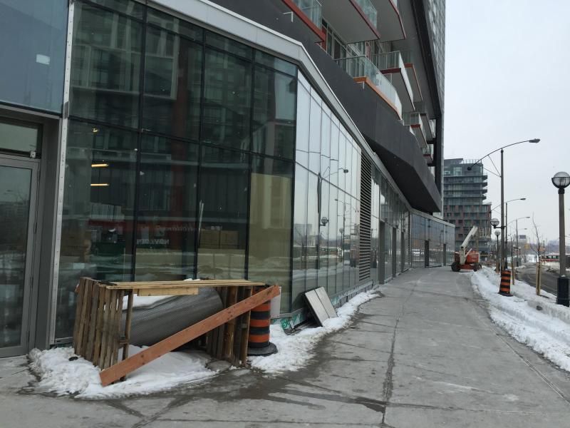
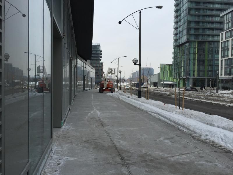
Great pics, Tuscani! (Always appreciate updates that are taken from a close-up perspective / show what it actually feels like to stand next to it or walk past it.)

Not a fan of this project or Quartz, though.
 
Another wall of glass and another cold, generic experience at street level. I don't like it at all but I better get used to it because the same thing is going up on every street in Toronto, sadly. When is this city going to start building some stylish, interesting, attractive and animated retail spaces along its sidewalks? The sameness of all this new retail is just getting on my nerves.
 
^ I have to agree, that one does look good and much better retail spaces too. Those small brick panels to break up the glass, makes a huge difference, along with the canopies.
 
Last edited:

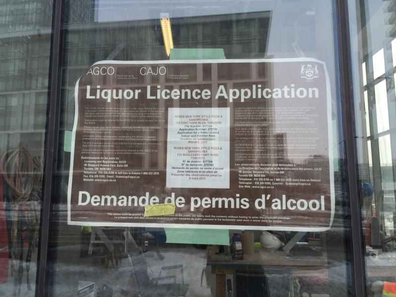
Its for the corner unit seen here:
036BAFC4-FB2D-410A-B8FB-787D4CB623BB_zpszitbf96g.jpg
 

Attachments

  • 036BAFC4-FB2D-410A-B8FB-787D4CB623BB_zpszitbf96g.jpg
    036BAFC4-FB2D-410A-B8FB-787D4CB623BB_zpszitbf96g.jpg
    76.6 KB · Views: 711

Back
Top