Very greeble-ly buildings- even though they're not all that innovative programmatically, they're interesting at least.
 
MVIMG_20200730_154740.jpg
 
Last edited by a moderator:
SQ2 along with the encompassing townhomes and landscaped courtyard is Tridel's most aesthetically pleasing finished product IMO.
 
Last edited:
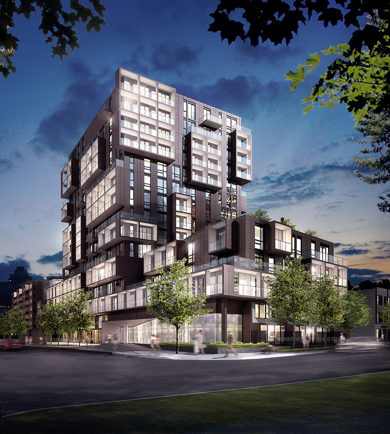
looking at buying in TO after many years away, and i'm reminded that this building prez center was one i actually visited back in 2016/17 and considered buying a precon. they only had a few units left and I was ready to pull the trigger on the J unit (a well proportioned 1000+sq ft 2bd-- like what! where do you find that these days!) but was told someone bought it right before me. was devastated. then considered the next one up which was either a 2+1 or a 3bd that was 1100 or 1200 sqft for $700Kish.... I was ready to spend $600 but 700 on what seemed to be such a hideous building in the renderings was just not what i was ready to spend at that point in time.

anyhow, seeing it built now - this looks actually really nice!!! i am shocked. literally, they were horrible renderings and i'm usually quite imaginative at envisioning what an end product looks like even with shit renders! this really does look interesting if not amazing, and love that it's set in this nice, pleasant landscaping. my dog would have loved it.. definitely regret not snagging that palatial unit for that price!
 
A bit outdated in terms of other projects to the south and east of here, but a couple unique aerial captures from Teeple's website showing SQ2:


sq2.jpg
sq22.jpg
 

That is so Janet.............sooooo Janet.

LOL

It's not terrible, indeed nice material palate and you can see the eye on execution too.

But we (she and I) so do not share design ethos.

The space is very formal, very rigid, and seems as her spaces often do like they're designed more for how they look in an aerial photo than how they work on the ground.

****

Forgive me, I can't resist pointing a few things out:

1655828254638.png


This space will be overbearingly dark when those trees mature, I suspect that may leave the impression of it being unsafe. I would have selected differently for that reason. I also think the path is a bit on the narrow side; and the apparent absence of seating is unfortunate.

**
1655828394602.png


Some seats w/o backrests are fine, but the complete absence of seats w/backrests risks reduced usage/popularity and is an issue for many older/physically challenged people.


1655828487882.png


I hate the gravel.............she loves that treatment for reasons that are completely lost on me.

I'm not terribly keen on mowed grass as landscape feature; it's clearly too small to 'play' anything on; or even picnic, it's there as decorative green carpet.

The space has a high degree of formality and will require ongoing maintenance to maintain that..............not a bad thing..........but something to consider when designing......who is maintaining this space after we leave?

Let me add a further image:

1655828819286.png


I see so many issues here..........I'll highlight just two though..............the gravel paths that delineate plant communities..........they're already disappearing as the ground covers spread..........very hard to maintain.

Fruit trees? Really? Whose picking all the fruit? And if they do, they have to step right over all the ground cover............in a word.........impractical.
 
Last edited:
Her work at the rbg rock garden is nice! But I tend to agree

I really like the Rock Garden at RBG as well, I think it's her very best public space work.

But that's at least in part because that's the exact type of space suited to her work; and it has professional gardeners who maintain it!
 

Back
Top