Northern Light
Superstar
I think the correct submission won.
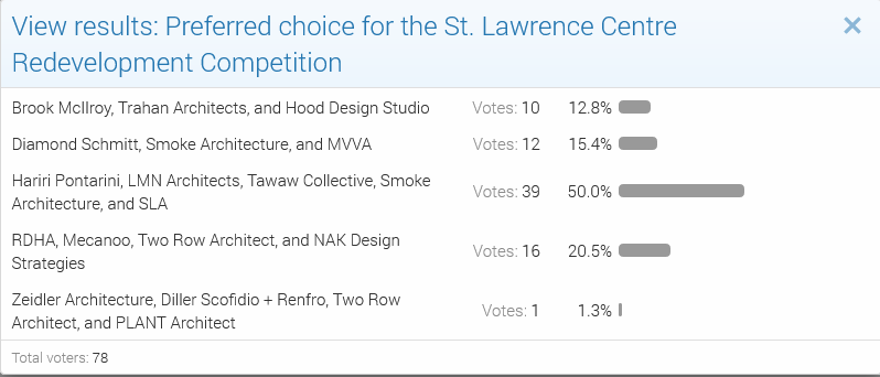
The UT Poll as at today would seem to concur:

The UT Poll as at today would seem to concur:
Note also that the original location for the St. Lawrence Centre was on the site of Market Square and that it looks from this 1964 pic in the TPL that the historic block on the south side of Front between Scott and Church would remain:
View attachment 460890
Yes, fascinating 'plan' - where did it come from? (A competition or ??). I note a plaza where the new North Market is, a building in "Berczy Park" and some sort of Obelisk at Front & Church.That model suggests many different things that did not come to pass. In the background, I don't see any North Market at all; the SLC design is different; and in the foreground, that office tower is not what was built in the Yonge-Scott-Wellington-Front block.
Always feels good to back a winning horse!I think the correct submission won.
The UT Poll as at today would seem to concur:
View attachment 460889
I'm electing to assume that the jury just consulted our poll, then went out for omakase.Always feels good to back a winning horse!
I'm electing to assume that the jury just consulted our poll, then went out for omakase.
42

 www.instagram.com

 www.instagram.com
Technically this would be CIBC Square, but @thecharioteer's image captures the background here:
View attachment 460918
I believe you're right - that building to the immediate left of the three towers looks like a stylized 1 Front.Are we looking north-east in this shot? I'm trying to orient myself.
****
For the benefit of everyone, a modest enlargement of PE's fine contribution above:
View attachment 460919
And we still haven't learned the lessons of the past. The cold and bleak charcoal buildings getting built in large numbers today aren't any better than the brutalism of yesterday....can almost hear 'Floyd's Any Colour You Like playing in the background with that pic.
Architects have been trying and failing to get the public to prefer modern architectural styles for a century. The tastes of the general public are too easily dismissed by architects and design snobs, IMO. Architecture isn't an abstract painting or a song or a novel. Interacting with it isn't optional. It has permanent impacts on its users and the surrounding cityscape. Architecture inherently needs to be practical and is fundamentally for the everyman. If architects are designing buildings that an average person can't enjoy, they're failing at their jobs....that's the problem though (and assuming this is on the money), is that this all really shows that the people sampled don't really like modernism as an architectural form for the most part. It doesn't say modernism is bad or awful here...it's just not a preferential choice. Which is not really saying a lot, IMO.
Thankfully, the good architects mostly ignore all that. And the rare good ones that don't (ie. Robert A.M. Stern) make it worth everyone's while.
A photo popped up on FB feed of the construction of the O'Keefe Centre (as it was then known). Of note is what you do and do not see on the east side of Scott Street.
View attachment 460539
A zoomed in look:
View attachment 460542
I have to say, I prefer the SLC's predecessor to the SLC itself
Granted, we need the space for the arts; in that photo, I see plenty of other spots for such a building.